I am designing a book cover for my Amazon kindle recipe book.
Here is my first draft.
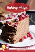
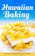
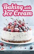
Cover 0:
However, this book is part of a series. I want all the other books to follow the same style and sometimes it can be hard to get photos that have empty spaces for text. Also I want the cover to be bolder and more eye catching, as on Amazon they show thumbnails of several books together, so it’s easy for books to be over looked.
I tried some different layouts:
Cover 1:
Cover 2:
Cover 3:
Any thoughts?
I know the subtitle and author name are small, but they will be on the Amazon page in large text, so they aren’t that important (I’d omit them from the cover, but then I can’t use them on the Amazon page).
I think the text in the band needs a little more breathing room. Given the amount of text you have there, I’d say it should spread over at least one-fifth or a quarter of the cover. That will also allow you to make the title bigger, leading to a bolder thumbnail on Amazon. You could even try having the title in two lines, like you have in the no band option.
The other thing I’d say is that in a book cover the author’s name is quite important too. So don’t keep it so small. In terms of a size hierarchy, I’d suggest this order: title, author’s name, series title, subtitle.
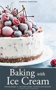
The top cover is inviting, and the title of the book is intriguing in that baking and ice cream seem mutually incompatible. Even though the typeface isn’t quite right it still has a soft swirling look to it that is reminiscent of frosting.
All this is lost in the subsequent covers. The photo crops are uncomfortably claustrophobic and begging for air. The titles are lost at the bottom and separated from the subject matter in colored boxes. The typefaces seem randomly chosen with no thought given to their personalities matching that of the photos.
Thanks for all the feedback! It has been invaluable. I’ll experiment especially with some different fonts. Out of interest, does anyone have any font recommendations (although I’ve got a few that I think will work).
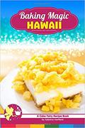
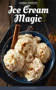
What does Baking Magic 1 and 2 look like?
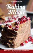
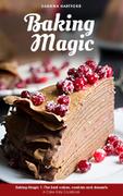
Here are the covers of Baking Magic 1 & 2.
Back when I released them, badge designs were popular on Kindle recipe books. But they have become dated now, so I will redesign these covers to match this ice cream one, as they seem a little tacky.
Why not photograph your own cover? Are your recipes also going to have pictures? Is the recipe for this cake in the book?
I don’t have a camera (or camera phone) at the moment. The photo I have used on the cover is for a recipe in the book. Kindle recipe books generally don’t have photos. Most of them are read on B&W devices, so the photos don’t look nice. Plus they take up bandwidth. When books include them, they usually get complaints in the reviews.
Who is Cake Fairy?
The Cake Fairy is my fiction series of cozy mystery books about a cake maker who solves crimes with her cat. A selection of cake is featured in each book, so the recipe books collect them allowing my readers to make the treats they read about. I mention the Cake Fairy on the recipe books to show that there is a connection to the fiction books. In practice though, it seems most of my readers prefer reading about cakes rather than making them, so I am considering dropping the link between the fiction books and the cookbooks.
However, as most have said, the text-over-image design is much better, so I tweaked that instead: Ref 2:
I think it looks really good. My only reluctance over not using that design is because sometimes I have photos that don’t have room for text. However, I realized in those cases, I could just use a blur to accommodate the title.
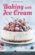
This works most of the time:
Ref 3 & 4:
However, there are occasions where it is an issue.
Ref 5:
I thought about adding a stroke to the lettering to make it clearer, but I am not sure if it still looks good.
Ref 6 & 7:
I would appreciate any opinions. (PS I decided not to make the author name/subtitle bigger, as they on the Amazon page, so it looks a bit dumb to have them big on the cover as well).
I’m liking these a lot better, and I’m liking how you’re pulling colors from the image for the extra graphics. The typeface is much more appropriate than your first versions.
I’d have reservations about stroking the title too. It usually doesn’t work — especially when done to enhance the legibility of the type that doesn’t read well over the background imagery. Although, it doesn’t look all that bad here.
Even so, on the Baking Magic cover, for example, rather than stroke the title, I’d probably be more inclined to darken the background behind it. What I probably wouldn’t do in a matching series like this, is stroke the title on one book and not do so on the next. They all, I think, need to be treated the same way.
Yes, definitely much better. But I have to agree with Mr-B that it’s better to make the background behind the title darker than stroke the title. The simpler the better, I think. A black to none gradient (top to bottom) on the picture might do the trick.
You are only thinking in terms of one online seller and how your cover will look on their site. My suggestion to you would be to imagine the cover as packaging for the book that is complete in itself so that it can be used on any platform (including print if you want). In digital terms, think about what it would look like on a Kindle or iPad or on a phone, especially when the title and author’s name are not given separately. Ultimately you’d want people to pick up your books because they are yours, and for that your name needs to be more visible because it’ll be the common thread across all your books.
When I need type to be over an image and also stand out, I often put a semi-transparent rectangle behind the text. The background still shows through, but it emphasizes the text.
And I agree with not putting a stroke on the letters.
Putting a darker blurred background works perfectly!
Thanks for all the suggestions, I am really pleased with all the covers.
I will consider this. At the moment my books are only sold on Kindle. And whenever the cover is show, the author and title is displayed in bold text underneath (or above) the cover. But if expand on to other platforms, it is certainly a good idea.