Hi folks, not a graphic designer, so trying to work this thing on my own and looking for input. I need to select a color palette for a landing/sales page (nevermind what the product is) and the parameters are warm, mature, masculine and authoritative. Here are some that I came up with. Do you like any of them, or have any suggestions? I notice that colors I select start looking like Thanksgiving/Fall which isn’t exactly what I want…Thanks!
2 Likes
I fixed your tags so the images can be seen ![]()
1 Like
Depends on the product.
If it’s stetson hats, rawhide and leather, old tools or Old Spice, maybe.
If it’s sailboats, lawn tractors or power tools, maybe not so much.
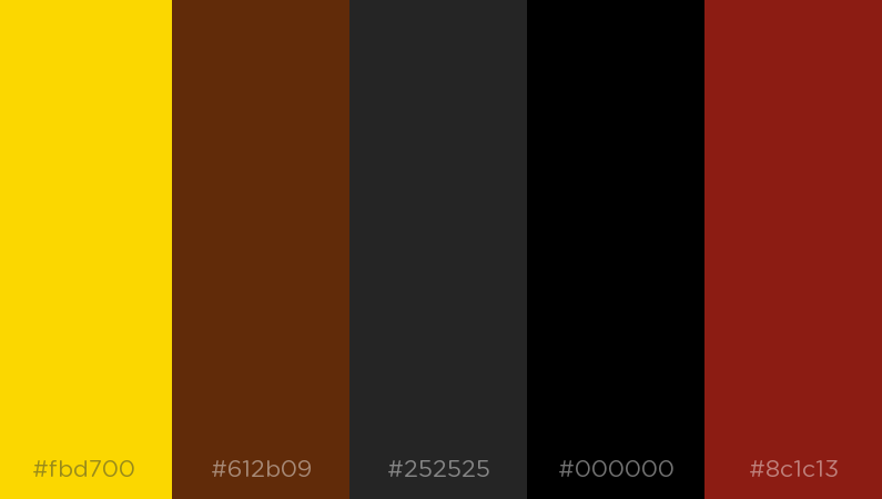
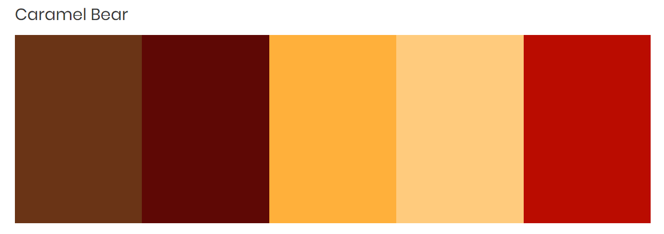
The bottom one is a better, choice as far as range.
But who knows if either is appropriate.
2 Likes
@RedKittieKat thank you ![]()
The product is an online course, music related if that helps
1 Like
A masculine online music course? That aside for a moment, music instruction that is “mature” and “authoritative” would benefit from a presentation or motif that is formal looking; not colorful or whimsical in any way. The black and white of piano keys, sheet music, and formal attire come to mind, as well as perhaps the silver, brass, and wood of classical instruments.
But, everything here (in this thread) so far is oversimplification. Your opening post tips, but says too little, about the target audience and the marketing intent, both underlying and overarching. And, it may be important to consider that the product is by nature a technical discipline. So warmth will have its place as a motivational element, but should cool down as committed business ensues.
The color scheme sample in top is good, just use the brightest colors for fonts and darker for backgrounds. the response about the vagueness of the site is just so we can get an idea of what the pitch is. The last thought aspect of any illustration is the colors rather than the concept. I guess the colors happen while designing or what mood needs to be set.
I hope this helps!
My favorite color palette is the one that will make your target market respond.
1 Like
When I say masculine, and authoritative, that is what I want the colors to convey. Don’t want it to look like twitter or facebook, etc. The audience is older/mature men, very few women, maybe 3-5%.
i would visit other websites like esquire and look at the colours, not text, pictures and ads.
remember 5 colors you noticed and go from there.
1 Like
Just about any color scheme can have either a masculine, feminine or neutral personality — it depends on the context and how the colors are used. Colors to avoid when aiming for masculinity might be pastels of various sorts, since they have a softer feel, but even they can work when used right.
When designing websites and publications aimed primarily at specific demographics, I never really think about colors ahead of time. Instead, I think in terms of what @Steve_O mentioned — what it takes to get the right response from the target audience. The design flows from that premise, with text, layout, type, headlines, structure, color, etc., emerging (often intuitively) as part of the process into a complete personality that’s appropriate for the task at hand.
It’s really something of an oversimplification to think of one set of colors being masculine and another being feminine. Holidays and seasons can be thought of in those terms, like those you came up with looking like autumn or Thanksgiving, but with people, it’s much more complicated.
@Just-B Well darn, now I’m really stuck. I have to do this myself, can’t afford to hire anyone, so I’ll just use one of those generator things until I find a palette that I think will work ![]()
use natural earth tones, i dont remember colors when visiting websites look at this one, blue, white and light blue. the content and graphics are more important, remember you can always change or adjust the colors afterwards.
It all depends on how the pallet goes into application. I’m With PrintDriver in favoring the bottom of the two swatch sets, however neither really hit home with me.
However, I don’t see what your color hierarchy will be in the designs. Meaning, for example, if the Brighter red and yellow appear as the dominant colors, with accents of the tan, I imagine that could work if done well. I have trouble envisioning the brown, as well as both the bright and darker red in the same piece.
Personally I’d have a warm grey (or two) in the mix. Something near neutral (not black) to really fill in the artistic gaps when the piece comes together. These can help draw the eye to the more important swatches, IE your strong Red tones.
Just throwing this out there. Something with neutrality in the mix, maybe more a copper or bronze, than a brown could be appealing.

You could even go with a perfectly neutral grey for a web application. A mid-dark red with a charcoal grey is highly aesthetic, and can appeal to both masculine and feminine parties alike.
Hmm… let me know if that swatch pallet appears correctly, it did when i initially posted it. Did I make the same mistake as the OP?
I don’t get the association of the colors to the content. In addition to your mention of “masculine” and music course, there also seems to be a airline theme. Wouldn’t it be best to have blue skies or to use the colors from famous or historic airlines instead?
1 Like
i like the second choice BUT my first reaction was desert and Arizona when i saw the image. I would go with blue and skies, That person looks macho enough.
we would use the blotter tool to chose lite to dark colors from our main subject, that guy and base our background and colors with 4 clicks on his torso.
I cannot retire out of this industry fast enough.
5 Likes
LMAO You get to retire? Damn, I’m dying at my keyboard.
1 Like
Yes, I’ll be reading PDF comments and tweaking a layout as the undertaker drags me into a cheap poplar crate.
1 Like