Hi Everyone,
My stepfather is a proud first time author and he has asked me to create an illustration for his book. I
I’ve uploaded an image but it doesn’t seems to have worked — can’t tell until I post this. Apologies if you can’t see the image.
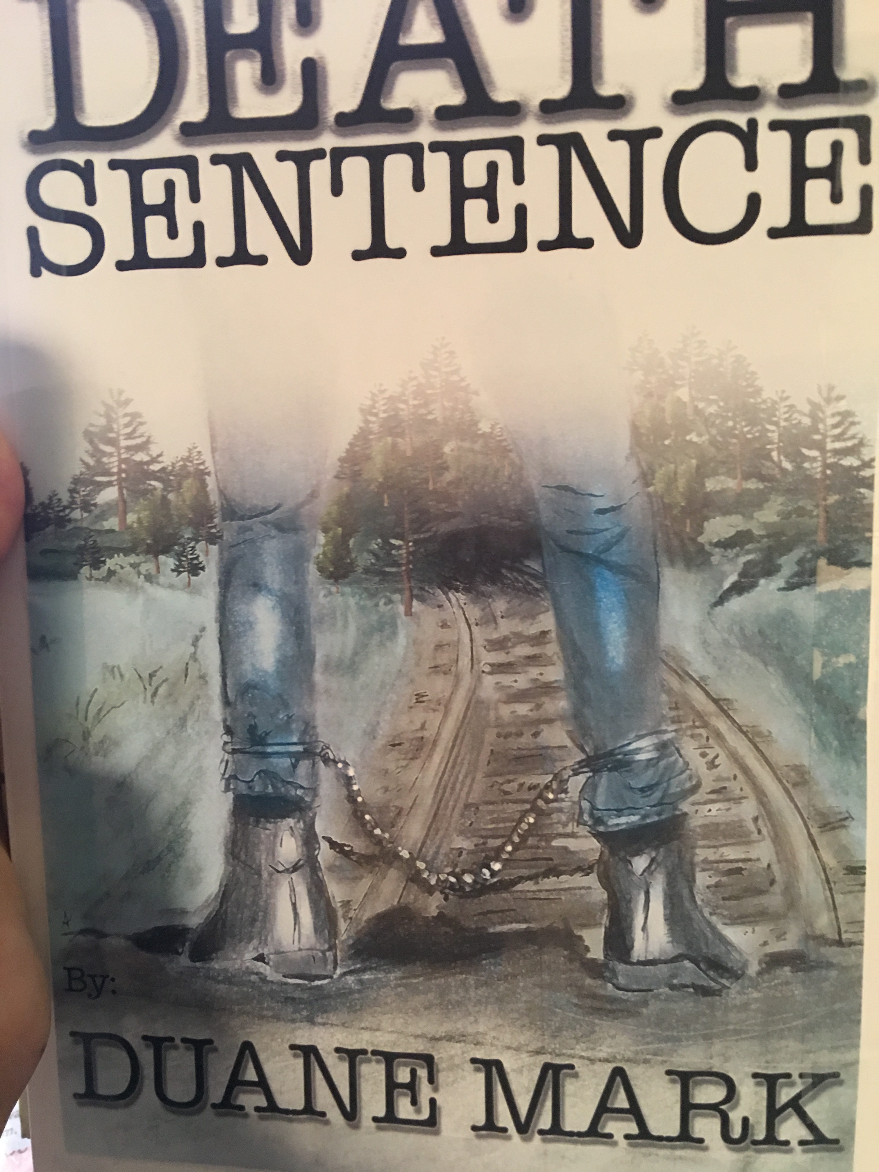
I’m not an illustrator, I’m a pretty good art director, et. al., but I’m not thrilled with how this turned out after deciding to give it a go. The irons are too small and I feel the legs are too far apart. I need your kind and critical eyes, illustrators. The subject matter works.
image|281x500
usually what I tell people in a case like this is to look for examples of what you are trying to illustrate. Don’t just go by what you see in your mind. Learning to illustrate is all about learning to “see” how things really interact in the real world. I’m not saying to find photos and copy them, you just need something to get the proportions right until it becomes natural for you to “see” for yourself.
For instance, yes the legs are too far apart. If you continue the legs up to the crotch, this guy is either starting to squat, with knees forward, or he’s been split in two.
The leg irons are pretty tight to this guy’s legs. The would be larger, looser and they would sag slightly to the weight of the chain. Also check details of what they would actually look like as they seem to be the focus of the illustration.
Perspective is off. Is he standing on a tunnel entrance over the railroad tracks, maybe to jump onto a moving train? Or is he supposed to be standing on the tracks themselves? If above them, the proportions are off. He would be a train height above them, not a table height.
Where the tracks enter the forest, the tunnel through the trees is too short. Again, the hole has to be train height.
Last item is what period of history is this?
Leg irons, pants and shoes should match that era.
1 Like
Thank you — duly noted! A lot of great suggestions!
Based solely on the title…to me, the illustration looks too soft and fluffy.
The font looks like a typewriter font. I’d look for one more foreboding and threatening.
I’d also consider changing the leg irons to handcuffs and/or a belly chain. Leg irons could suggest slavery, rather than capital punishment.
I’d use more contrast, with dark, sinister values.
The train track and trees don’t support the topic. I’d replace them with prison walls. Maybe with handcuff silhouettes overlaid.
Just my opinion, of course.
1 Like
The leg irons are why I asked the period of the piece.
Think Cool Hand Luke rather than slavery era.
And really dangerous felons are cuffed, belly banded and chained at the ankles.
Period may also play into the typeface chosen.
The type didn’t bother me as I figured 1930s-50s so a typewriter may be quite apropos.
1 Like
What medium did you use to make this? Some areas look like they’ve been cloned in ps. I agree with the comments above. Depending on what it’s made with, it may be fixable.
1 Like
So you’re in exactly the right era @PrintDriver. The protagonist was in a local jail (think westerns) and escaped—he’s also a writer. (Hence the typewriter typeface…I know it’s seriously overused, but the author was comfortable with it. Definitely want to change the leg irons, I know they need big help (yes, along with the legs) before I had them too close together so I scanned the original pencil and ink drawing and then added more color in photoshop and which is also why he looks like a very strange version of an outlaw. @cornfed, if you see a way to fix this without starting over, I’m all ears.
Thanks for your opinions. Valuable. So this guy is not sinister. He was in the wrong place at the wrong time and he’s actually a writer who escaped a local jail in the 1930’s West Virginia. That’s why there are train tracks and trees…so the illustrations do match the story, I’m just not an illustrator so I’ve had some trouble with that portion, not what I want on the cover.
1 Like
Book covers are challenging, for sure. They have two jobs; catch and hold attention, and illustrate the story within.
I appreciate you posting this question, because I am interested in doing more book cover design. I enjoyed this discussion. 
1 Like
The stove-pipe jeans and hipster-esque booties throw me the most - and the leg-irons already mentioned. Maybe look for reference for more appropriate garb styles for the period.
The typeface doesn’t bother me but the 3 different treatments applied, do. Half the title is embossed, half not, with the author’s name having been given a drop shadow. I would also spend some time on the kerning.
Congrats to StepDad on his first novel!
Just as a visual. Jeans from that era are baggy and usually upturned. They were for work .. not for fashion. And they’re were no skinny jeans for decades to come 
1 Like