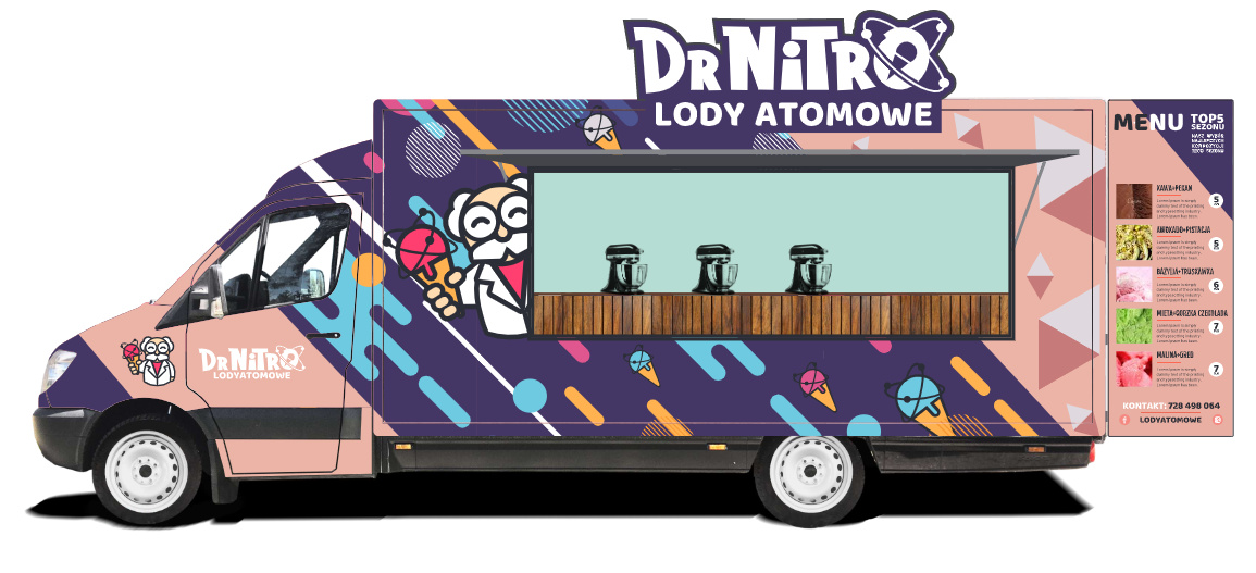
How are you making the applied pieces that have neutron rings. Are they goin to be solid shapes with white infills inside the rings. (and make them DOT -or equivalent- compliant.)
Also, will the van be under-bridge height with those deployed if they are permanent fixtures? Can I tell you how many of those kinds of things I’ve replaced after someone took them under low-hanging tree branches? LOL.
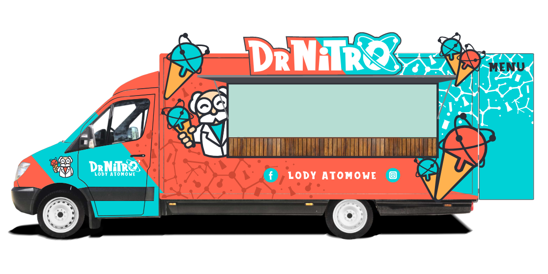
I much prefer the second option with the teal and orange. It conveys the idea of ice cream much faster, it’s easier to digest (all pun intended), and I like the playful color scheme. Plus the orange/teal thing really works. The darker one is little too busy.
I second Steve_O opinion. The teal and orange look more inviting and the design elements on it really say scientific but relaxing. If I wanted to buy ice-cream, especially “designer” ice-cream I would buy from a place that has that relaxed feel. The purple and pink one with the diagonal motion gives off a more rushed feeling.
Also I would say the pink and purple would stand out less compared to the orange and teal. The colors feel too muted to me for your brand and doesn’t match your scientist guy mascot.
Also color theory wise
pink = sweet, playful and nice with purple = luxury, royalty, power
orange = joy and happiness and teal/blue gives off calmness
So the back door features the menu. They’re going to keep that open when parked?
Also, what exactly is the name of this? They seem to have social media as Lody Atomowe, but the actual truck is called Dr. Nitro. One of them you seem to care about the social media mentions, the other you do not.
yes, I thought of cutting those elements from dibond (with white infills, just as you said) on a CNC machine.
Also, will the van be under-bridge height with those deployed if they are permanent fixtures? Can I tell you how many of those kinds of things I’ve replaced after someone took them under low-hanging tree branches? LOL.
TBH I was inspired by colors of the Nintendo Switch console (neon version)
Thank you for your opinion, but dont you think the Orange design is less stylish/it looks a little bit like a circus? Doesnt it look cheap in comparison to the darker one?
If I wanted to buy ice-cream, especially “designer” ice-cream I would buy from a place that has that relaxed feel. The purple and pink one with the diagonal motion gives off a more rushed feeling.
Also I would say the pink and purple would stand out less compared to the orange and teal. The colors feel too muted to me for your brand and doesn’t match your scientist guy mascot.
This is very interesting view for me, because I felt the orange design was too colourful, busy, bright and tiring (it was the first design I had so im looking at it for a long time).
Maybe it does convey ice cream theme better because it has literally cone models pasted on the truck :). I feel the darker one is a little bit more abstract and the color scheme is less tiring…
So the back door features the menu. They’re going to keep that open when parked?
Menu is mounted on hinges, its not a back door
Also, what exactly is the name of this? They seem to have social media as Lody Atomowe, but the actual truck is called Dr. Nitro. One of them you seem to care about the social media mentions, the other you do not.
The full name is DrNitro - Lody Atomowe. I thought of leaving just DrNitro but decided to add the subtitle/tagline so it would much easier conver what we are about (and help internet search).
My SM accounts are LodyAtomowe.
I would think you wanted colourful and bright as your a food truck and want to stand out if your beside a park or beach.
I would say the purple truck would be considered more busy with all the movement and graphics.
The orange and blue feels more related to your brand (which I’m guess is more on the fun, happy side), its colour palate relates strongly to sweets/dessert, it would stand out easily in busy areas, has a very “summer” feel, it’s design elements contrast well with each other, the simpler look is much more inviting than the almost chaotic graphics of the purple one
Pink and purple are analogous colours while orange and blue are more complementary, while both are good color schemes depending on the situation. The analogous colours would give of a sense of stability while the complementary colours would give off more fun and excitement which I feel suits icecream and your brand better.
Purple would be good for a more high-class feeling place like a Italian gelato shop in my opinion
MrChoob’s in the right mindset there. These decisions must always factor context; the target market, the location, the product, and the core business objectives. So, it depends on where the truck will and who is to be attracted.
Around a park or beach where the market is potentially very diverse, a more playful, in-your-face scheme is appropriate.
Parked in a business district where the market is predominantly adult and more upscale, a more subdued and sophisticated “designer” scheme will work better.