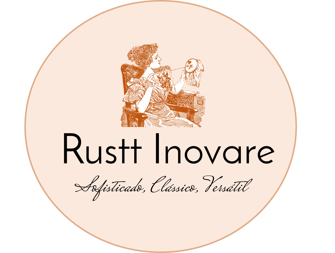
This is the first work I did, it was for a site of handicrafts, crochet, sewing, etc. The subtitle is in my native language, portuguese, the translation is: Sophisticated, Classic, Versatile.
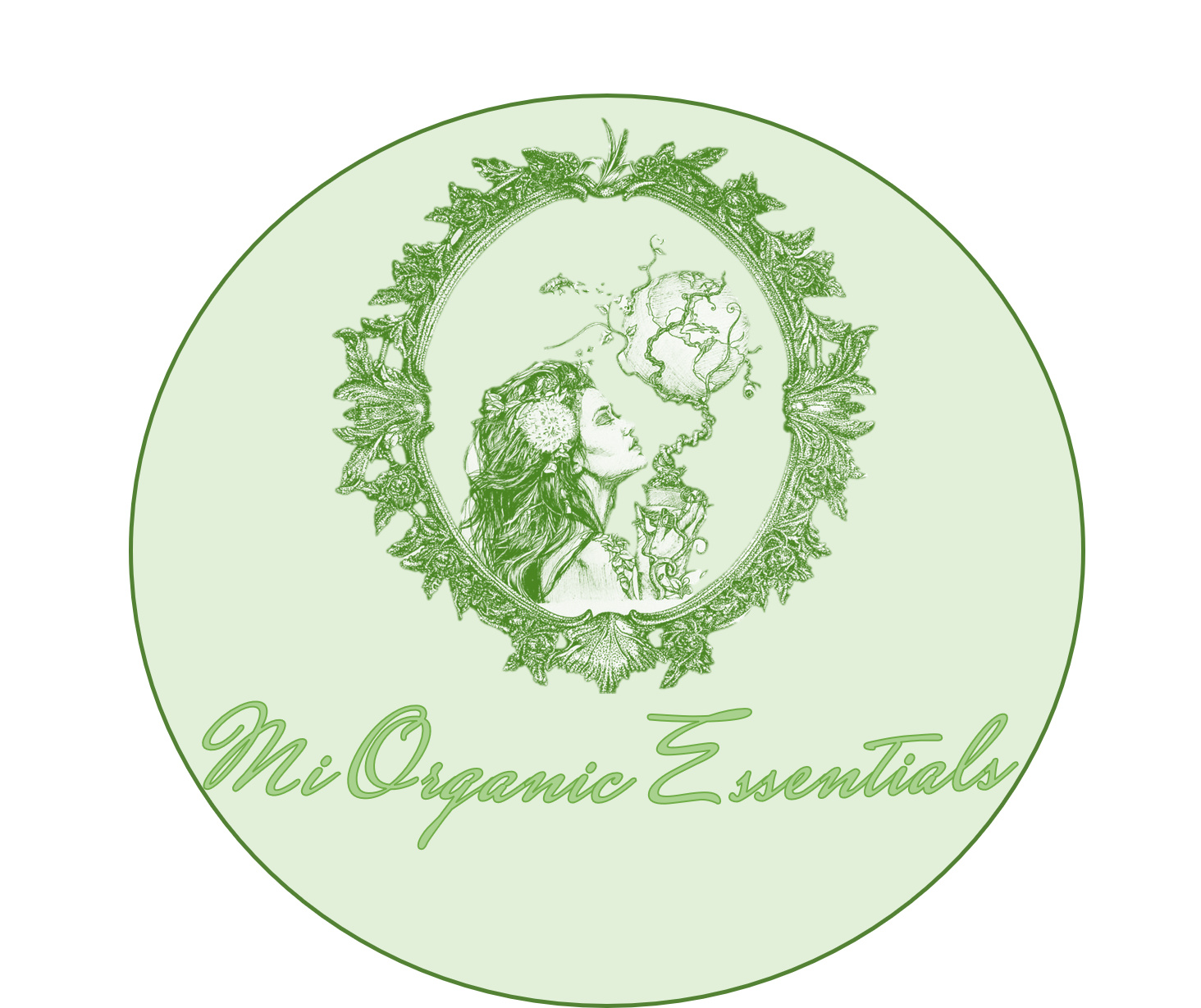
The second was for a commissioned job, the client asked for a round, rustic (practically in the same style) logo on organic beauty products that focused on environmental awareness with name of mark.
I await your opinion, a little nervous, i confess haha but i’m here to learn too, thank you in advance to all who devote themselves to take a peek and give their opinion.
The other image is from an 1800s magazine, and is technically public domain. I did find it on a clipart site whose usage license specifically forbids using it for commercial purposes even though they can’t lay claim to owning it. Clipart generally cannot be used in logos as the logos cannot then be trademarked. Most stock art sites expressly forbid logo usage.
Thirdly, unless you vectorized those images, they are raster and therefore not reproducible other than in print or on screen, and at the size limit of the pixels.
Technical gaffes include using thin outlines on letter forms and the letter placement within the circles. The orange one is off center. The green one is off center and crowding the edges.
Okay, thanks for your considerations. And yes, the images are vectorized, they are intended for online use only, directed to websites and blogs. I do not know how it works abroad, here in Brazil an image falls into the public domain 70 years after the death of the original author.
Hello Rebecca
I am the artist of the ‘Mother Nature’s Mirror’ in the green that you have infringed and modified.
Please do not use my work without my knowledge. If you would like to you use my work for a logo/commission then please contact me on instagram @dma.arts to workout contracts and details.
I’m only a student, but I think the green text could be moved or changed in size so that it’s not touching the edges of the circle. Also, the typefaces on the red logo don’t seem to complement each other well, the top font is jarring in a distracting way compared to the bottom text and the image’s sophistication. Also, besides the copyright issue, the images would be difficult to reproduce.