Hi, I made a booklet for a company that hosted an event where older people talked in groups about the future/living together in retirement homes and inclusivity. There were also illustrators present to make drawings during the discussions and this book is a sort of resume/recap of the event, with quotes divided into different topics from what the participants said. In the beginning there is a part of a speech by a local politician and a poem. I was wondering if I could get feedback on the design?
Some info about myself: I studied graphic design but I’m not working as a graphic designer at this company (I do public work and social media) but once in a while I can do some graphic assignments like these. So I wasn’t hired as a graphic designer but would like to work more as a professional designer in the future. All feedback is welcome, thanks!
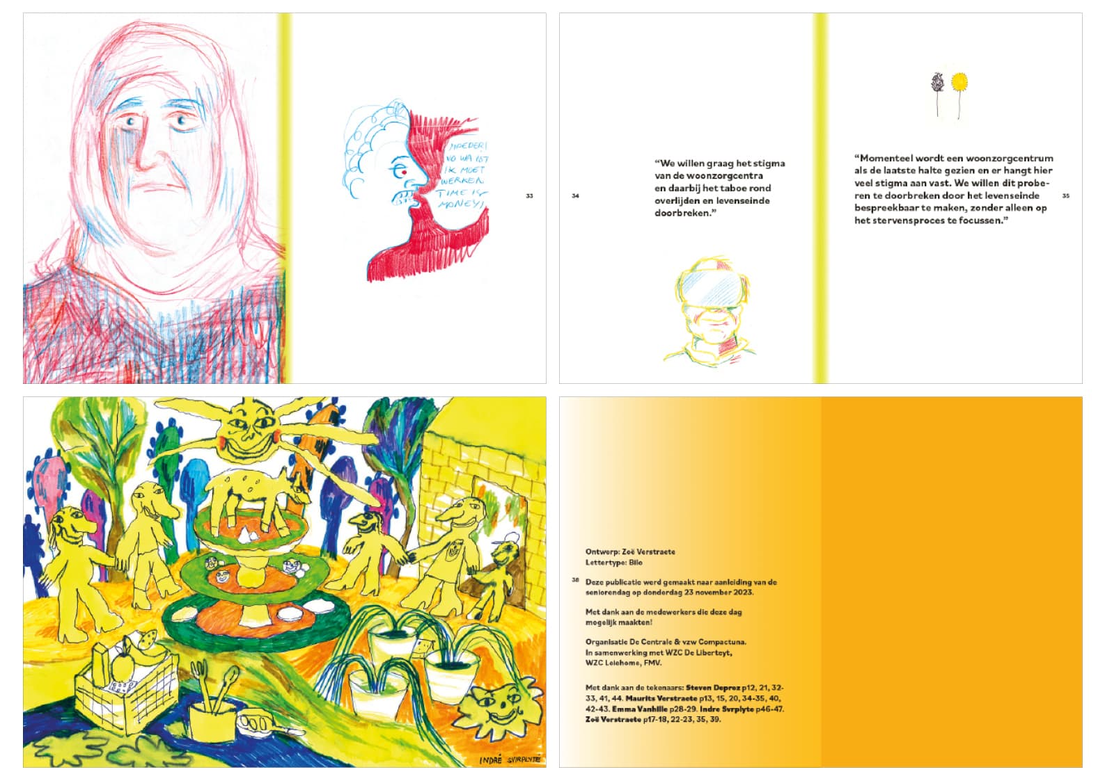
ps: since i can’t upload pdf, I made jpg spreads. Maybe it’s not completely clear this way but I don’t know how else I can show it. I couldn’t upload the back cover but it’s just orange. Format is A5. The order is top Left, top right, bottom left, bottom right.
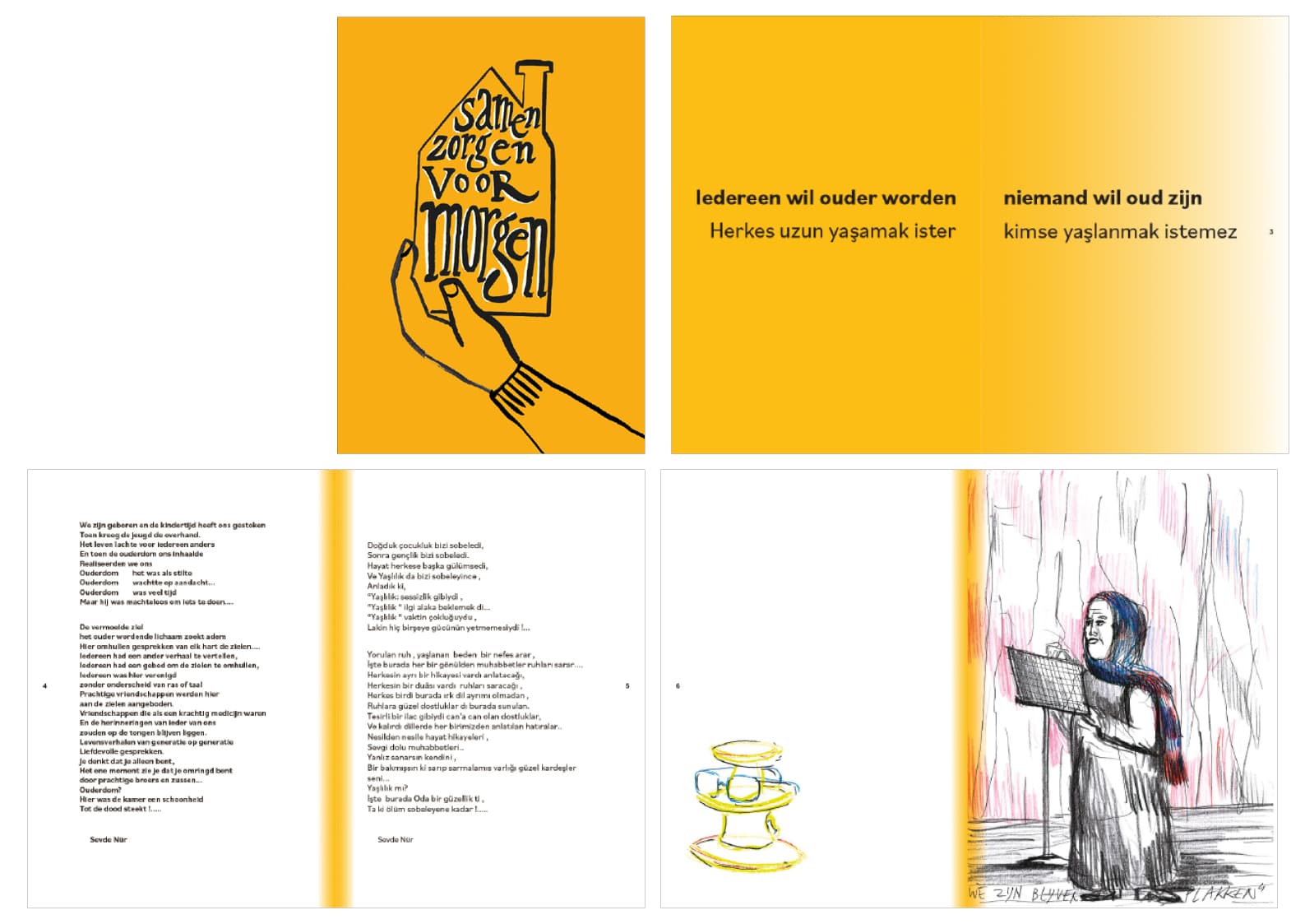
Cover: I really like the illustration and type. I’m not sure if you did that or an illustrator. Either way, nice job. The only comment I’d make would be to work on the letterspacing of VooR. It looks like you could move the lower case “o” characters closer together.
2/3 Spread: This isn’t doing too much for me. Maybe it’s because I can’t read whatever language that is, but I’d have to say you could get a little more creative with the copy and space.
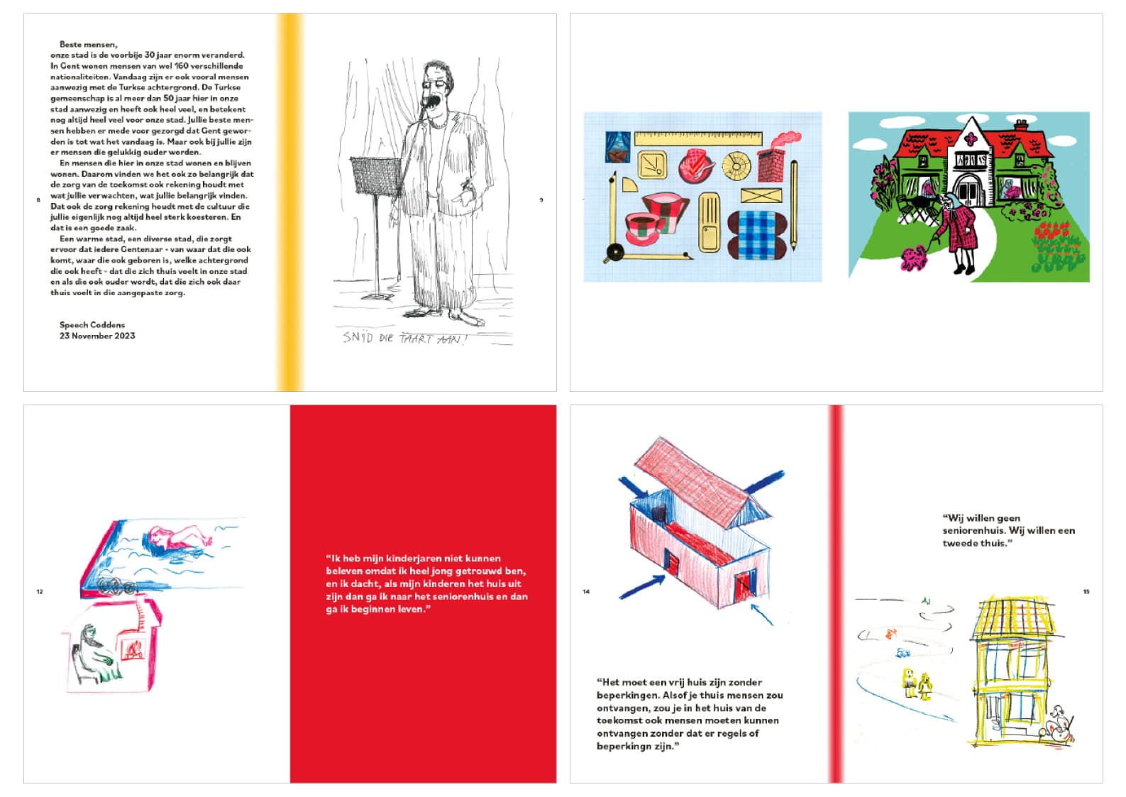
General Note on Spreads: I’m not crazy about the gradient in the gutters. I’m guessing you did that to break up the pages. Personally, I prefer having opposite pages on a spread in set in a color like you did on 12/13 spread. Granted, the illustrations need a white background, but where you can run a solid background color on a page, I would.
General Note on Type: First thing that jumps out at mean is that the quotes should have hanging quote marks. If you don’t know what that is, look it up. That would go a long way towards making this look more professional. Really pay attention to the right rag / where lines break — especially with short, display copy like this. I think this could be cleaned up quite a bit. I wouldn’t mind see the size of the type vary a bit from spread to spread to add some visual interest.
All of that said, not a bad effort for someone who isn’t a working designer.
The cover is made by myself so thanks a lot! Also for your other feedback, I find it very useful.
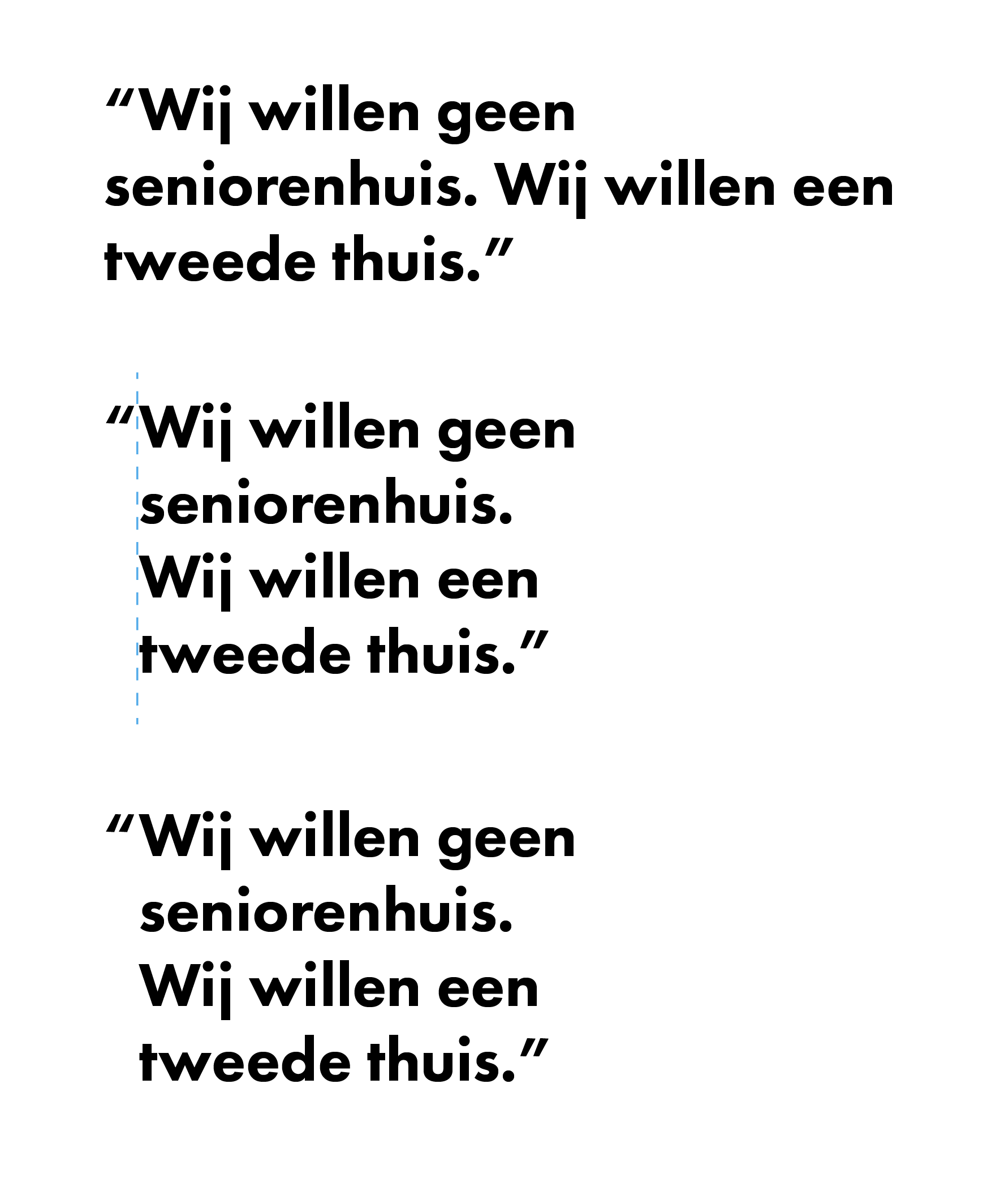
I didn’t know about the hanging quote marks, but I will definitely apply it Also for the right rags, I find it hard to make it look good sometimes but I agree that it still needs some work. I can be a bit hesitant to experiment/play with type because of some fear of making mistakes (or making it ‘bad’) but I agree with you that it can use some more ‘life’ or variation so I will definitely use and apply your tips
Here is an example of one of your paragraphs with a hanging quote and more attention paid to the line breaks. In my opinion, the lower paragraph is the better looking of the two.