Destroy Me.
Told the client they might want to pair down the copy, so they of course gave me … more copy.
I hate this. everything about it. quite awful. I’d like to hear about how you dislike it as well.
Have fun!
Destroy Me.
Told the client they might want to pair down the copy, so they of course gave me … more copy.
I hate this. everything about it. quite awful. I’d like to hear about how you dislike it as well.
Have fun!
I have some serious skepticism about what they’re offering, but that’s another issue.
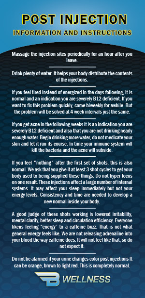
Sticking to the design, yeah, it’s very copy-heavy and not written especially well. Even so, if I were the one getting regular injections of various substances, I’d want to read a whole lot about it and what to expect.
Since they’re not inclined to cut back the words (and giving them the benefit of the doubt that the words are needed), if it were me, I’d suggest not decorating it up with heavy background patterns, outlined type, reversed type, centered type and gradients.
The main goal here is to keep everything readable, clean, light, airy and simple. A design that suggests medical competency, honesty and professionalism is likely what’s needed. Once again ignoring my suspicions about the efficacy of what they’re selling, a straight-forward, classy, corporate, readable, Swiss-style minimal layout would probably work best to counter the impression that they’re selling snake oil remedies.
Okay, you asked for it. ![]()
I would second Just-B’s advice. This isn’t a marketing piece. It appears to be something that’s handed out after treatments. As the title of the post suggests, this is informational. Given that, I’d concentrate on something that’s legible and professional. Assuming the clientele are older, make it easy for them to read – no busy backgrounds / outlined type. I think the type could use some overall improvements. I won’t go into too much detail on the latter. I’ll save that for a revised version if you post one.
I totally agree with all of these points. I would have loved to make something more professional looking, however the client wanted this ridiculous “infomercial” style! They specified bold and in your face with bright colors. It goes along with a table cloth cover that had already been designed.
There won’t be any revisions to this as this is the final product which the client was somehow happy with.
True, I could have not used the background pattern. And seriously I just didn’t know what to do with all this text and was trying to find ways to break it up.
The only additional note I have is that the color combination of yellow on blue is too “alarming” (for lack of a better word). I’d change the yellow to a lighter green (like Seattle Seahawks). The cool pallet will ensure the calm feeling associated with the message.
Although yeah, I hate a lot of this “new age sctience”. I don’t know about this company in particular, but people are falling for hokum like I’ve never seen before. If you can make a pretty box and put candy in it, just label it as “healthy alternative” and it will sell.
The yellow-outlined black text hurts to look at.
Not liking the curved edge below the the POST INJECTION bit. If if needs to be curved, I’d lessen the arc as it seems a bit severe here.
Centered text is best suited for headlines, invitations, and poems in greeting cards. Long blocks of text like this ought to be left-aligned or left-justified, otherwise your last line ends up looking a little lost. I also would eliminate the rules between the paragraphs, I don’t think they add anything.
The patterned background is a just a touch busy for all that text above it.
Why the blue margin on one page, but not on the other?
Do you think it would be better flip flopped? Yellow with black out line? client wanted all these colors (I would not have picked these colors!) - he wanted it to be LOUD and to POP
Yes I agree I could have made the curve less. It was pulled from a previous design that this was to match.
The client asked for a way of separating the “steps”. To me, this seemed like a simple way to do that. Open to suggestions though.
This is a front and back of a card. I guess I didn’t feel like they needed to be the same … I didn’t think about it until you just pointed it out.
Thanks for all your input!
Oh, I know. Client did not want calm. Loud and pop were his descriptors. This is all created to match an existing design of a table cloth.
I’d head for the hills.
I wouldn’t have used outlines at all. They rarely add anything except clutter. They almost always interfere with readability. They compromise the design of the typography. They’re most often used to increase contrast with the background, which is a bad workaround for a problem that should be addressed by changing the background to something more conducive to having type over it.
I’ve had my share of know-it-all clients. Sometimes their minds are made up and they want no input from the person they hired only to implement their awful ideas. I do get that, and in those instances, it’s best to get the job done, collect payment and move on to something more worthwhile.
I don’t know what conversations you might have had with this person, but I always assume clients hire me because they want an expert to think through a design problem. I would have asked the client what he/she was trying to accomplish with this information card then made my argument for doing it differently from the point of view of trying to best accomplish the client’s underlying objectives.
As @Steve_O said, this is a card designed to provide people with information and ease their minds about the procedures. It shouldn’t come across as a wordy and visually heavy sales pitch from the back of a supermarket tabloid.
Even if there is a marketing aspect to supplying the information, a dense design with loud, clashing colors from opposite sides of the color wheel is counterproductive when given to people who are looking for calming reassurance. Contributing to their uneasiness about a series of injections by tossing an information card in front of them that “Pops!” and alarms instead of soothes and reassures is, again, totally counterproductive to achieving the desired results.
B was kind.
The writing is atrocious.
I would place bullets were the Benefits of HRT is located just to break up the monotony.
we all have been in this “put the elephants were the foxes lived” text cramming projects and we all feel 2 feet small doing this.
PrintDriver was kind.
The writing isn’t writing.
Too many gradients/busy pattern overcomplicates the whole design when combined with the text, and the yellow is really mismatched to the design, looks like text plopped over a stock template. Also with a wall of text like that, I might favor positive text coloring (dark on light) rather than negative (light on dark.) The arch on front isn’t repeated or reflected anywhere else in the design so it feels out of place; choose either flowing, rounded edges throughout or stick with color blocks, not mix and matched. The colors feel more corporate than “medical”; to legitimize the content I’d go with a lighter, gentler, green/alternative, natural look and feel. For the record, I also worked with somewhat of a snake oil salesman, and had to get good at making it look legitimate, which is an ethical challenge that ended up making me quit. Here’s what I did with some of it:
Ignore my message on style then…wow, that sucks. ![]()
I’m stealing that metaphor ![]()