Hi there!
Check out this infographic, please. We are working on creating a new website about home security https://securinghome.com/. This site is intended to be a source of helpful information about how people can protect their homes from break-ins and other cases of house damage.
What do you think of the infographic and site in general? This is not the last version of the front page. What improvements can you suggest?
1 Like
I’d make two suggestions.
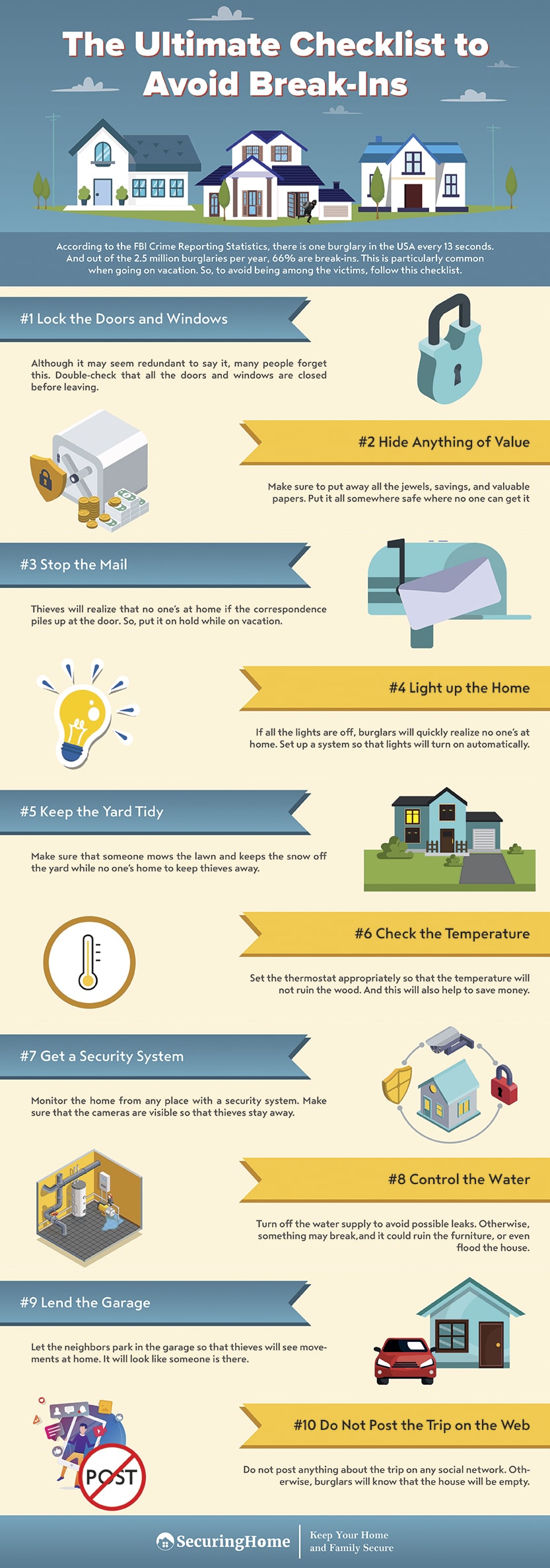
First, look for ways to tighten up the copy with its associated graphic. For example. the thermometer graphic is visually disconnected from the #6 Check the Temperature copy. Maybe it’s a matter of moving the thermometer graphic over or enlarging it. Or maybe you create 10 boxes and put the graphic and copy in a box. As it stands, you sort of have this river of white space that’s actually a bit distracting.
Second, I’d like to see the graphics be more cohesive. The first thing I’d try is coming up with a color palette, and it could be the blues and yellows you’re currently using, and having all of the graphics done in the same palette. This would help unify the graphics rather than making them look like 10 separate pieces of clip art.
1 Like
Now that issue with the thermometer looks so obvious. We’ ll try to fix that.
As for the rest of the graphs, your remark is to the point, but I don’t think we will change the infographic that much. So much work to do with the project. Anyways, thank you for your feedback!
What I like:
-Friendly graphical style: The graphics look very cute and innocent, which makes it inviting and easy to read.
-Chunk size format: I like how the text is broken up into pieces. Again makes it inviting and easy to read.
What I would change:
-
The left-right layout of the different steps is awkward to read, especially because:
-A) The even number steps use a different color for the banners
-B) There is too much space between the graphics and the banners.
I wouldn’t necessarily drop the left-right layout, but I would definitely unify the colors and drop the space between the graphic and the text. -
You’ve got clean inviting graphics. But then you use grey as a primary color. It feels like you were worried that it looked too fun/innocent and so used grey to make it more serious. But it just makes the piece feel like it is in conflict.
Personally I would use a dramatic image for the heading (maybe even a photo). This would set a serious tone and makes the reader think about the risks. And then for the steps, I’d drop the grey. That way, the steps will feel more inviting to follow and will make a nice contrast with the dramatic image.
-
In a lot of cases, the banners are longer than the text they hold. This draws too much attention to banners and disturbs the balance of the piece.
-
Too many steps
This is quite a long piece for an infographic. It’s so long that my first instinct is to skip over it. I’d personally only use graphics for the first 4 important steps. The other steps could be grouped together in a box labeled More great ideas to stay safe…
Either that or split it into two infographics.
-
Brand is hidden
After all the mammoth scrolling needed to get to the bottom, the brand behind this massive seems visually weak. There isn’t even any contact details to get in touch with the company. -
Statistics are weak
The statistics motivate the reader to take action, but they lack any impact and are easy to skip over. They are also too wordy. For stats like this, you need to use easy-to-read badges that emphasize the numbers and can be understood at a glance.
Overall
I hope you won’t take this the wrong way, but it feels like you put all your effort into the lovely graphics, and everything else was an afterthought.
I would step back and decide what info is going to motivate your reader to take action and what info is the most important for them to follow. Then I’d think of ways to prioritize that information. Because at the moment, there’s too much stuff (e.g. graphics, text, banners and especially pockets of empty space) competing for my attention and I just want to skip over it all.
I would ask a copywriter to look it over. Some of the copy is too wordy and convoluted and sounds like a non-native speaker wrote it. There are also some typos/grammatical errors) No offense meant with that (I’m not a native English speaker myself) but if you want to use this in an international context, you want the language to be flawless.
Overall I like the look.
Problem: Excepting the top graphic, each graphic element looks separate from the other, making it difficult to organize the information in my head.
EX: #1 Lock doors… is too far away from the descriptive text below - and I can’t tell which graphic belongs with it.
Group the information for communication as well as design.
Thank you for your feedback. I really appreciate you spending your time to give me advice.
I didn’t even notice so many troubles with this infographic. I see all your remarks. But I’d like to keep the picture in the heading as, to my mind, it’s more inviting than a photo. We will think of changing the text with statistics, I completely agree with you here.
Thanks again!
Thank you! We are already working on it!
1 Like
I agree that there is something that needs to be done with alignment. The way the checklist items are placed, I can’t tell if the matching icon is to the right/left of the checklist item or if they’re above/below. I need to see the “chunks” of information as more of a unit.
Also, take another look at your grid overlay. Something about the top text being centered and the rest being aligned doesn’t feel right to me. Consider making the top justified.
Finally, this part is minor, but I feel the best way to unite icons that came from different sources is to find one key color from your palette and apply it to all icons. I see that light teal color is present in all the icons on the right. Would it be possible to ad this color to some of the icons on the left? For example, the shield near the safe, the blue parts of the lightbulb, and the inteior of the thermometer icon.
The design was good but the information provided was not the best. so, overall its a good graphic design but certainly not the best.