This is probably the first infographic I’ve ever done, so any feedback to make the next one better is much appreciated. I’m a pharmacist, but have somewhat out of necessity started getting interested in graphic design. I thought the Visual Capitalist website was amazing and wanted to try my hand at something like that in the pharmacy world!
Holy Word Overload, Batman.
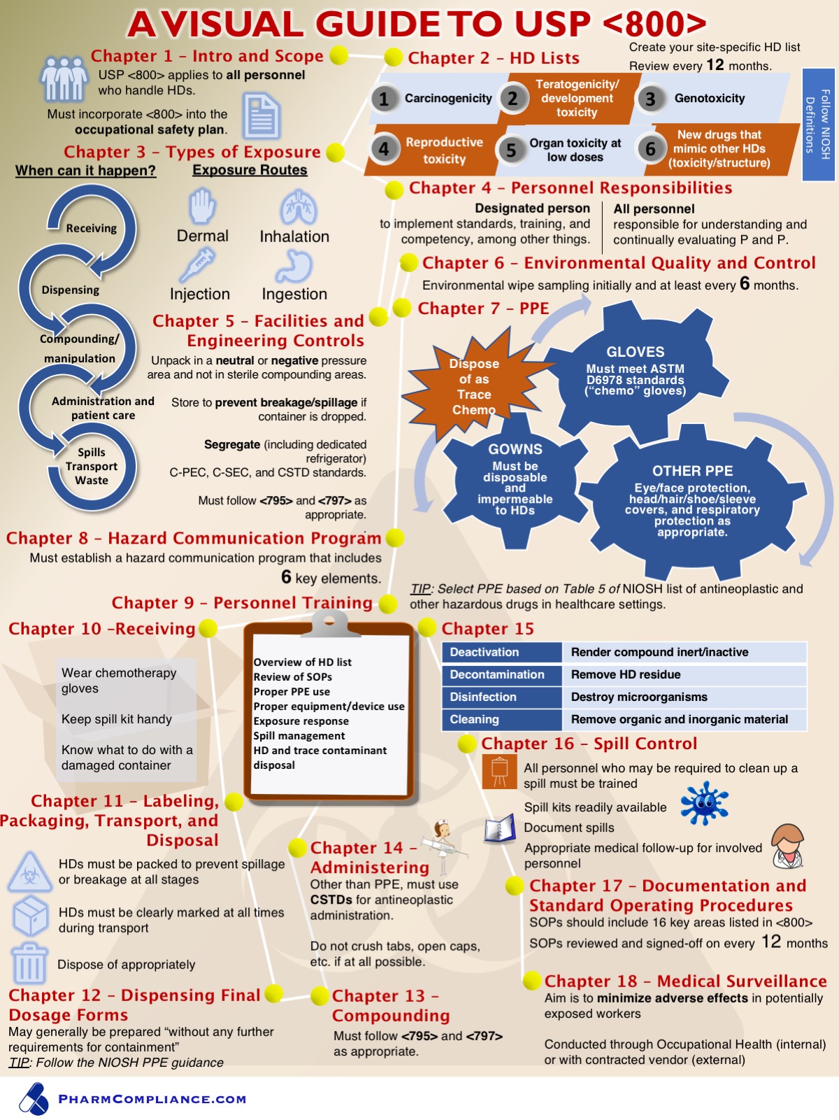
The major criticism of this is: Hierarchy.
Where the heck is my eye supposed to start?
Your numbers are all over the place, 10 ends up coming after 9, 12 and 13 come after 14 – they do not flow left to right as you might think because that circlular chain of arrows is pulling your eye down, then the starburst (yikes) and gears pull down to the right, The clipboard comes next and then it’s off the page to get a welcome respite from the cacaphony.
Sorry. This is really not working at all.
1 Like
I agree with all of this being said. I don’t even know where to start to look, and I’m not even engaged.
Just at a glance io see you put strokes, and affects around your typography and some of the graphics. That is generally frowned upon and really isn’t needed.
Try starting with a grid, or sketching out some layout ideas.
I appreciate the feedback. I read a little about color theory and a little about fonts before getting started but will look up articles on hierarchy/layout too. It’s definitely a lot to learn, but I guess doing it is probably the best way to figure out what to work on lol.
Actually, this is the type of stuff one would learn in a college course in professional graphic design. Then it’s all about practicing and figuring out what works. Yes, there is a lot to learn. Far more than a little color theory and typography. And it doesn’t end with hierarchy.
Not sure why other professionals think the very real profession of graphic design is easy.
3 Likes
Infographic implies communications of information. I think that is a good place to start.
You’re throwing too much info at people, and the result will be that none of it will stick. Too ambitious for a first design project. Start with something much simpler… different topic, less text, and like 6 key points.
There’s just way too much going on. You’re trying to communicate lots of information, which is getting lost in the chaotic layout. As others have said, there’s no intuitive hierarchy. You already know this since you’ve resorted to using white lines and yellow circles to connect everything in the right order, which adds to the visual clutter.
Some things are centered, some things a flush left, other things are flush right — everything is just sort of crammed into whatever space it occupies in a chaotic way similar to a junk drawer of random stuff that’s nearly impossible to sort through.
Like a messy junk drawer, you need to wrestle control of it and establish some order. Simplify. Line things up. Don’t pile everything on top of everything else. Leave some empty space. Don’t cram things right up against the edges. Get rid of those unnecessary background objects (the box and the object that looks like a hazardous waste symbol).
Concentrate on clarity, simplicity, organization, hierarchy and efficiency. The whole purpose of an infographic is to aid in communication — it’s not about decoration.
You’re on the right track with your Chapter 3 graphic. It’s a good example of how an infographic can simplify and clarify what it would have taken many words to explain. Not everything lends itself to an infographic, though. In those instances, just keep the text simple and avoid decoration.
Just to be clear, I wasn’t implying it was ‘easy’ or that it wasn’t a profession in some way; the people that think that probably don’t bother to read anything, much less dig around on a forum for design.
Not entirely related to this, but I do think that horrible looking forms, etc. are everywhere in healthcare (you’ve probably seen them at your MD office) and increase the risk for errors, so there is real value in at least some people who are in healthcare learning a little about the subject. Heck I’m sure there are plenty of people on this forum who could make money on an Udemy course doing a one-hour thing on design to prevent errors.
Out of curiosity, can you explain how the gear wheels work? If they all turn at the same time, it’s going to be a mess before the first turn completes. On top of that, anything less than a perfectly round wheel will jam the bloody hell out of the adjacent wheel(s).
It must have been designed by a lawyer or politician.
1 Like
Funny you should mention the gears that way. When Apple started using gears on their System Preferences icon, they had the gears meshed so they wouldn’t turn. Made me laugh every time I clicked on it.
1 Like