I would never send you a native, app-specific file, be it an .AFDESIGN or an .AI.
My clients don’t receive such files either.
Instead, I supply them with .SVGs, .PDFs, .EPSs and .PNGs, so they don’t need a specific app to edit their logo files.
I would never send you a native, app-specific file, be it an .AFDESIGN or an .AI.
My clients don’t receive such files either.
Instead, I supply them with .SVGs, .PDFs, .EPSs and .PNGs, so they don’t need a specific app to edit their logo files.
But for the logo they would require the actual .ai files.
EPS is a largely defunct file format. Albeit, still widely used, it’s highly recommended to use .ai with pdf compatible.
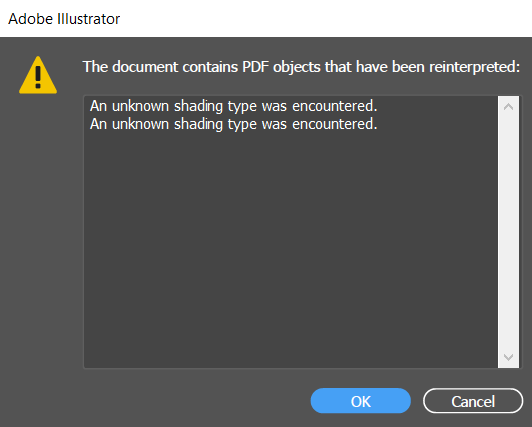
That’s insane. As opening PDFs or EPS or any other file format in anything other than what created the file is going to cause problems.
Illustrator - and other Vector editing programs are NOT PDF editors.
Nobody should be opening any PDF in any program other than what created it.
That is - if you saved a PDF from Illustrator with Illustrator editing capabilities that’s fine. If you’re sending files to your clients PDF format and they’re opening it in anything at all they could cause strange things to happen as not all things might be honoured - like clipping paths, gradients, compound paths.
By not supplying native files to clients you are actually causing more harm than good.
I hope you’re taking this in - we’re trying to help you (or at least I am).
If you have any questions let me know. I see the same trap coming up for a lot of people across various forums. And it’s great when someone takes the advice on board.
Let us know if any of it is not making sense or what questions you might have.
I’ve looked at your logos - and your work - and it’s not bad - but I’m trying to steer you in a direction that is more beneficial for both you and your clients.
I hope it makes sense and that it is helpful.
I wouldn’t say you’ve done a whole lot wrong - but understanding pitfalls and how to avoid them is a huge plus.
What you’ve described is true, but these are problems more typically encountered in more complex files. Logos are simple shapes — basically nothing more than simple filled paths.
I include PDFs because (1) they’re expected, (2) clients can always open them to view the logo, and (3) they can always be used in a pinch by designers when clients can’t find all those more appropriate files that they couldn’t open. It’s hardly ideal, but it happens.
Even though EPS is an outdated format, it still works for logos and is widely used for them because of its cross-application compatibility.
Logos don’t (or shouldn’t) contain clipping paths, gradients, transparencies, etc. Compound paths move seamlessly between various vector editing applications.
SVGs are great for logos, they’re totally generic, and nearly every well-designed logo can be saved to SVG.
Thank you very much. I really appreciate your help.
I would like to clarify that my .PDFs are pure vectors, without any app-specific elements.
Please just have a look at this actual client file:
The PDF is fine - because you save it as an illustrator PDF with editing capabilities.
In fact, the only way you see a preview of the ai file is the PDF compatible file that is saved with it - when that option is saved.
There are rhymes and reasons for doing certain things.
But not supplying the native design files for a logo is something different.
And we all know gradients/transparencies etc shouldn’t be used in logos - but they are.
Yes, I said it about the EPS format.
But clients need the native files, c’mon. It’s a basic for them.
Of course, PDF, PNG, TIff, SVG etc. to accompany it. But the original design files should be with them.
It’s actually something I label the folder with.
Native Design Files
So many things can go wrong - i know that logos shouldn’t have clipping paths and compound paths - but it does, when you outline a font a compound path is formed for the counter of the letters. And now you’re relying on a non-native app to correctly display these paths in the order they are meant to be viewed without anything breaking - only a small example.
And you might notice if you open a logo in a non-native app that there’s a bounding box around it - as it’s applied a clipping path for the media area.
But you wouldn’t see these things within the native app.
Ok - small examples - but just quick scenarios.
I do it all the time when clients can’t find their own logo - find a publication of a PDF online, extract the logo. Or find an SVG on their website, extract it etc.
But I have a few fixups to these, like applying branding colours - or erradicating bad paths.
C’mon.
So this is what I was explaining to you before.
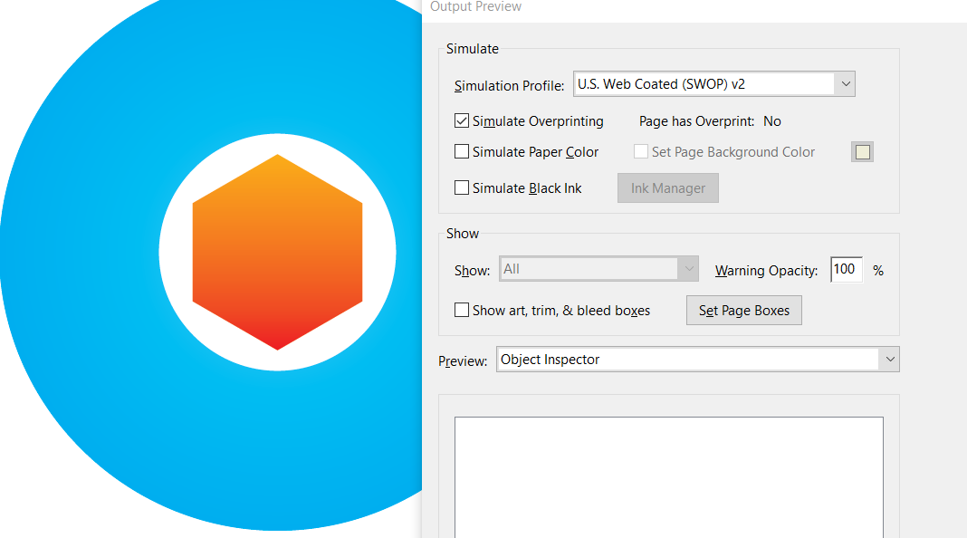
You have included a colour profile for US Web Coated SWOP.
Web presses are the big newspaper type presses. and SWOP which just means ’ Specifications for Web Offset Publications’
But this would be a colour profile based on it being printed on a web printer in the US using that type of printing.
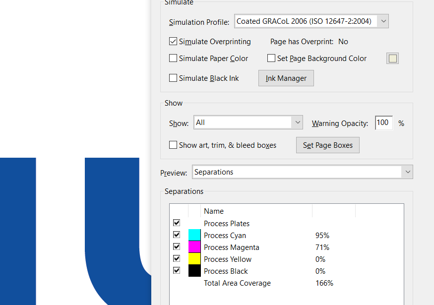
Here it is side by side using a different colour profile.
So your one is on top - what happens when it goes to printers is that your colour profile is ignored - and they use their own colour profiles.


You might think it’s a great idea to these colour profiles in place and hope they are honoured, but largely they won’t.
Which is why we specify colours with Pantone - as it gives a level playing field and no excuses (really) for colour mismatching.
And it’s not just the printers ignoring your colour profiles.
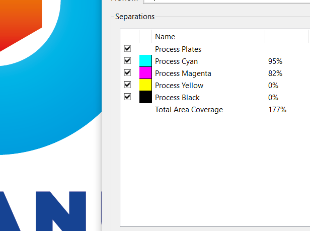
The blue for your Ocean gives me a reading of this
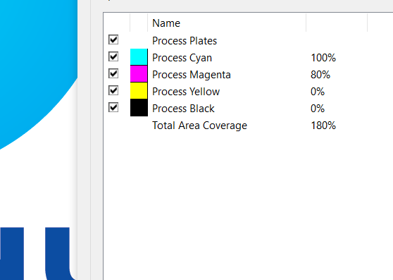
100 Cyan and 80 Magenta
So as we alluded to - people have a tendecy to think that Illustator or any vector editing progam is a PDF editor. And it’s not
And what I see in Illustrator is strange compound paths

And this is what can fail in a RIP - as someone needed to alter the file - opened it up in Illustator - made the edit - resaved it.
And it goes to print - and the compound path fails - as it can - and the logo is ruined.
I’d need to rebuild that logo in Illustator - which is an added cost to the client - a client to which you charged and supplied a PDF too - and do you think the client is pleased with you over this?
Just a scenario - you don’t have to answer.
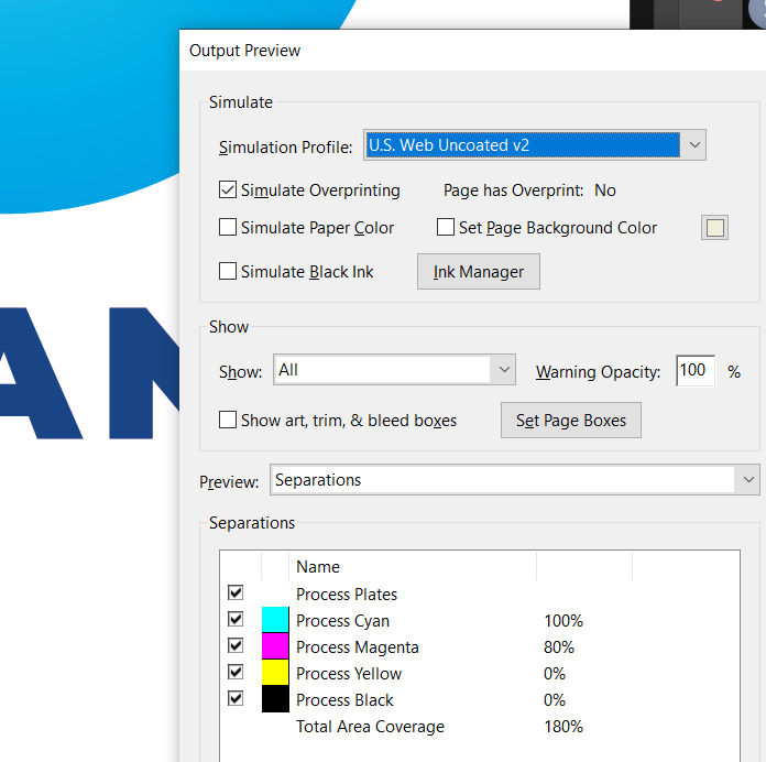
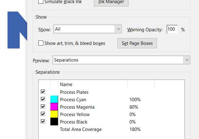
Now I resave the PDF to my settings (cos I’m just doing this for visual)
You see the colour has shifted.
The major problem with your file is - that if you change the simulation profile in Acrobat - the numbers of the CMYK changes. And it shouldn’t.
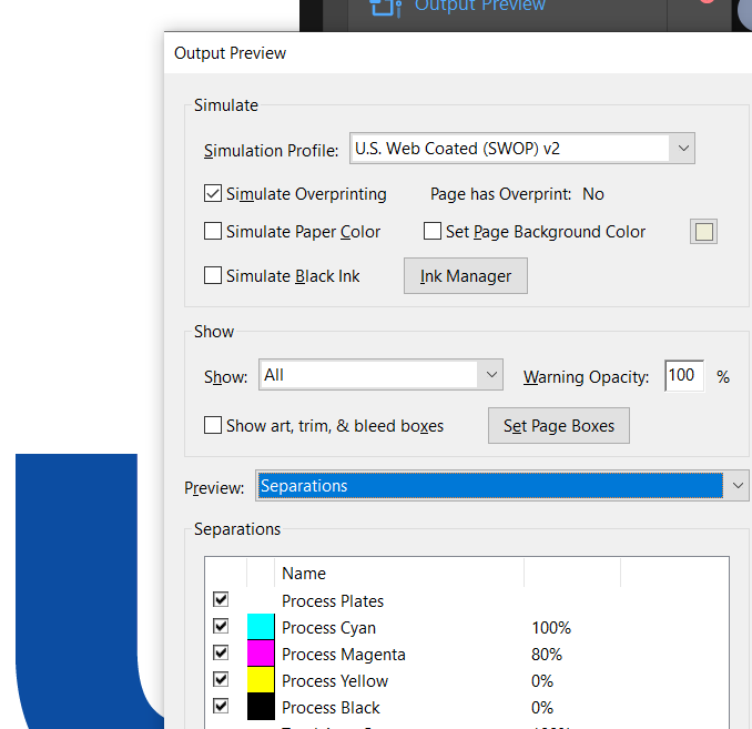
Changing your colour profile
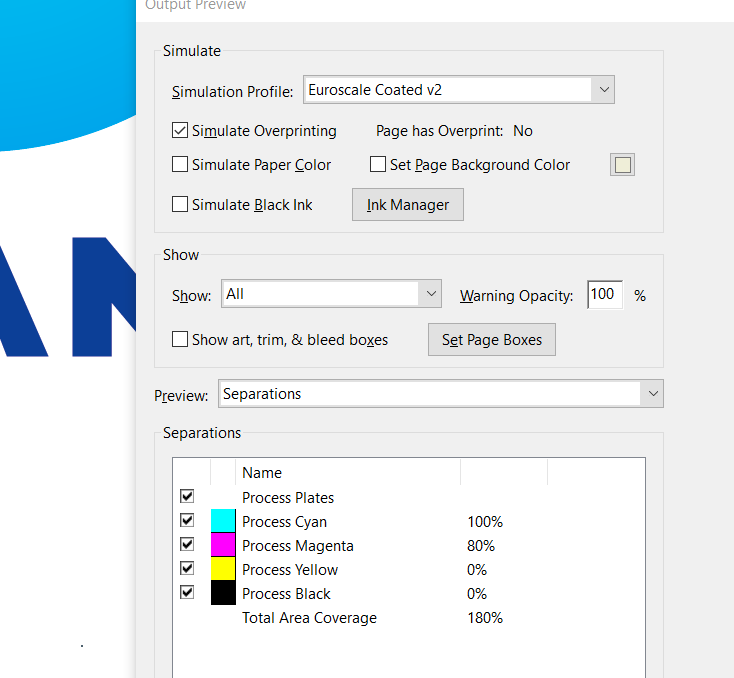
And here’s the logo fixed up so no colour changes no matter what
Hope this helps highlight all the concerns I’ve raised.
Yes, I always save logo files with the Illustrator editing box checked, but that’s a just-in-case fallback measure for designers who, as I said, get the PDF from their clients who don’t know enough to send them the SVG or .ai or EPS. The main reason for sending a PDF is, as I mentioned, so clients can open it when, as often than not, they don’t have a clue what the other files are for.
Yes, I did that just two days ago, when a client sent me a logo from a sponsor he pulled off his sponsor’s website. I located an online brochure from the company and extracted a vector logo from the PDF. Yeah, we’ve both done that dozens of times.
Not for logos. Even so, I always send .ai files because that’s typically the preferred format designers want. But for logos, SVG or EPS work just fine for almost all well-designed basic logos. The absence of a native file in a logo package shouldn’t be a big deal. When it is a big deal (for the basic logo), the logo was built with application-specific data that shouldn’t be there in a logo design.
I’m not making an argument for what should be done to maximize compatibility for badly built logos. I’m making arguments for how they should be built to begin with. The blinged-out versions that are sometimes included as part of well-designed logo packages, however, can contain these kinds of application-specific features, so there, yeah, I agree with you. However, anything short of that, as far as a logo is concerned, should be as generic and non-application-specific as possible.
Open PDFs that weren’t saved for Illustrator and the normally hidden bounding boxes will, of course, show up as visible paths that need to be deleted in Illustrator and other vector apps. Software applications, like Affinity Designer, can open native Illustrator files just fine. This is sort of a side issue, though.
In general, as usual, I agree with you on most everything. However, most of your concerns expressed here are more applicable to files more complex than logos, which should be simple and generically built for maximum compatibility between applications and over time.
Any logo (other than the fancy, blinged-out versions) should be designed to be simple and generic. Yes, plenty of badly designed logos don’t follow these rules, but I’m not talking about badly designed and constructed logos — I’m saying how they should typically be done. Any basic vector logo that contains data that can only be properly opened and used by the software application in which it was built was, in my opinion, designed the wrong way. Compatibility with generic PostScript (which from the beginning included support for compound paths as part of the original specs) should be a goal in logo design. If there’s anything in the logo vector file that’s specific to Illustrator (Designer, Inkscape or whatever), the logo was (with situation-specific exceptions) built the wrong way.
Thank you very much.
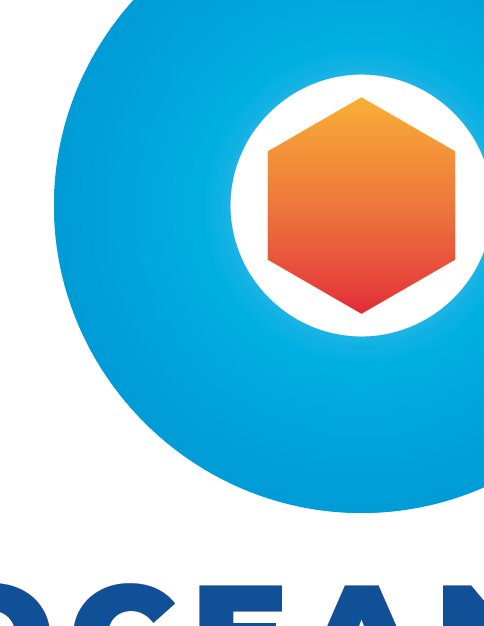
The file was created with Affinity Designer, not Illustrator.
That “compound path” is just a simple, basic hexagon with a two-color gradient. It shouldn’t cause any issues.
Each client receives a palette with all the color codes (CMYK, RGB and HEX):
All in all - the same rule doesn’t apply to all.
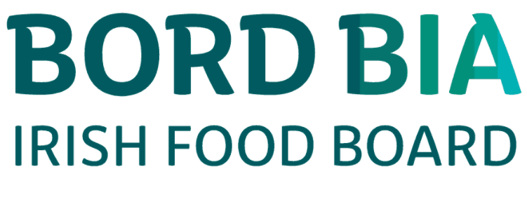
This is the logo for the national board of food in Ireland -
And those guidelines have specifics how to build the gradient for different situations - it’s very strict.
But all logos shouldn’t have gradients, these things don’t happen all the time.
The actual brand guidelines and how to use the gradient are very strict.
Is that it?
Yes, that’s it.
Fair enough - if you’re happy with your workflow then go for it.
Best of luck with it.
In my post, I mentioned several times that I wasn’t addressing how to make badly constructed logos more usable. I was addressing how they should be built in the first place to avoid these kinds of compatibility issues.
The Irish Food Board’s decision to build their logo with possible and unnecessary compatibility issues is precisely what I’m saying shouldn’t be done. Them placing data into their files that may or may not require a specific software application to use is a mistake. This is common but is exactly the kind of thing that I’m arguing against.
The subject here isn’t how to work around other people’s bad decisions — it’s about how designers can minimize these kinds of problems by doing it right to begin with.
Thanks to your advice now I certainly want to improve my color workflow and finally probably make it Pantone-based. 
One thing is that I have no control over the printing process of my designs, which are designed for clients from all over the world.
That’s the problem here though. And I’m trying to help.
I demonstrated already how your logo behaves in different colour workflows.
For example, you’ve handed your logo to your client with brand guidelines.
The client uses the logo in an online printing scenario - and just uploads the logo to the website.
They never see the brand guidelines.
What you’re getting is that the item could be printed in Japan - you don’t know. And using that specific profile you’re getting colour shifts.
The way I fixed it - it doesn’t shift in colour when changed to different colour profiles - you retain the colour breakdown.
It’s something to be wary of.
This is a very good reason for building logos, as I’ve mentioned, in ways that minimize the chances of them being incompatible with various end uses and software. For a basic business logo, I wouldn’t include features that depend on them being opened only in one specific software application — they should be equally compatible with Illustrator, Designer, Inkscape, and other commonly used vector software. If it can be successfully saved to SVG, it’s almost certainly going to work with other vector apps.
As for Pantone, it’s turned into a universal standard for color consistency. I wouldn’t even consider handing off a logo to a client without a Pantone version. There are other standardized color systems (Toyo, for example), but Pantone is the big one for printing in most countries.
You should see their last logo…
Instagram, Tinder, Firefox, BT (telecom) are all examples of logos that have gradients.
So it’s not really something I can say is a definite no-no in logo design.
It’s different when you know what you’re doing.
Anyway - I think we’ve gone in a different direction and split the conversation into a more esoterical discussion. Which is fine.
I enjoy our exchanges, and it makes me think long and hard - and even to rethink my position from time to time.
It’s great to be able to talk about these things.
Thanks for thinking about this - I’m glad you’ve taken it on board.
I really hope it helps you.
Yeah, that’s why I mentioned the blinged-out versions (for lack of a better term) and the exceptions.
All those logos also come in more basic and universally compatible versions. There’s this old rule of thumb in logo design saying to begin with the B&W version, but I think that’s largely outdated. Today we live in a color world and B&W is the exception, but there still needs to be those basic one- and two-color versions.
If I’m designing a logo for a Podcast, for example, 99-plus percent of the time, it’ll be used small in full color on a digital display, so that’s where I’d concentrate my efforts.
Even as the conversation has veered off in other directions, I’ve been mostly referring to the kinds of logos for miscellaneous clients that @Jakub_Trybowski seems to deal with — basic small business logos. There might be those blinged-out versions that require specific software, such as After Effects, but usually, it’s the standard stuff — basic, simple and compatible for every use imaginable.
What’s important, I guess, is knowing what you’re doing and understanding what the client needs (whether or not they know themselves), then designing something that’s right for them and in a way that minimizes any down-the-road problems they might have with them. As usual, simple and broadly compatible are usually (but not always) better.
Yup. I couldn’t agree more.