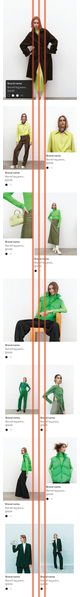
I am testing some ideas to make the grid system in mobile be more dynamic and interesting, and my idea is mixing within-grid and off-grid compositions like this sketch.
The purpose of the grid is to provide visual order and continuity to the layout.
Off the top of my head, I can think of a couple of instances where breaking out of the grid makes the layout better.
When layouts become too orderly and rigid, sometimes they also become boring. Developing a good gut instinct for where and when to break the grid to provide this variety involves some sensitivity and experience.
When forcing the elements in the layout to conform to a grid would be detrimental to the looks and functionality of the layout. This is also an instance when the grid itself might need to be re-evaluated since it’s not working. However, sometimes, for various reasons, it can’t be helped.
Regarding the example provided, without putting it under the microscope, from afar it actually does look like it adheres to some form for grid structure/pattern:
Utilizing a grid doesn’t necessarily mean that everything is perfectly aligned and symmetrical, but that the grid provides some underlying order and structure to the elements being displayed.
To answer your question, I think what you’ve done works fine from an aesthetic and functionality point of view.