Below are some of my works.
Please Criticize me
Are you a student?
what do you mean by student?
Are you in school learning how to do this type of work? It will depend on why type of critiques you are given. If you have already hung your shingle and taking on clients this will be moved to the Crit Pit. If you are a student and still learning, this will be moved to that forum. Right now it’s just hanging out in the General forum and it’s tons of examples. I’m trying to narrow things down a bit ![]()
lol yeah, well i have a couple years experience. should i say 2 Approximately.
Ok .. thanks ![]() I’ll move this to the Crit Pit
I’ll move this to the Crit Pit ![]()
You haven’t given us much to go off of, and you’ve given us a lot to look at. So I’m going to make some general comments.
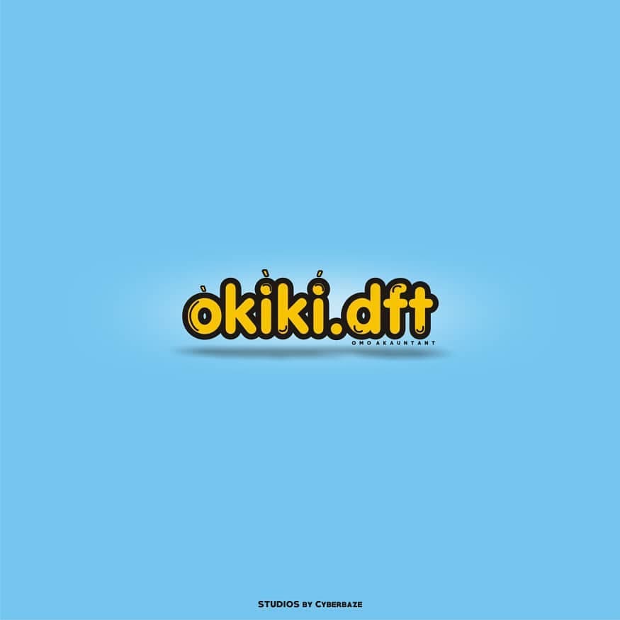
okiki.dft – Looks like playful, youthful word mark for a website. I’d guess this was aimed at something related to kids. I don’t find this objectionable. The small line of type under dft is illegible and will only get worse as the design is reduced. The highlights should parallel the letter shape. The highlight in the d does not, and it looks more like a bulge than a highlight.
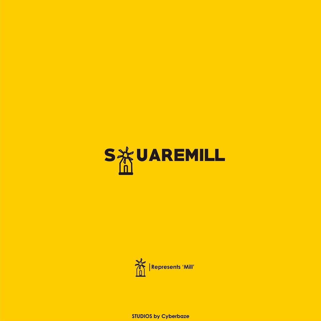
Squaremill – I’m guessing it’s supposed to say Squaremill. Substituting icons for letters like this is tricky to pull off. It’s not working here. The icon has some merit, but this needs work to come up with a better type solution and a better way to marry the icon and the type.
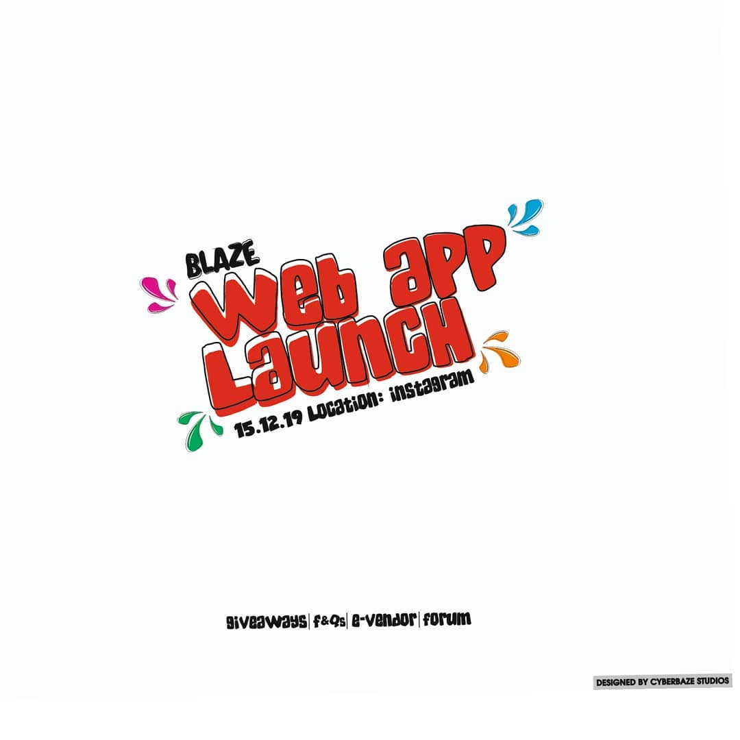
Web App Launch – I’d consider this more of a type treatment than a logo. It’s okay. Not super strong, but I’ve seen a lot worse.
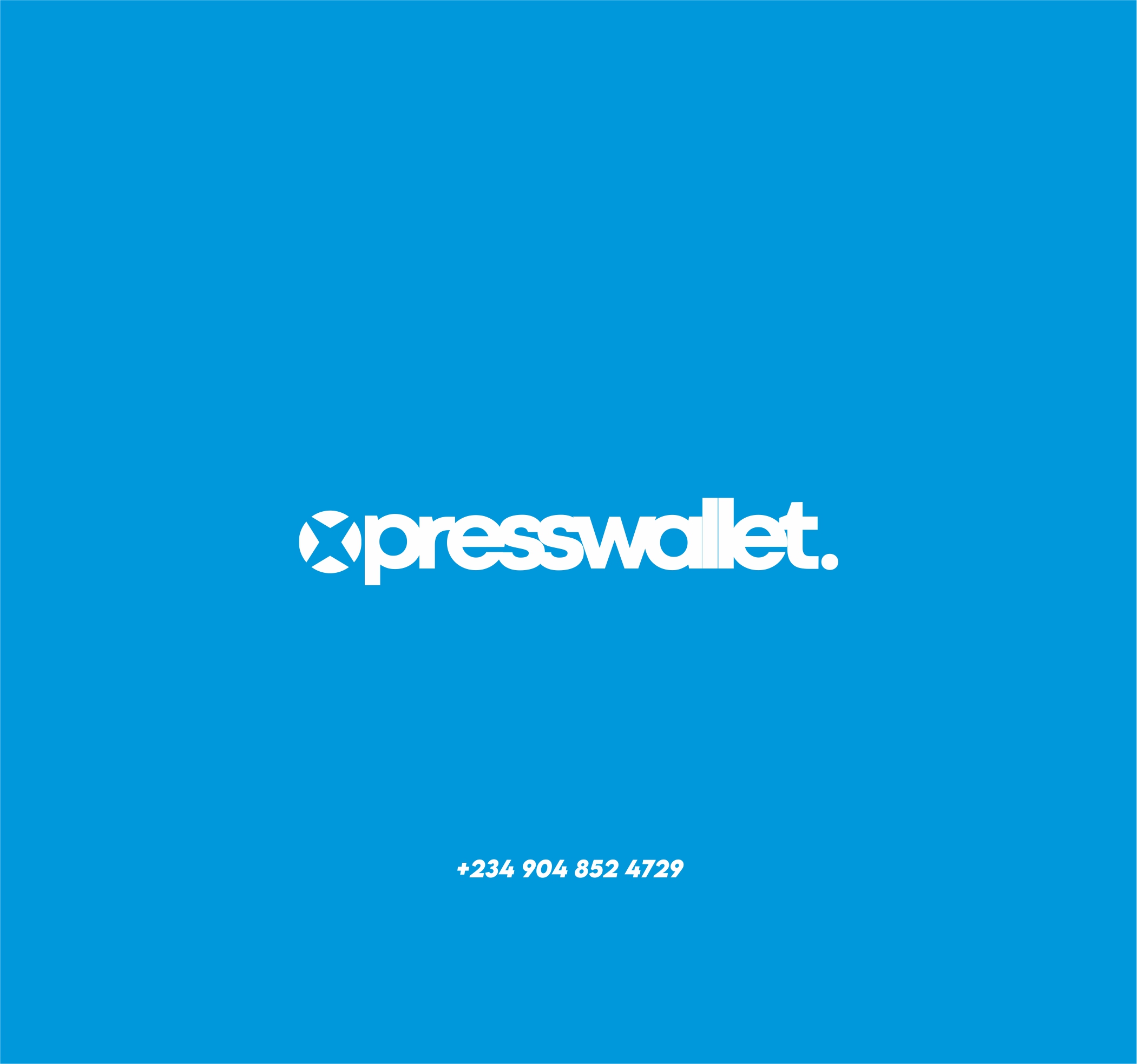
xpresswallet or presswallet – The mark is way too close to the xbox logo. And I’m guessing it’s supposed to read xpresswallet not presswallet, but you shouldn’t leave the reader guessing what the name of your company is. Same comment about Squaremill and replacing letters with icons applies here. Also, I know you’re wanting the kerning super tight, but the “alle” isn’t working that great.
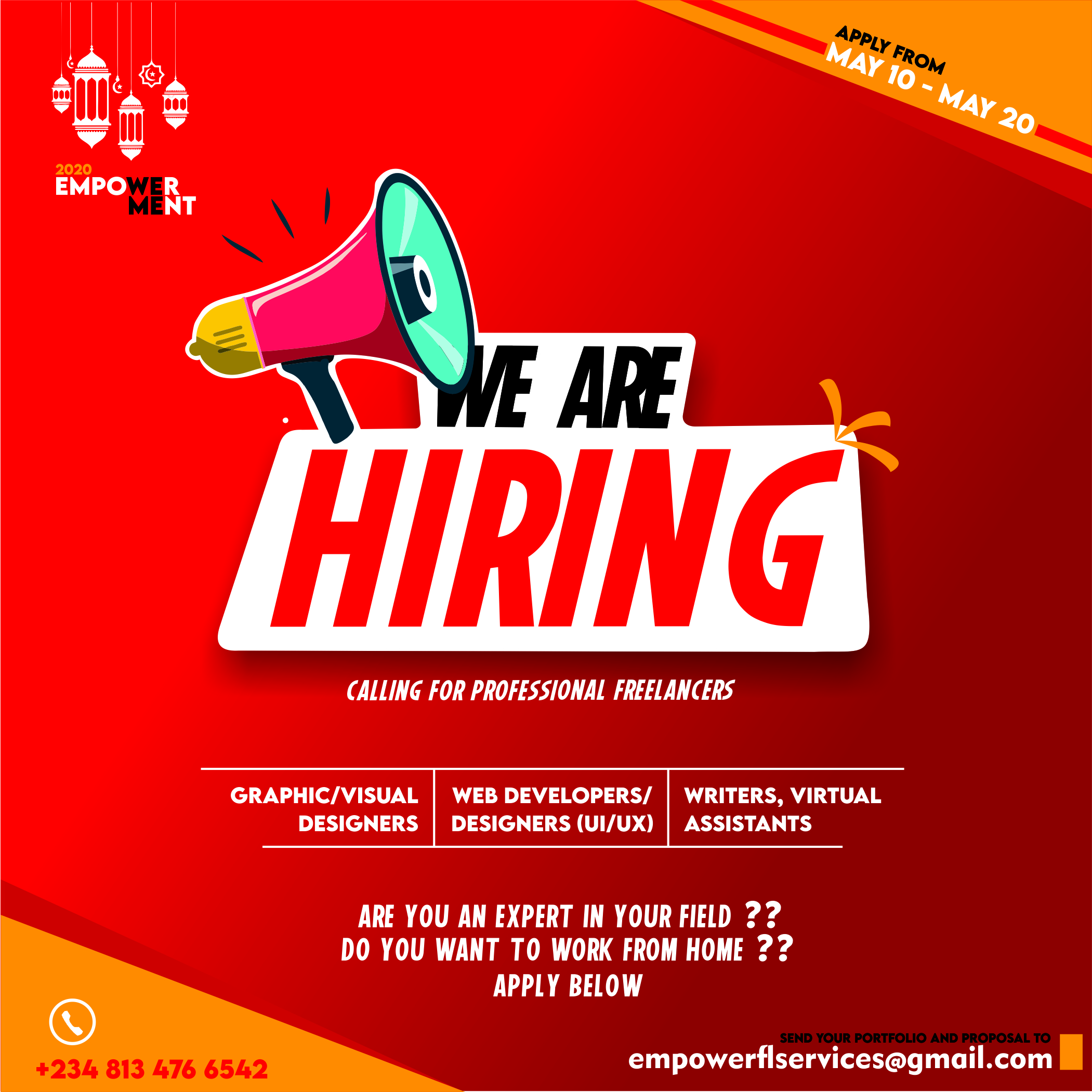
We Are Hiring – Looks like an ad not a logo. Overall it’s nice looking. I’m not sure what’s up with the ornaments in the upper left corner. Also, I’d be tempted to bump up the size of the block of type starting with “graphic/visual designers.” I hate saying something needs to be bigger, but i think this ad would communicate better if it was a little more apparent who you were hiring. This may be a moot point if the ad is highly targeted, but if it’s in, for example, a booklet for a job fare, saying “we are hiring” doesn’t say as much as the type of people they’re hiring.
Hi,
here is my opinions:
OKIKI.DFT : i like the design and contrast between the blue and yellow. Do you need the glow behind though? try without it. Also the ‘d’ and ‘f’ in ‘dft’ the highlight lines are too bend which doesn’t look good. make them follow the roundness and shape of the letter more. i’m also not sure about the small line like under the ‘dft’.
S_uaremill : simple yet enjoyable to look at, but the name is very difficult to read. it took me some time for me to realise the windmill is a ‘Q’.it is a ‘Q’ right? if you want to implant the windmill to replace any letters, you have to make it look like the letter.
blaze web app launch : more like a title and a logo i think, but it does show some festive mood to it. i don’t have much to say for this one except maybe the 2 ‘P’ doesn’t have the white overlay compared to the others letters.
xpresswallet : again simple but nice to look at. the 2 ‘L’ are way too close, in different backgrounds you wouldn’t see the space.
we are hiring : i love the ‘we are hiring’ in bug in the middle to make people read it that first as a way to attract them but this is more like a poster than a logo for sure. the basic infos are displayed simple and easy ti read too so thats good. the designs you put on the top left, do you need them? it is not related to anything here. i also thing the deadline should be with the infos i guess.