Hello!
I am designing label for jars with hazelnut butter / peanut butter and almond butter.
I want your opinion about some things:
1.Do you think the additional white outline on the title is unnecessary?
2. The colored line above the “Activeat …in a nutshell” is unnecessary?
3. The text “100% καρπος” (which mean 100% pure nut) should be like the text “Almond Butter” or better as the main text?
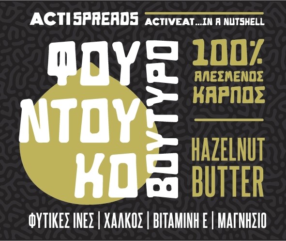
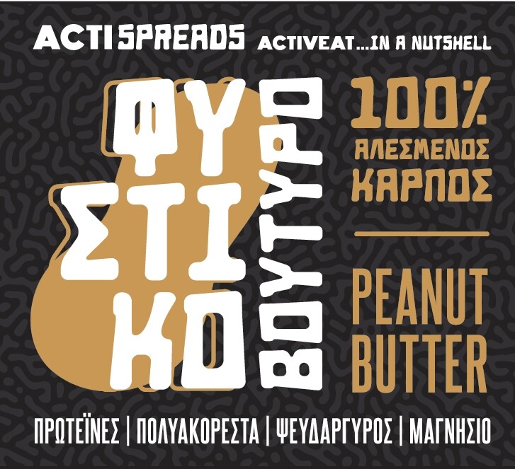
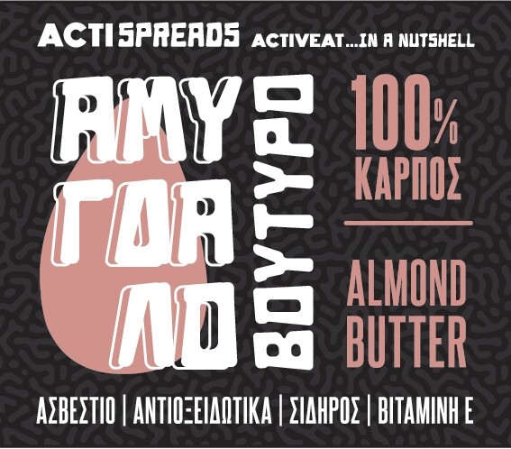
Personally I like the middle one.
Fantastic work.
Well done
1 Like
But I also like the line in the first one
I would remove it. The little shadow lines come across to me as unnecessary clutter that makes the unusual typeface a bit less legible.
I would remove it — again, it’s mostly clutter.
I would make both the same typeface and reserve the unusual typeface for the large type in the middle where you’ve spelled out Hazelnut Butter, etc., in Greek.
Why are the letters ACTI and ACTIVEAT in a different typeface?
I like the looks of these. They’re fun and look nutty. If I were in a store looking for nut spreads, I’d most definitely consider these based on the labels alone. Good job.
Thank you so much!
-As for the main text I am more opt to the second style (peanut butter). It doesn’t affect legibility and it’s not that flat/plain as the first one (hazenut butter).
-Don’t you think that removing the line above “Activeat in a nutshell” will create and awkward empty space (like almond butter label)?
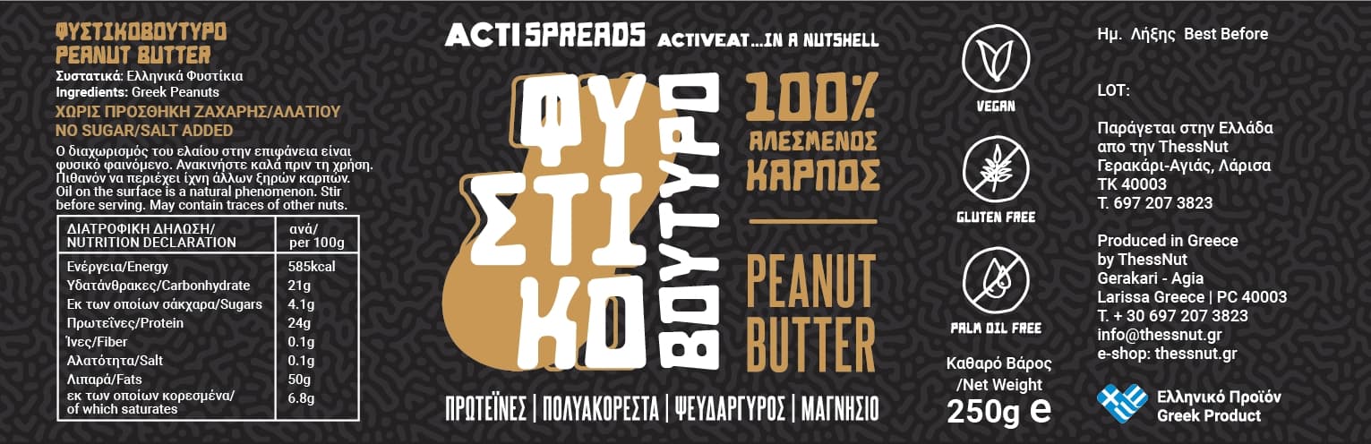
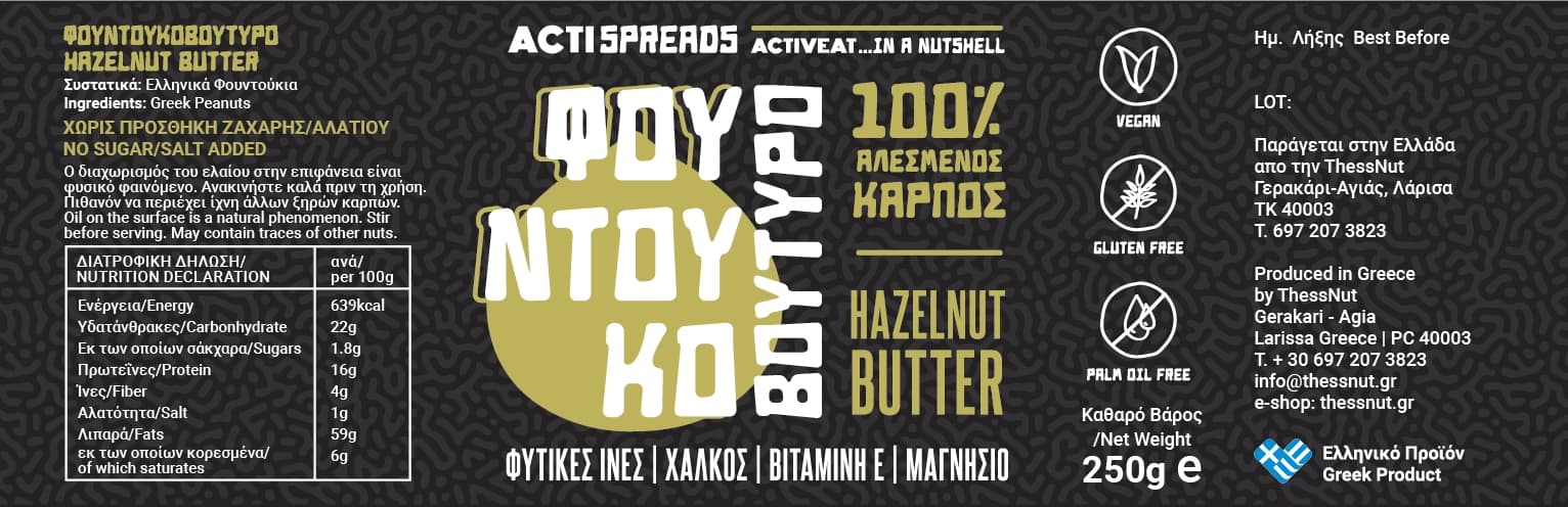
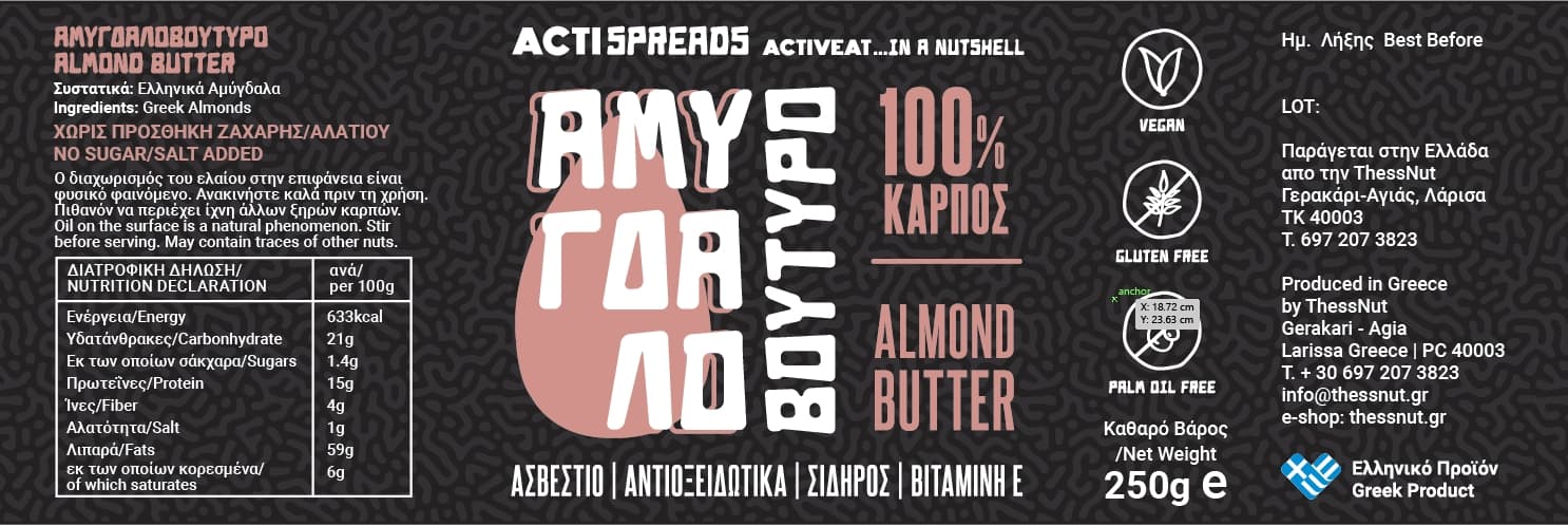
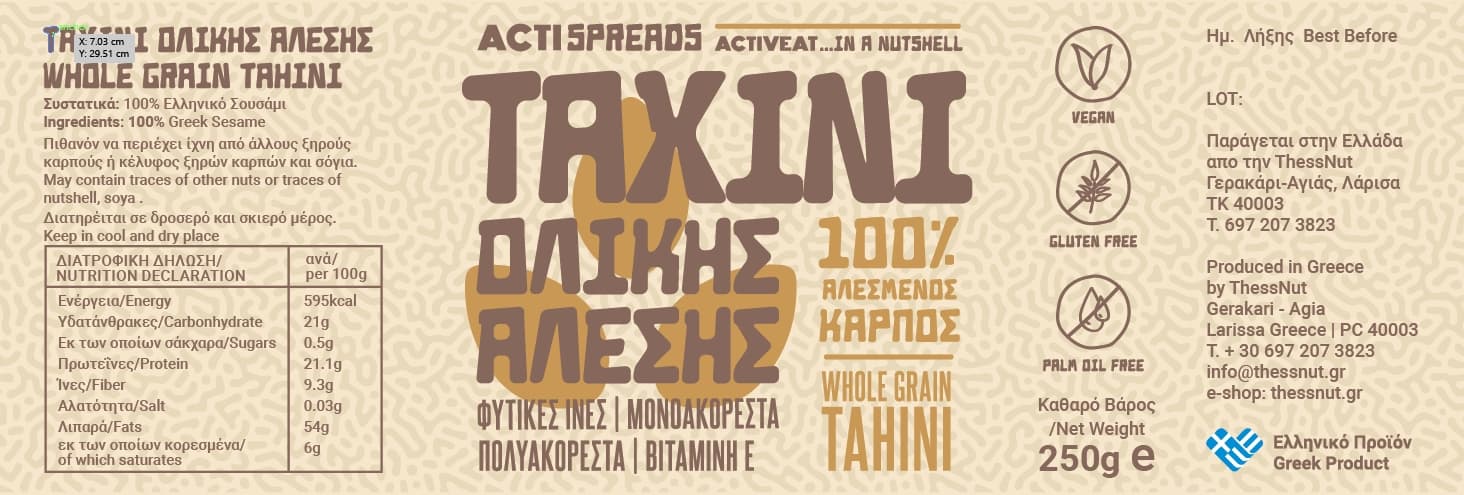
Finally, ACTISPREADS are 4 products (almond, peanut, hazelnut and tahini). My client is a nutritionist who has her business named “ACTIVEAT”. So, on the label, the font used for “ACTI” is from her logo, and SPREADS are the font of the main text of the label.
These are the complete labels ( some adjustments might be needed, though)
Any recommendation are very welcome!
1 Like
My challenge is that the client asked me to add the word “Crunchy” somewhere in the peanut butter label
And I really struggle!
PS (it was really fun creating this turing pattern in photoshop)
I think the line above frames it nicely
I have nothing against it. It adds to the design by framing it and drawing the eye.
It’s only a line, but I prefer it.
2 Likes
I think it’s missing a main component of packaging - flavor appeal. The main product benefit is the health claims from the nutritionist. The “no palm oil” one is a big deal for the spreads I worked on. Across your line you’ve focused on consistent treatment which on shelf will create a brand block. That’s all great stuff, Maybe it wasn’t a requirement in the brief but, it just struck me that it’s missing.That’s why our labels have food photography on them. I like the designs and you’ve gotten great feedback here already. Just thinking strategically, your label is helping consumers navigate between flavors, it isn’t working hard at convincing them to eat it. If they are new products, I would argue for switching priorities.
To be honest, I sort of skimmed the thread, but I did see that you asked for specific feedback. Sorry if this is unwelcome.
1 Like
Every feedback is welcome! Thank you
That’s why I am posting here!
I understand what you say.
I was targeting to design something that it will attract the consumer’s eye.
The biggest trait of these products are that they are 100% pure milled nuts, with nothing more added.
So my (not very experienced) thought was to stand out from the competition, attract consumer’s eye, make him pick it up and read the 100% natural product, so he will be convinced.
I visit large market stores and most of these products have plain (browin-ish) labels with photographs and usually a calligraphic font. 90% of them are the same.
PS:
These products though will not be on large market shelves (for the time being).
They will be available only on the nutritionist e-shop and at her office/studio.
2 Likes
I also think the line above the lettering at the top frames the content nicely, especially the 100%.
Once I zoom out to a size more-less printed label, the third version with the lettering emphasised makes sense to me.
To me the colours of yellow and green don’t seem to be different enough.
Actispreads reads a bit difficult, could you slim down the font of ACTI? it introduces third font and it seems to be a bit too much.
Great work!