What could I have done better
-
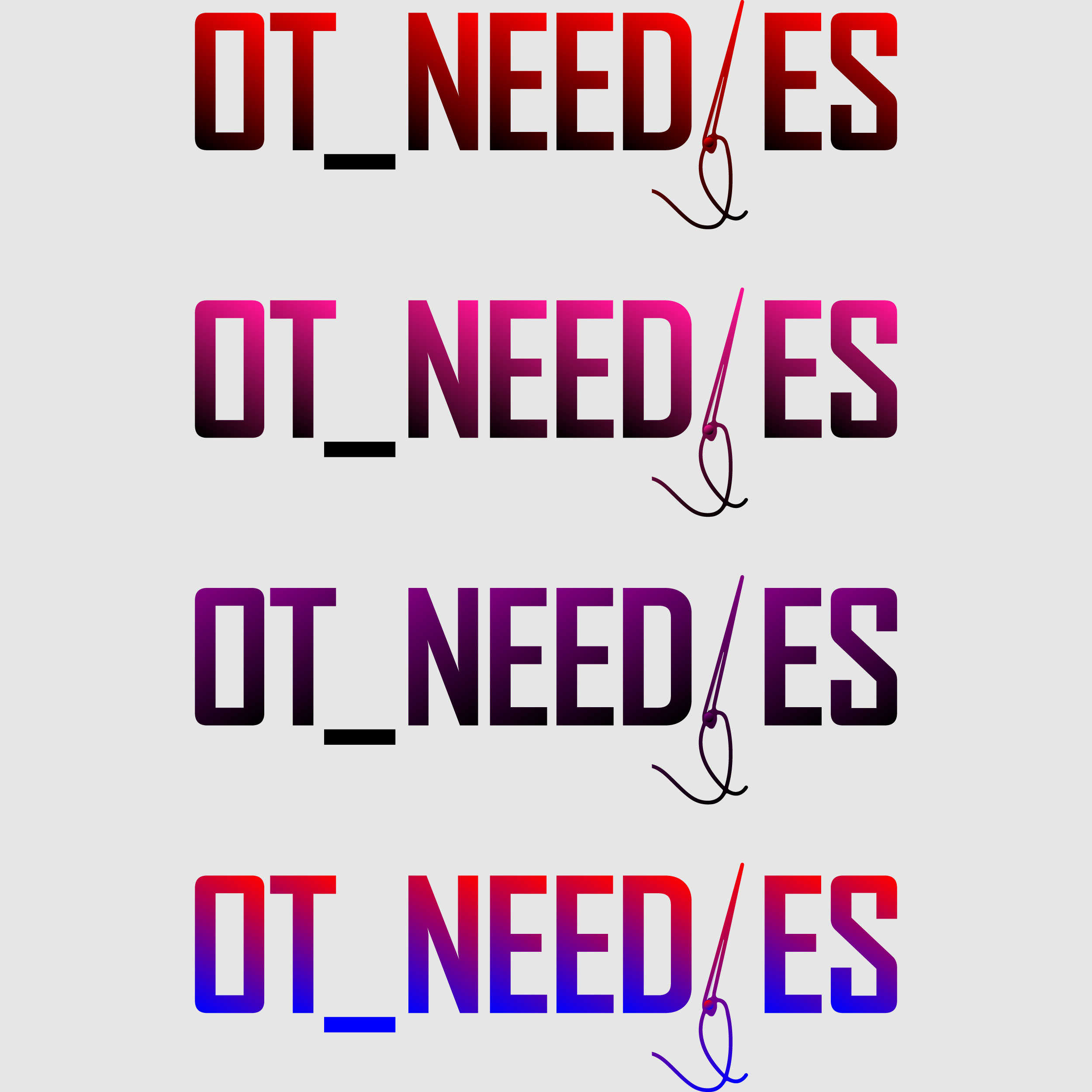
The drawing is too weak. That, or the type too strong, or both.
-
Gradients are uncalled for.
-
It reads like OT NEED ES, or OT NEEDLESS with the L and S fall off.
1 Like
OK, what about the underscore?
That’s a question I had too. Why is there an underscore?
On a larger note, I don’t know what this is for. Logos aren’t just art objects to be judged on aesthetics alone. A logo needs to be appropriate for the organization it’s meant to represent. You haven’t told us anything about that organization or why you feel that what you’ve shown us is an appropriate solution. This limits any possible critique to a subjective opinion on how nice or not nice it looks.
1 Like
The logo is for a fashion company. OT is a name initial then I decided to add NEEDLES by removing L and changing it to a needle icon. To separate the initial from needles I decided to put an underscore
Sit at arm’s length and look at this with squinted eyes. It reads “OT_NEED ES.”
Lol… What do you suggest I do?
- Define a persona or avatar for the client’s customer.
- Create a mood board to reflect the persona’s taste.
- Market research into competitor’s branding.
- Spend a week sketching concepts.
- Narrow the concepts down to the best 15 to 20.
- Post those sketches here for feedback.
- Based on feedback, select the 10 strongest options to build in AI.
- Post those logos here for feedback.
- Narrow it down to 3 to 4 solid concepts to show the client.
- Create a presentation that shows each logo in color and black and white as well as showing the logo applied to a variety of marketing materials such as a business card, a brochure, an avatar or a trade display.
- Pitch the concepts to the client with the confidence that you’ve done your homework and are presenting rock solid options, that will compete favorably in the marketplace, that will accurately represent your client, and that will server your client well for years to come.
4 Likes
Ok, thank you
You’re welcome. I’m looking forward to seeing what you come up with.
Do you have pencil sketches to share instead. Do not just jump to the computer.
Sketch First yes, Sketch … step away from the computer.
Those are what’s sketched in my book
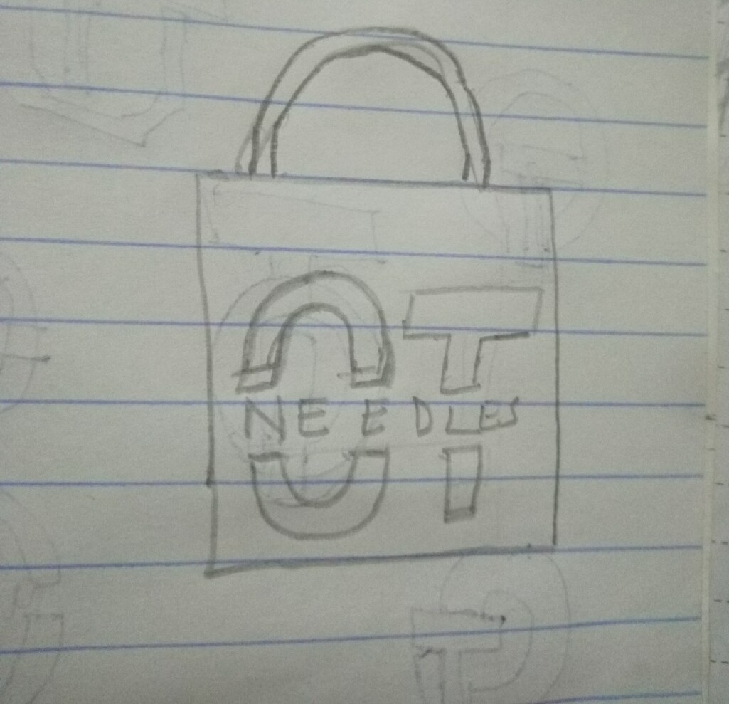
That’s what @Steve_O was talking about.
I’m unsure of whether the underscore is relevant/significant? It makes me think of digital file naming, If that’s not the intention then drop it. Apart from colour variations they’re all the same, if I was your client I’d want to see a few more concepts. I prefer strong flat colour for a brand, blends/gradations tend to look wishy-washy and unstable. I’m guessing OT NEEDLES is some sort of creative/crafty business? You have an opportunity here and indeed an obligation as a designer to show some real creativity, I get the feeling you’ve hit on a single idea and just gone with it. Brand design takes a huge effort, pushing your creative imagination until your head hurts and then managing to refine your ideas in spite of the pain. I’d keep going on this one if I were you. Good luck.
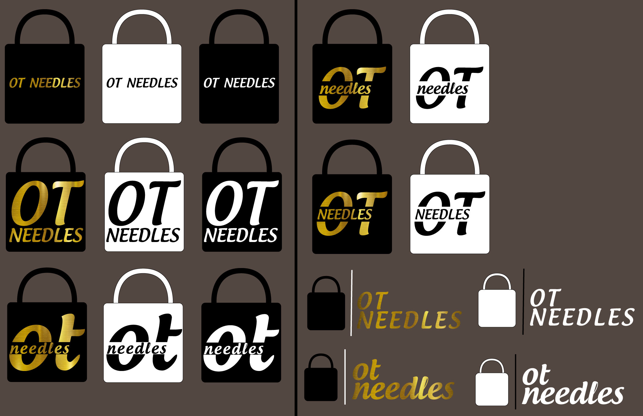
When considering typographic elements of a brand you need to explore a great many alternatives. Here you essentially have 1 concept and 1 font applied in a variety of ways. As Steve_O says, you need to smash out dozens of concepts, sit on them for a while, come back, ditch the one’s you know will never work and produce some more. Keep pushing and refining those concepts while comparing them to similar business brands. Keep one thing in mind, “Less Is More” the most successful brands are the most simple. I hate to seem harsh but what I’ve seen on this development so far would not get a pass in 1st year design school.
1 Like
I’m confused. Are you selling padlocks or bags? ![]()
3 Likes
lol… Nah, bags
I am also confused. You say the logo is for a fashion company, then you say the name is OT and that YOU decided to add “needles”, now you are saying it is to sell bags???
So, if I got this right, you are designing a logo for OT fashion that apparently only sells bags and you really thought that you needed to add the word “needles” to the logo?
I guess my biggest question to all of this is why?