I’m a new on making logos.

1 Like
so nice dear
1 Like
How are those colors going to work in CMYK?
2 Likes
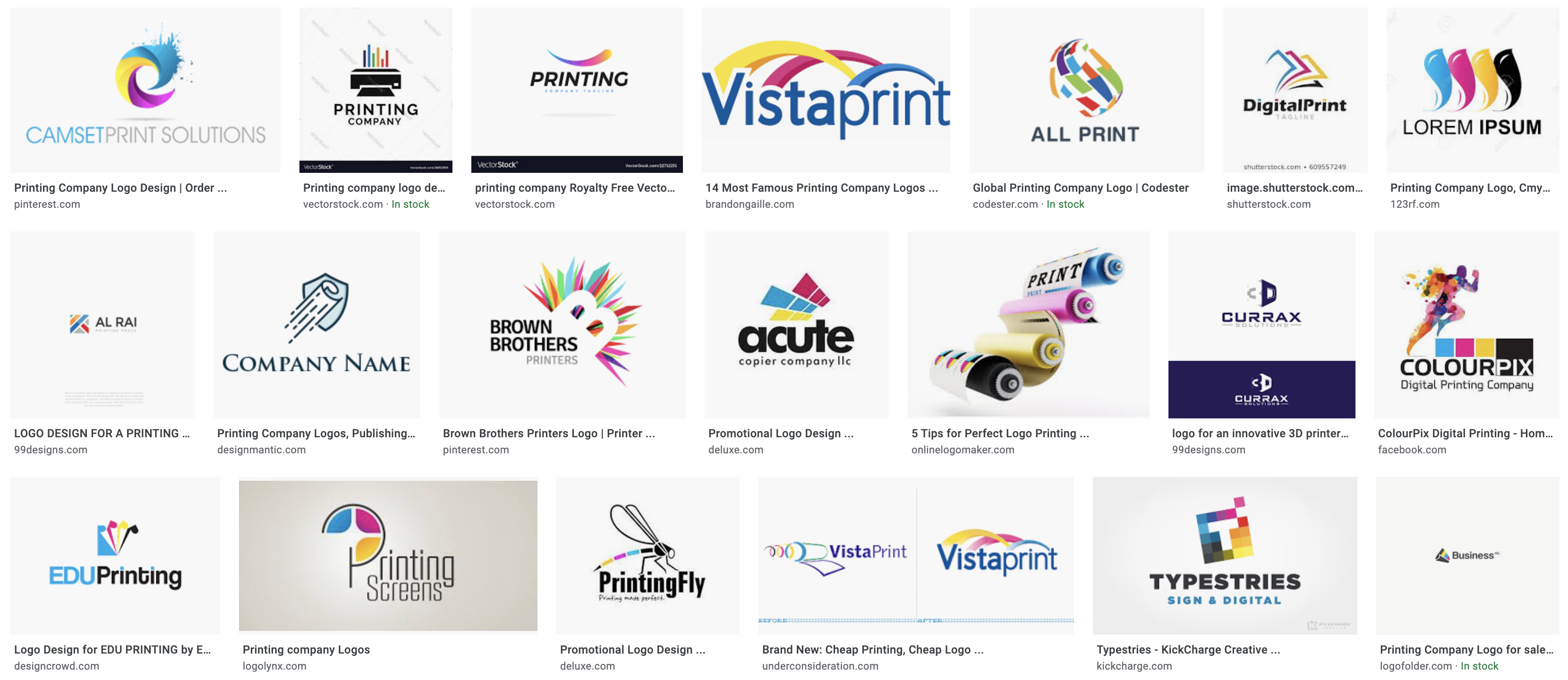
I agree with @Steve_O, that’s definitely not going to print like that unless you’re using PMS maybe… That vibrancy is going to be difficult to capture. Most printing companies utilize a combination of actual Cyan, Magenta, Yellow, and Black. That’s not to say you couldn’t do something different, however it needs to make sense why you’re using those colors. Here’s a screenshot of some printing company logos:
1 Like
aside from what is already mentioned, the super tight negative spacing in the middle of those 3 colors is a death sentence for logos in print as well.
Also, what happens when this logo needs to print in one color. Those 3 brush strokes will become one weird blob… try to avoid having colors intersect each other in logos, and if they must, use a “stay-away” with enough room for print misregistration on each color.
1 Like
Also, the size contrast of your mark and the text will probably reduce “Printing Solutions” too much. It may not be legible when small. Think about the extremes when designing logos.

Here is an example from the logos above. You can’t read what is below Digital Print
1 Like
thank you! that helps actually
noted. will do ![]()
I gotta say, that is one screenshot full of really bad print company logos.
2 Likes
why is that?
I’d say because they print. I think that’s what printer is supposed to mean.
Why are the logos in that screenshot bad?
to start with, 70% of them aren’t logos, they are stock art. You can’t use stock art for a logo. Can’t trademark it. In fact, most of the EULA’s on stock sites with logos say right in the body copy that you can’t use them for logos. “What are they for?” you ask. Good question.
They are also what a generic newb designer would think a printing company might want for a logo - a logo using primary CMYK and a printer mechanism - when that couldn’t be farther from the truth. Seriously, do designers think printers use desktop inkjets???
Many of them can’t be created in black and white. Gradients, transparency overlaps and raster effects should not be used in any initial logo lockup. If a logo has more than 3 colors, or unidentifiable colors due to a transparency overlap, you run the risk of not matching color across any number of print devices.
Ink spatters and general messiness would be off-putting. That top left one, yeah, if I see that on a print, that is a bad day for someone.
A lot of them don’t take the sign blank into consideration. That one with the rollers…explain to me the negative space in that one, or why someone things that company name is legible. Even the image of the leading gang printer is described as “cheap” in the article it came from.
From the aspect of someone who outsources a lot of very large printed material, would I not use a print company because their logo was ugly? The logo is not a consideration. It’s all about samples, workflow, and timely delivery. Still, a lot of major players in the industry are not going this route.
Logo design is all about knowing the client’s industry and marketing demographics.
Not about pretty pictures.
2 Likes
what separates printers from each other is quick turm-over.
sir speedy had someone fast on their logo and that worked.
They aren’t.
I agree, but I also find logos to be a pretty specialized discipline. You have to practice logos specifically, just as if you were drawing still lives every day.
Quick turnaround is NOT what separates printers from each other.
Quality is.
But Quality is quickly falling by the wayside for the “want it now now now” generation.
I would go to Sir Speedy if I wanted 1000 photocopies of something. If I wanted a nice tri-fold on heavy recycled stock with foil and excellent photo quality, I’d go some place a little more capable of that kind of quality. And I’d plan into my production schedule the time, or the money, to get that quality.
Fast, Cheap, Quality
Pick two.
that was an example of a theme or an idea to add in a printing logo.
i’m surprised sir speedy is still operating tho!
Hello Dear, nice try.try to use better color combination in your logo
Slightly off topic: Printers should never use CMYK in their logos. Just my opinion. But they are weak, ugly colors. There are better ways to create the “hook” of a logo.