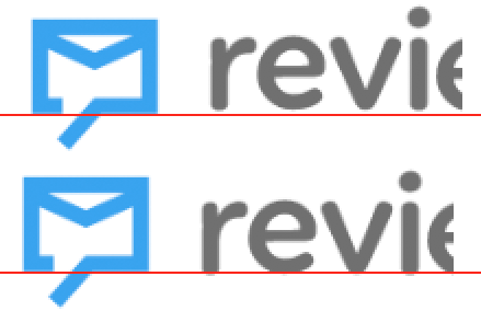
Welcoming some fresh sets of eyes for the kerning of the wordmark.

Also any feelings on the positioning of the logobug vs the word? Space between and vertical placement.
Welcoming some fresh sets of eyes for the kerning of the wordmark.
Also any feelings on the positioning of the logobug vs the word? Space between and vertical placement.
If it were me, I’d likely lower the word just a little so that the rounded terminals of the letters extended ever so slightly beyond the horizontal line created by the bottom of the envelope.
I might also remove the left side of the crossbar on the t so it could be pushed closer to the preceding r.