Hi everyone,
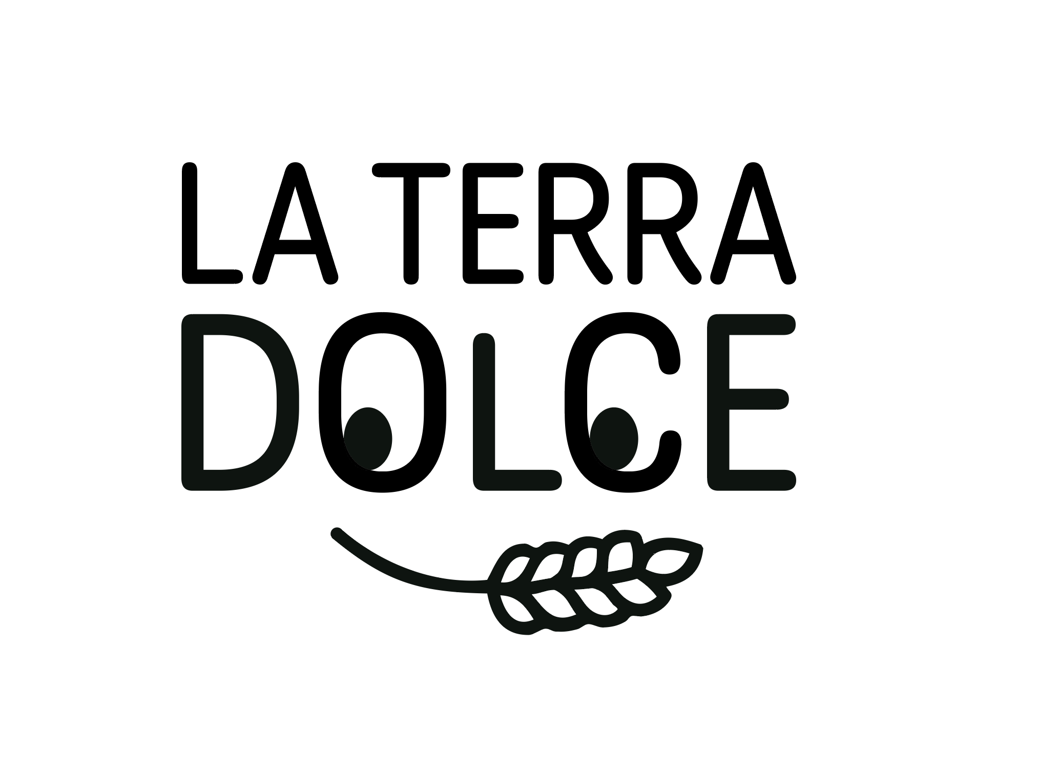
I wanted to share an update on my logo design for “La Terra Dolce.” I’ll be posting the original logo as well for refrence.
The original design I created was black and white, and my professor initially liked it. However, when it rendered reversed, it looked pretty scary, which made me lose confidence in it. I felt that the design still looked too much like student work and wasn’t something I could proudly add to my portfolio. After that, I decided to create a new logo, taking a different approach. (Spoiler, draft two didnt work)
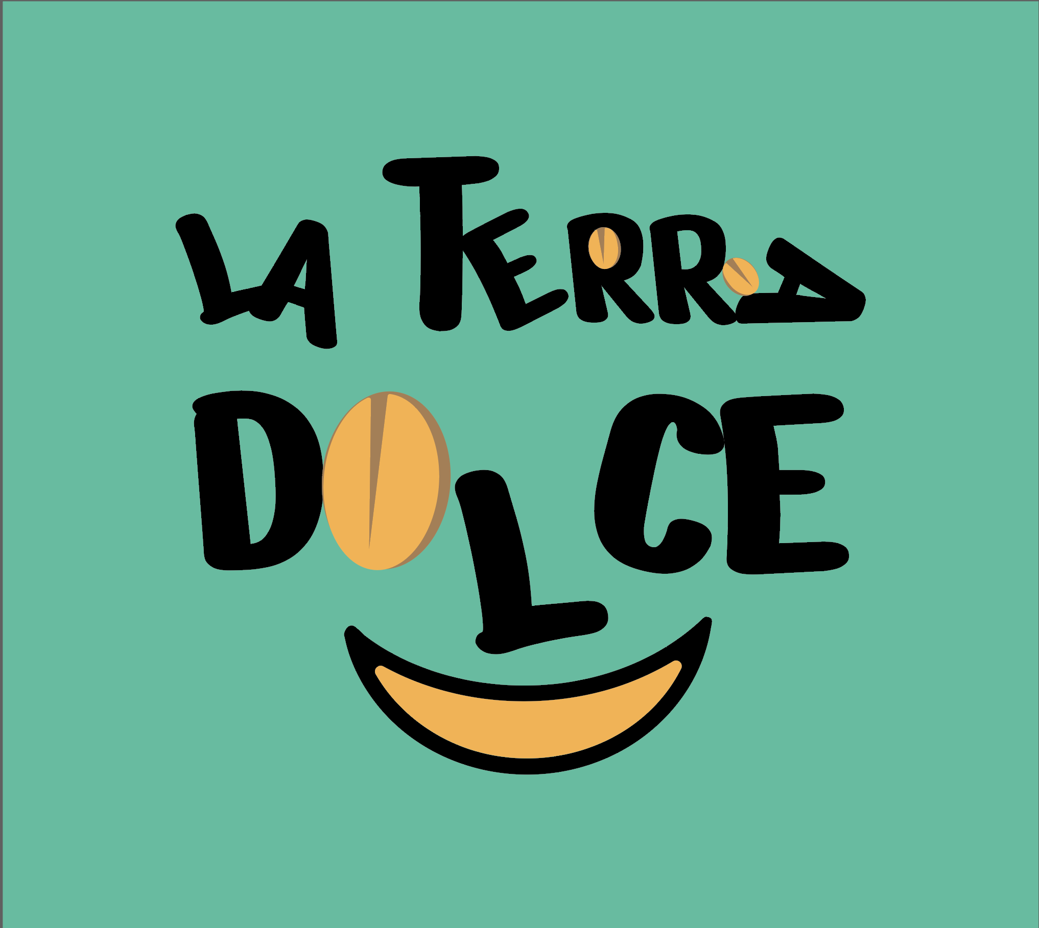
This new logo (the 3rd draft) is something I’ve been much happier with. I’m reaching out now for some constructive feedback—I’d really appreciate your thoughts on the new design!
Your color logo here is much more playful and inviting, assuming that’s the feel you’re going for. The initial one-color version tries to be fun and playful with the eyes and smile, and I can see how reversing that wouldn’t feel so great.
I’d suggest reducing the second (color) option here down to one color. You may find that the smaller beans in Terra hurt readability there, and that the O in Dolce may not read as intended, a slightly different stylization may be the ticket.
I caveat this with the fact my Italian is adequate and conversational, but not mother tongue, or formal – more kitchen sink Italian.
The name La Terra Dolce feels a bit off. You are right that the article usually precedes a noun in Italian, but in this case it feels a bit too literal. Also, it’s not generally-used idiomatic phrase I’ve ever heard used; certainly not in the area I lived. It may be elsewhere in Italy. As I say, I am no linguistic expert and maybe there is a mother-tongue speaker around here who can correct me.
Also, for the English-speaking market, probably dropping it and just having Terra Dolce as the name would work better any way. It scans a bit better for the English-speaking market.
It may be a fixed that you have to work with, but sometimes there have been times where you have to advice clients that their name does not resonate with their target audience.
Thank you and I agree with you on the grammar however itys a fixed name that we couldn’t change. It was either La Terra Dolce or Liberty Paper Mills. I went for the former.