Hi there! This is two directions for a premium canned cocktail (like white claw but with natural ingredients) Objectives:
Clear healthy ingredients
Outdoor Lifestyle / Adventure focus
Fun but sophisticated
Premium brand
Weekend vibes
Cheerful
Any insight/opinions/advice would be extremely appreciated. Thanks in advance!
I’m not so sure there’s any way to spin vodka and soda as being “healthy ingredients.” As organic and full goodness as lime juice might be, it doesn’t really bridge the gap.
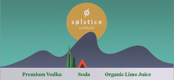
Anyway, I’m assuming this is a drink to take on a hike or to go camping or for just about any other time when convenience dictates a pre-mixed drink. You want it to suggest active, outdoors and adventure, but I’m not really seeing these qualities in the labels.
I see the small tent and conifer trees in the first one. which clues me into the purple waves behind them being mountains. Without that tent, though, I would have had no inkling as to the outdoors or active lifestyle associations you’re after.
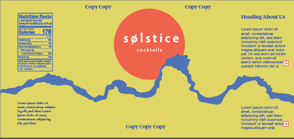
The second label is just sort of abstract. If the irregular blue shape moving through the label is supposed to be mountains, I’m pretty sure no one’s going to pick up on it. The background color is not something I’d associate with a drink unless I drank way too much and began feeling ill.
I’d definitely not use the serif typeface you’ve chosen — it just doesn’t have the personality you’re after.
I’m sorry for the largely less-than-positive critique. I’m not saying these are all that bad, but I think you can do better than this.
From a visual aesthetic standpoint I enjoy the top half of the design. Just B is right that it’s a total disconnect from the product itself.
The bottom half reminds of a knock off soda or energy drink that I might find at the dollar store, that I knew would be a mistake to purchase, yet I did it anyway, and became terrible ill after consuming.
If you can tie the product into the art, and expand the look and feel of the top half of the design, you may have a product that would peak peoples interest.
I was this close to mentioning the overset type.
Then, I decided to let it slide.
However, in hind-site, It could present the impression that you don’t have a firm grasp on the software, or perhaps worse yet, don’t care enough about the project to remove obvious errors.
I hate overset type. Even if it’s just an additional line return at the end of a paragraph. Sloppy.
And it generates a rip error. That makes me grumpy too.
I’m not trying to be overly harsh, but I think you need to go back to the drawing board on this one. I see where you’re going with the concept, but these need a lot more work. With the enduring popularity of craft beers and the (relatively) more recent popularity of small batch and craft spirits, this category is packed with top-notch creative work. If a microbrewery ever called me, I think I’d be equal parts excited to work on the project and intimidated by the space. Anyway, print this out, roll it into a cylinder, take it to your local grocery store or liquor store and see how it holds up the competition.