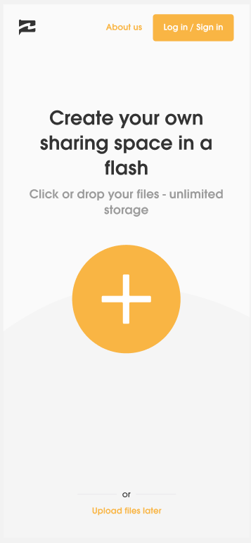
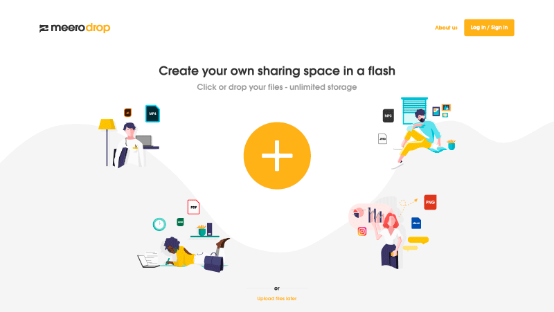
We’ve prepared a new landing page for MeeroDrop - our file sharing platform dedicated to creators.
We’d be happy to get your views on it ![]()
First impression? Understanding what it’s all about? Design wise?
I still have some doubts on the “+” button size & color.
Feel free to share any feedback you might have!