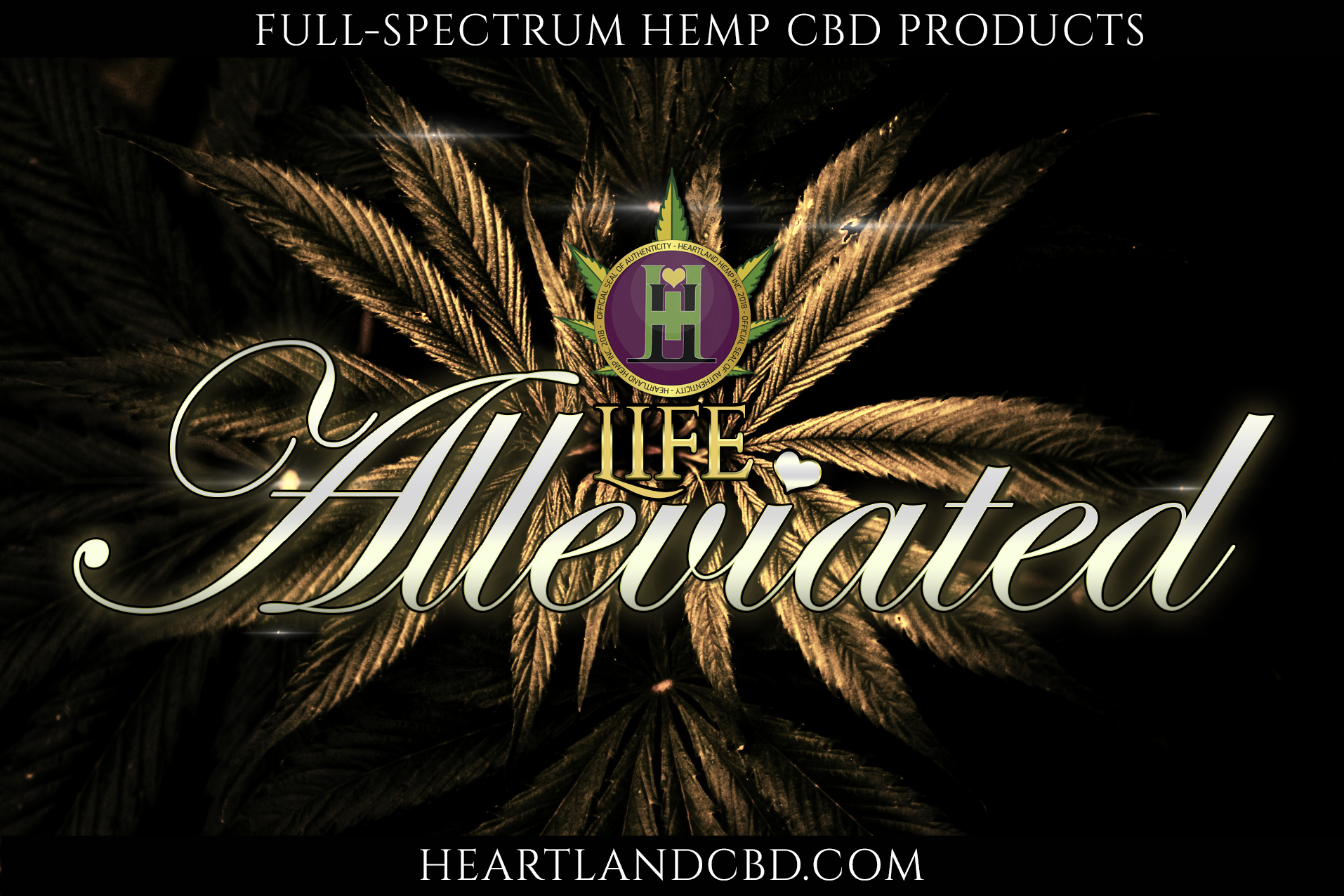
So aside from the phrase “Life Alleviated” (I have qualms with it anyway), what do you guys think?
1 Like
I think the script face is difficult to read — especially over the leaves. The background leaves also lessen the contrast and legibility of the logo and the word LIFE.
I’d be inclined to also pull the top and bottom lines a bit further away from the edge so they’re not crowding it. Things need space to breathe and relax. Not providing that space causes unwanted visual tension (as well as a potential trim problem in this instance).
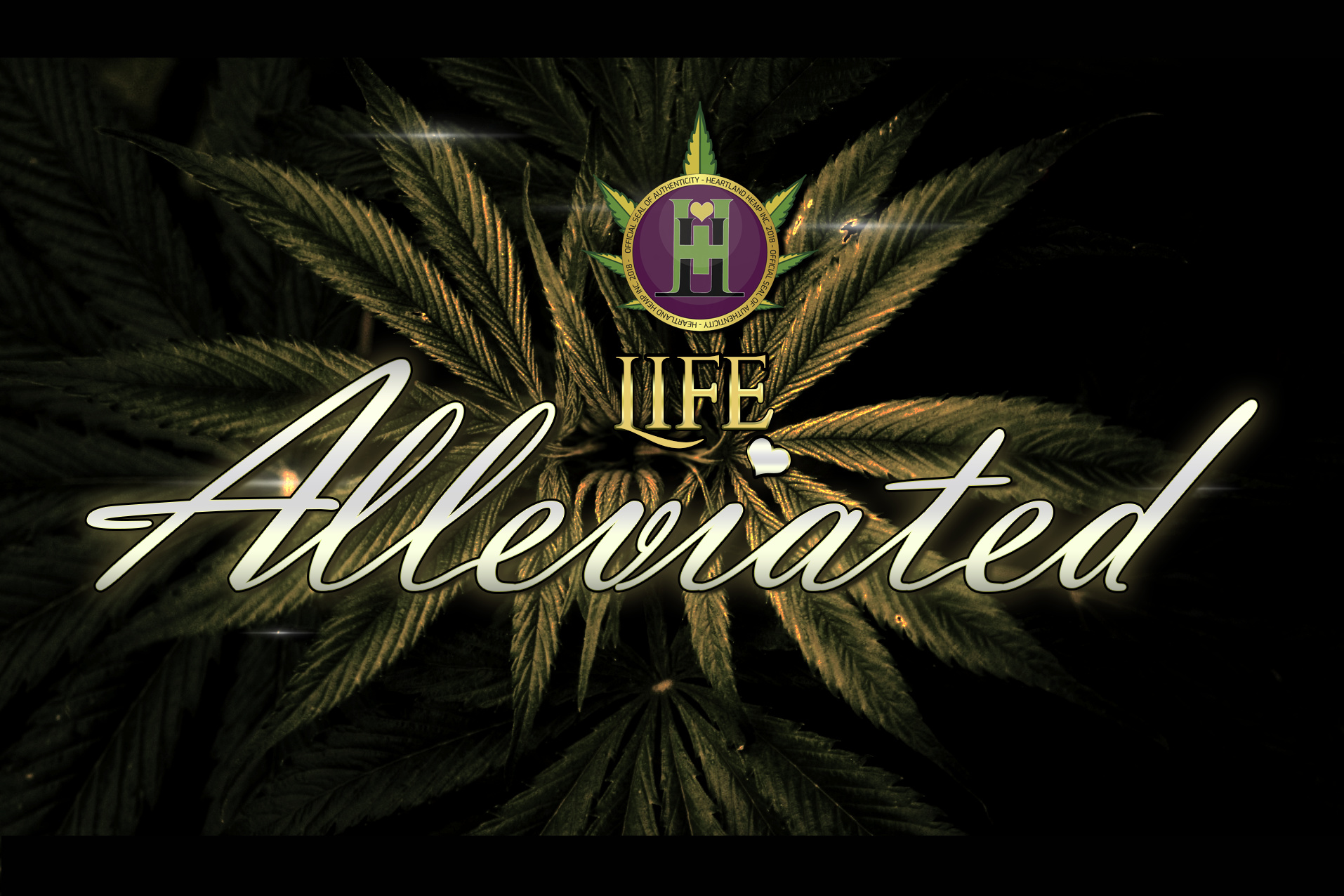
The word “Life” is still too insignificant. Not that it needs to be made larger, but maybe even more contrast to the background.
I’m not a fan of stroked text. Especially skinny stroked text. Either have it there for a reason or don’t use it.
The logo/seal at the top is really too busy with elements that are too small.
Who is H..tl..d H…p (ellipsis to avoid search) and why does their seal of authenticity matter?
Is this a large display for web or for print?
I got ya, so the color needs to be changed up to something different from a color that can be found on the backdrop so to speak?
Also, the seal is for the company that oversees this company. Heartland Hemp Inc.
The logo and seal have already been made official and apart of our branding. I do wish I was here with you all much earlier in the year when I was able to more freely focus on this.
This is just a practice display really, I am just trying to stretch my photoshop fingers out and get more professional perspective on the things that I am doing for our company.
Looks good, but I thing that the word “ALLEVIATED” must be of the same font and colore like the word “LIHE”. The background is perfect, but all must be harmoniously.
too many solar flares, only on should do
This is from 2018 folks … no need to keep dredging up OLD topics. The OP hasn’t been back since.
Thread closed.