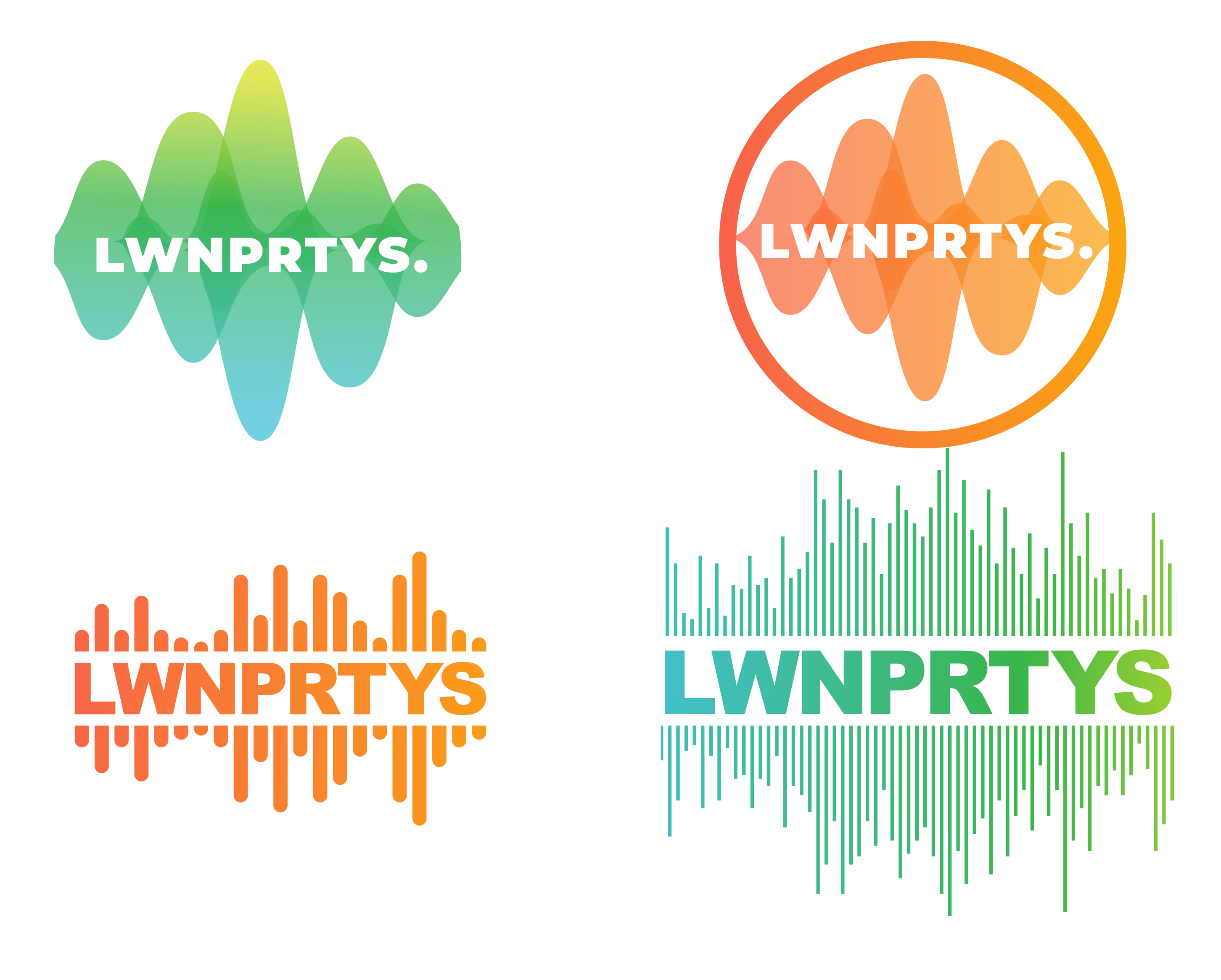
Hey all! Hoping to get your opinion on some logos I’ve made. I’ve been feeling a little stuck/not sure where to go with them so any feedback is ideal.
Some background: I am the current head of Social Committee at Princeton University. Twice a year, we run a music festival on campus called Lawnparties. It has a ‘preppy’ theme so pastels and bright colors are generally worn. It’s a day time festival, going from 12PM – 5PM and it happens the week before classes in the fall and after classes end in spring.
I was really excited to rebrand it when I became in charge of it starting this spring, but of course all major parties/festivals/events/socialization-in-general got cancelled so it felt kind of unnecessary? Anyway, I’m trying to beef up my portfolio so I decided to rebrand it anyway. I’m trying to make it ‘brighter’ and ‘lighter’ because I think the former logo didn’t really represent the festival well. Anyway, here are some really rough logos (also, know that the mascot for the school is tigers and the school color is orange). I also created a graphic for posters possibly, I would like to know if there is any part of the tiger graphic that I could possibly incorporate into a logo (I know, it’s way too complicated for a logo but I’m wondering if you think the shapes/color palette/or anything could be incorporated).
Anyway, I’m fairly new to graphic design but I am very ready for you all to tear my logos to shreds. Truly, any critique is super welcome.