Layout Questions for Brochure for Community Foundatin

Hi,

I am doing a mockup of a brochure for a community foundation. This brochure is geared toward their investors and funders of their education scholarships.

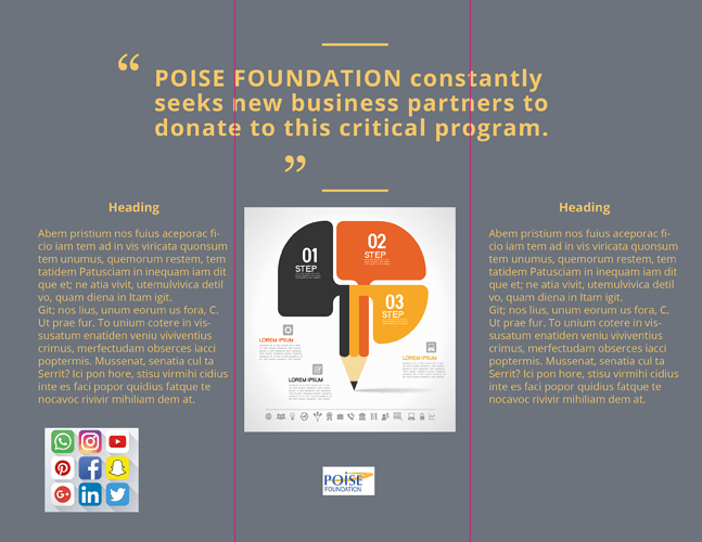
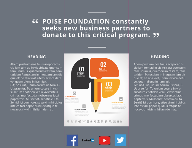
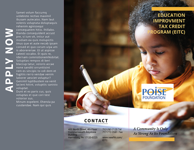
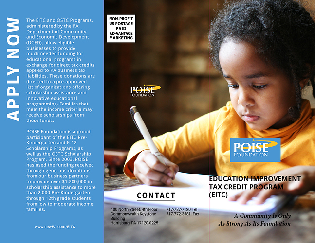
The brochure is a letter size trifold. The image with the young girl is the outside panel (the right side is the outer front panel). If I decided to use this photo does it look strange that a portion of her face will end up on the outer middle panel? For now I just have that quote as a placeholder but if I decided to use a quote does it look strange to have it straddle all of the 3 inner panels?

If you have any other tips to make the brochure more appealing it would be appreciated. Thanks in advance.

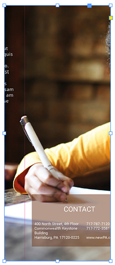
Yes, especially since the fold will go through her eye:
image
I think it would be fine if the whole thing was shifted right so that both her eyes fit on the cover, and then the center panel will have the symbolism of her writing hand without a fragment of her forehead:
image

1 Like

In addition to HotButton’s observations, the main issues I’m seeing have to do with the typography. Some of it’s personal opinion, but the kerning is a little loose for my tastes. The quote marks on the pullout quote are off (maybe you haven’t positioned them yet). Several of the headlines are a bit weak-looking (Contact, Apply Now, Heading).

Placing white boxes around elements that would otherwise be problematic against a colored background (social media buttons and Poise logo) isn’t a particularly good solution, even though it might be necessary in some instances.

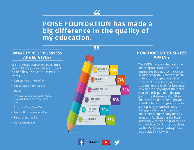
The type in the infographic is way too small for anyone to read. The white tagline type on the cover is also difficult to read since it’s over some light areas.

I like the photo and the general layout, however.

1 Like

Hi, Charm. I probably wouldn’t split her face.

Also, I have a few suggestions:

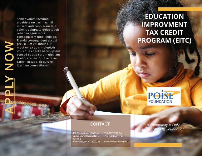
  • On the front cover, I would have the heading be flush left and align with the leftmost edge of that yellow bar. I realize that may not fit so you might need to adjust the width of the yellow bar. But, currently, the centered text with the position of the yellow bar is off balance.

  • The tagline at the bottom of the front cover is hard to read. Perhaps that could appear on top of the bottom yellow bar, which would need to be larger. The alignment of that text is off balance too. So you could make the tagline flush right and align it with the right edge of the bottom yellow bar (the opposite of what I suggested above).

  • “Apply now” on the back cover should align with the top of the body text on the page (in other words, making “Apply now” flush right). Does the underline on “Apply” convey something? If not, I’d remove it. I feel the need to click on it.

  • I like the color scheme on the inside but the yellow on gray is hard to read, and the gray isn’t used elsewhere. I would use the blue from their logo, perhaps for the quote, and have a yellow background. I’d also have the end quotation mark appear at the end of the quote, not below it.

  • I realize they might be placeholders, but the social media icons could all be the same color and very simple and in a row.

  • I would stick to type typefaces.

  • I would move the logo away from the face. Both are competing for attention.

Hope this helps!

1 Like

In my opinion, if you have to put the logo in a white box, the overall design isn’t working. Scrap this and start again. Sorry.

Yeah, I don’t know that I’d say the whole design is a throw-away, but you definitely need a solution for the logo, and the same goes for the 1-2-3/pencil graphic, which is pretty cool.

“improvement” is spelled wrong.

Thanks for the input everyone I appreciate it and will make those changes.

As for the logo unfortunately the client didn’t give me a requested vector file (eps or ai) so I had to go and grab from the internet. I tried to remove the white border in PhotoShop but unfortunately the letters start to disintegrate. I hope they can provide me with a vector file because the white box around the logo doesn’t look good.

SEarch for the company name as a .pdf file. Usually something like a brochure or a financial statement in pdf form will have a vector logo in it. Unless the same designer is doing those for them.

Echoing what @PrintDriver said, grab the vector logo from their annual report here.

1 Like

Thanks for the suggestion. Unfortunately I wasn’t able get the logo. I made some changes and this is how the brochure looks (I think the inside spread might display first).

It’s a little blah with all the white & grey. You’ve got some great color options with the blue & Yellow from the logo, plus that orange in the pencil info graphic. The info graphic is quite small and difficult to read. The areas where the yellow text is on top of the girls forehead seem to disappear… you should photoshop the shadow on her forehead more. Same for the “only” & “foundation” on the bottom… there you should lighten it so there is more contrast and the words pop more.

I gave you a link to the logo. Download the PDF, open it in Illustrator, grab the logo.

Thanks for the info on adjusting the image in PhotoShop wdesign. I have changed the background to mid value blue. CraigB I will have to do this when I’m home because I don’t have Illustrator at work (just volunteering my services). Would love to scrap the logo and do something from scratch but that’s not my call.

In the Apply Now text, it seems those are separate paragraphs but without space between them, it’s hard to tell.

Also, on the front cover, my suggestion for aligning the text was for the yellow heading to be flush left and left aligned to the leftmost part of the bar above it, and the text at the bottom to be flush right and right aligned with the yellow bar below it.

Thanks again to everyone for their great suggestions. I made some changes. But I am wondering (1) Is having the word “Program” on her finger a really bad idea (it’s not very readable, would just adding a shadow make it better?) (2) On the inside Panel I have a subheaer “What type of Business Are Eligible”? is the underline overkill since I already have underline on the pull quote (it’s just a made up quote acting as a placeholder). It seems to be competing with the under line in the pull quote. The bulleted list is a bit weak any suggestions for making it look better. Any other suggestions are welcome. The inside panel is on the top of your screen.

One more thing can anyone offer guidelines on direct mail brochures (what changes would I need to make and where should I place the Permit Imprint Indicia (I have it place in the outer part of the brochure in the middle panel on the left side). Is there a way to directly create the Permit Imprint Indicia in Illustrator for this company?

I realize that my previous comment probably came off as rather flippant, so I’ll expand on my thoughts a bit.

You have a great photo – the light is nice, and she’s a cute kid, but the layout is still isn’t working. The logo on the front is still awkwardly placed in a box. This makes it seem like a tacked on solution. Without the box, I’m sure it would be difficult to read over the folds and highlight / shadowing in the girl’s shirt. As you pointed out, you also have some legibility problems, and the headline is way too close to the fold. All of these issues could be solved with a new layout – at least on the cover. This might mean going to a vertical photo rather than a square photo. You can always use this great photo on the gatefold or the inside. I like the line “a community is only as strong as its foundation.” That sounds nice. Lead with that, then have the photo of the girl, and use the logo and EITC copy as a signature on the panel. Since this is about building strong communities, perhaps a montage of photos depicting community with the girl being one of the photos.

If you need more convincing, you’ll have to change the layout on the back if this is going to be a direct mailer. It’s been a while since I’ve worked on direct mail, but the post office does have regulations on this, so check them out. Try searching the USPS website for direct mail design guidelines.

On the inside, the pull quote doesn’t mean much – at least to me – without some qualification (e.g. person’s name, what grade they’re in, their title if they are a working professional, what college or high school they’re in if they are still a student, etc.).

Regarding your question of the rules above and below the headline on the left panel, yes, they are too much with the rules on the pull quote. Look for another way to make the headlines stand out.

You should add the account name along with the social media logos. If this was a website, you can make them links to the social media. As it stands right now, you tell me the foundation has a twitter account, but it would be more helpful if you gave the handle, too. Same thing applies to the other icons.

Re-rag the type to try to eliminate, or at least reduce, the number of hyphenated words. My strong bias is against having only one word on a line unless it’s unavoidable. (Look at the fourth bullet point.) Watch for these when you re-rag the copy.

I do like the Poise corporate blue as opposed to the gray you used before.

A second call to action on the inside wouldn’t be bad.
I agree with everything Steve said.

You’ve added a US postage paid indicia, but where does the address go? Your mailing panel does not conform to US postal regulations, and they’ll charge extra postage because of it. Depending on the number mailed, this could be a costly mistake. We had a client not too long ago that wasted close to $10,000 when the postal service charged them for not adhering to their guidelines for bulk rate.

1 Like

USPS won’t like that, and might refuse it. If you have any questions about a design, you can take it to the counter at USPS and ask. Each office has at least one person trained as a Mailing Standards Specialist, and they can answer your questions about how your piece will interface with their system.

See if your printer has a trifold brochure template, otherwise, find one and use it as a guide so you know what areas can be used on the mailing panel. The mailing panel has to go through their sorters along the longest side, and it has to be able to read the address info while in that position. Also keep in mind that they will slap a barcode along the bottom edge of the piece. If you put critical info there, it will get covered up. They also always want the bottom edge to be the fold, otherwise it tends to fly open in their machines and gum things up. And destroy the piece.

Are your folds in the correct position? I can’t check. A good template will help. On a trifold, one of the panels will be slightly smaller than the other 2. All 3 do not have equal widths. If they have equal widths then the folds will be in the wrong position and your art will look misaligned.

Aesthetically, I would reduce the photo so all of it occupies the front cover. I think the crossover to the back panel is weak because there is an implied visual line from her eye to a place OFF the cover. I’d leave the mailing panel white and use it for return address, indicia, and space for a label. And maybe a call to action, in the safe area.

When you make that photo smaller, it will give you room to put the Poise logo at the top of the cover, in a larger, more prominent position, and allow you to put the rest of the text on the blue background, rather than have it compete with the background of the photo. The cover will be cleaner and read better.