A visual Identity project for an apparel brand.
Full project here:
https://www.behance.net/gallery/100431599/Littywonka-Visual-Identity

A visual Identity project for an apparel brand.
Full project here:
https://www.behance.net/gallery/100431599/Littywonka-Visual-Identity
Since you posted this in the Crit Pit, I’m assuming you’re looking for feedback.
First, I like the logo and the animation you put together. They’re both simple, straight-forward and aesthetically interesting.
However, I looked at what you linked to on Behance and ended up being a little mystified. You designed a nice logo and paired it with some matching typography, which is good. What I don’t understand is the elaborate presentation you’ve made regarding it and what purpose it serves. It almost seems as through the logo is just a prop for your presentation.
Reading through the text of this presentation, I’m guessing that English isn’t your first language. There’s nothing wrong with that, of course, but since you did choose English, it really needs to be well-written English. Unfortunately, it’s full of grammatical errors, awkward phrasings, misspellings, and punctuation mistakes. If at all possible, I’d suggest you have someone read it over and suggest some improvements.
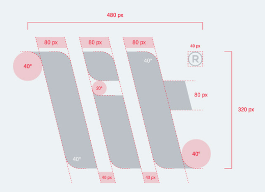
An equally big problem (at least to me) is the presentation itself. I still don’t understand why you’ve made an elaborate presentation to show off what is, essentially, just a logo. For example, the screen capture below looks superficially nice, but it makes no sense.
Why are you showing this? What purpose does it serve? Why does it have pixels measurements on it? What are 20° and 40° circles? Your presentation seems more like a presentation for the sake of showing off your presentation than showing what the subject matter is ostensibly about.
Lol thanks for pointing the circles out @Just-B nowadays I feel like designers are trying to make their job look so much more technical and difficult than it is for the client, just to make clear that not everyone can do their job ![]()
Nice logo design and the animations work with that is like cherry on cake. Good job!!
Thank you for your reply!
I’ll try to explain and talk about your points shortly
I appreciate it
Thank you so much!
You really don’t have to be rude!
“Rude” is a matter of interpretation, but in substance, LandOfFae’s post doesn’t say anything Just-B’s post didn’t already imply.
Superimposing pixel-based measurements over (what should be) a vector-based design is erroneous at best. The pixel is only valid as a relative unit of measure, and what’s more, by its very nature, the pixel could never be a truly reliable measure of distance between two diagonal lines. Unless the pixel grid is rotated to the same angle, there will be fractions of pixels all along a diagonal line. Also, specific to your graphic, radius is not measured in degrees.
So it’s a valid question; what does this graphic demonstrate? To someone who knows the mechanics of graphic design, it can’t demonstrate anything of sound basis.
People are so quickly offended nowadays ![]() that is just what I’m saying. I totally understand why you created the visual, for presentation sake. But that’s what it is. It’s not meant to display rocket science. Just a nice visual. Just keep in mind the client can’t do anything with it. I think only showing the striped lines or the intersecting lines would have shown enough for it to be a nice presentation. Showing the mathematics of the project and degrees of a circle is just decoration, I think you already know that. You could show Pythagoras if that’s what you want to do, but to me it would be excessive work. That said, nice animation.
that is just what I’m saying. I totally understand why you created the visual, for presentation sake. But that’s what it is. It’s not meant to display rocket science. Just a nice visual. Just keep in mind the client can’t do anything with it. I think only showing the striped lines or the intersecting lines would have shown enough for it to be a nice presentation. Showing the mathematics of the project and degrees of a circle is just decoration, I think you already know that. You could show Pythagoras if that’s what you want to do, but to me it would be excessive work. That said, nice animation.