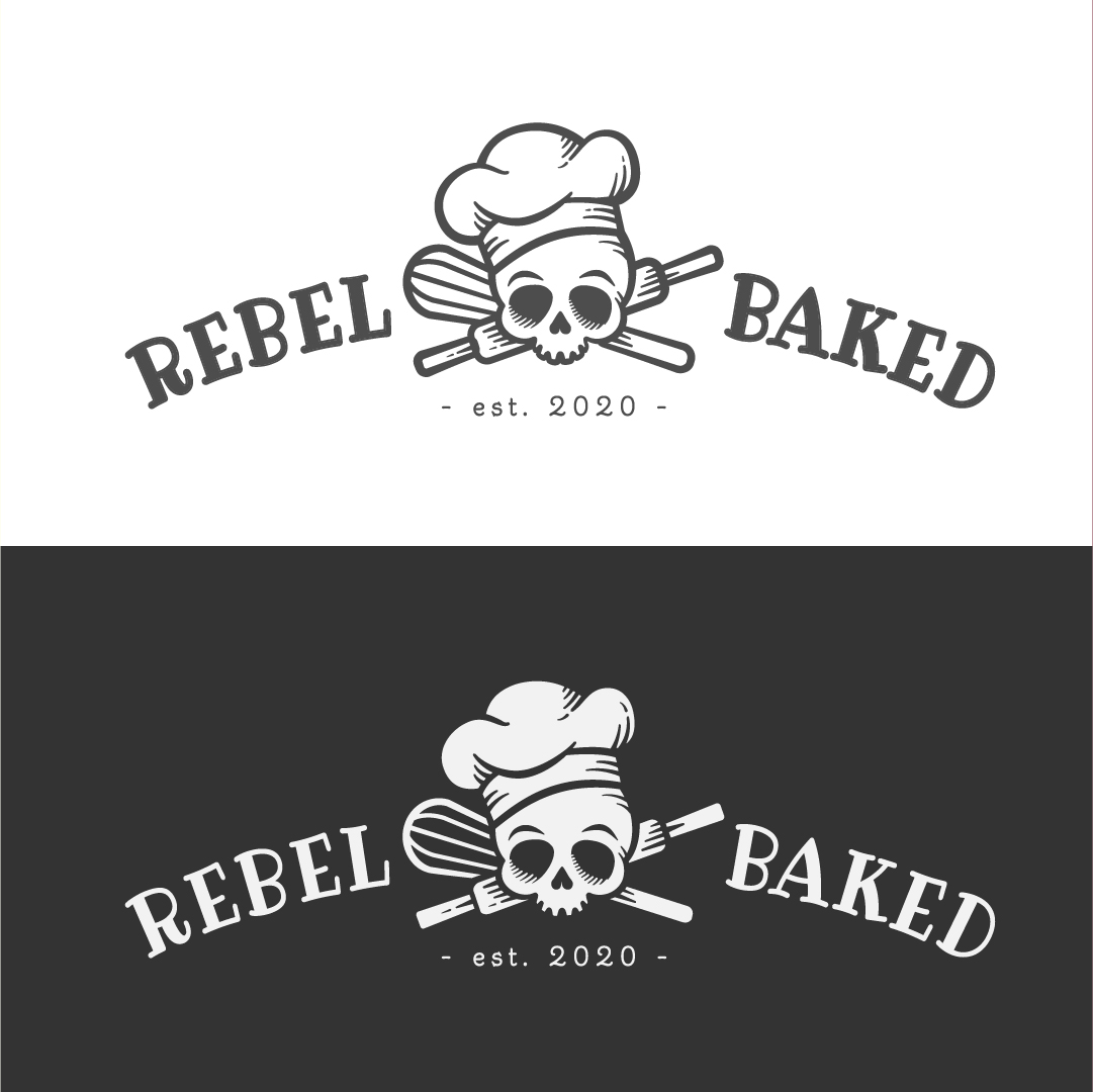
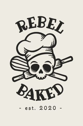
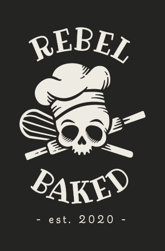
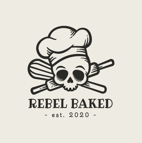
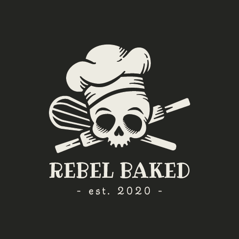
Hey y’a!! Haven’t posted in FOREVER but finished up some work for a local bakery startup. NOT my typical style so feedback welcome and I know it’s not that greatest at 80px but the baker loves it lol.
1 Like
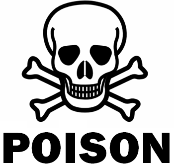
Isn’t a skull and crossbones a common symbol for poison? Did the owner request this?
I suppose the skull and crossbones and rebel references might be appealing to a certain crowd, like motorcycle gangs, but does that crowd buy pastries, buns, baguettes and cupcakes?
Why the “est. 2020”? What point is there in mentioning that bakery is so new? I know it’s a faddish thing to do (reason not to do it, in my opinion), but the only reason I can come up with to place a date in a logo is if the date is somehow relevant, as in serving satisfied customers for many decades.
All that said, it’s really a nice illustration, and as an illustration, I like it a lot. It just doesn’t seem appropriate to me unless the client really is going for some kind of counterintuitive, rebellious and out-of-the-mainstream sort of branding. And if that’s the case, I might choose a slightly more serious typeface. If the point is to be humorous, I’m not too sure that skulls and implications of poison are a good idea.
Yes, the customer came to me with an idea in mind.
You’re spot on about the appealing to a certain crowd. We have an active skater/hipster community here due to a well known skater and entertainer who grew up here. Our downtown used to be packed a couple decades ago and we’ve been a corporately supported, suburbanized, conservative area for some time and with everyone starting to move back into downtown, the local brewing and food truck scene is slowly but surely growing, so you’re correct with the rebellion of it.
Eating at a place that has the universal sign for poison is well beyond my rebellious nature LOL ![]()
That being said I like your Illustration ![]()
1 Like
The skull-poison connection does not really bother me if it’s a good bakery. The “est. 2020”, however, causes some consternation. In the eatery business, new kid on the block is not a comforting gesture.
Like everyone agreed, the illustration is very nice.
My first take was along the edgy / hip / trendy line of thinking more so than the poison symbolism. So any tie-in with a warning symbol doesn’t bother me too much.
Overall, I like the illustration work; however, I’d like to see a little more separation between the skull and the whisk and rolling pin on the left side. Maybe there is a deeper drop shadow there.
On the type, I’d suggest adding some of the texture / shadowing from the illustration to the type so it’s not quite as flat looking as it is compared to the illustration.
Definitely got a cool skater vibe. Makes me think about Blind boards! ![]()
I think the mark is trendy and will resonate with the audience you’re trying to reach, I love your line work on the mark/illustration, it looks super slick ![]() . I wouldn’t usally entertain the idea of a bakery, but I think I’m the demographic that would check a place like this out.
. I wouldn’t usally entertain the idea of a bakery, but I think I’m the demographic that would check a place like this out.
Although I think the balance of the mark it feels a bit off to me. From the moment I saw it I thought it felt weighted to the left hand side. Am not sure whether it’s the direction of the shading of the eyes being the same, the combined visual weight of the wisk and the lean of the bakers hat or the uneven baseline of it, or all of the above:
Regarding the typeface, it feels a bit like a mismatch to me. The outline and strokes of the font feel inconsistent with clean smooth lines in the mark, both in style and weight. I think you should try a heavier weighted font with cleaner lines (maybe Gotham bold?). I don’t think the type even has to be display font like the retro tattoo style you’ve chosen, in fact I think the quirky fonts detracts from the cool mark being the hero ![]() of the logo. I would personally just keep the bold mark as the hero.
of the logo. I would personally just keep the bold mark as the hero.
The only thing I would caution you about this mark is that it feels very trendy to me and while it’s cool now (and I do think it’s cool!) am not sure whether I would feel the same in 5 more years ![]() .
.
Hope this all helps, I like it mate ![]()
![]()
3 Likes
Ok so I’ve been out of the skater world for like 15 years now but isn’t most skater artwork not associated with cuteness? I tend to be a dark soul but my initial reaction was “how cute!”. Then I realized that might not be what your client wants.
I also saw the skull and crossbones and thought of pirates… then read Rebel and felt a disconnect. To me Rebel symbols are a fist in the air, motorcycle, skateboard, ripped jeans, leather jacket, a black star with wings, or like a laughing skull.
The text also feels more pirate to me then rebel. I understand it would be too wild and unreadable to have a skater font but I would def look for something more skater like.
You did a beautiful job on the artwork so if this is what the client wants then so be it.
I also agree with @pluto to be concerned about this logo staying relevant to its audience in 5 years. And I agree that it is sitting heavy to the left. A simple fix would be to switch the hat to the right side of its head.
One last thing, I’m really glad you made the different arrangements so it would be easy for the client to print their brand on stickers. As I said Ive been out of that world but skaters used to love throwing a sticker on poles, signs, their boards, etc. wherever they could reach lol ![]()
1 Like
I’m not typically attracted to toxic baked goods but I like the design nevertheless. In the store or whatever, I’d probably would choose a brand that didn’t promise to poison me.
They will not poison you. It’s just for fun. I like it.
3 year old thread ![]()