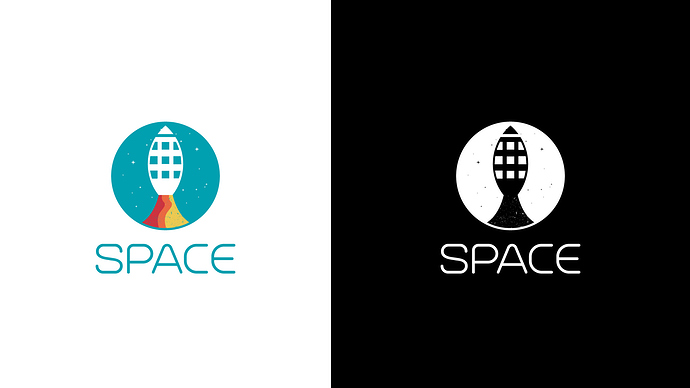
Hi everyone this is my first design of the thirty logos challenge i hope you guys give me feedback and advices if possible, the logo is about a coworking company. thank you.
I like the colors on the first one, but I’d get rid of the stars or leave only three and make them way bigger. They are too small on the logo and look like the logo has problems (especially on black and white).
On the black’n’white version the rocket isn’t recognisable as a rocket anymore, at least not to me. Maybe you could do something with the ‘flames’ coming out of it to make it more seperate from the rocket, like only displaying stripes coming out of the rocket or something like that. But maybe only vertically stretching the rocket itself could help too.
That said, I like logos with a simple shape and that you have a black and white version. That’s great!
The squares are throwing me off as they don’t follow the perspective of the space ship. Same with the line at the top. Try curving the line and squares a bit.
It seems like you are trying too hard to incorporate curvature, or golden ratio, or whatever that technique is called where you’re building a design based on circular curves.
I don’t like the textures, makes it look as if this was designed as a raster image and would not translate well to all mediums.
