For me underwear is all about comfort, even if they are quirky, sassy, or whatever. This logo does not evoke that feeling in me, especially with so many curvy lines, and I’d be hard pressed to consider shopping from the brand just by looking at it.
Moreover, the lace and the perfect model-like body is pretty male-gaze-y, and not reflective of the fact that women come in all shapes and sizes and clothing preferences. Another thing that would completely put me off.
I agree! I want to like this! And I like the name. Unfortunately it doesn’t say bra! And neither does the logo. The frilly is ok but it gets a little ovarian in the undies…
I’d go for a type design using a sturdier font (those serifs as someone said could be a problem, unless this is an online venture and you don’t have to worry about brick and mortar signage) Also try not to get into drawing bodies or parts. Maybe actually have a simple graphic representation of a bra and a tape measure, as this is a tool used to get the right fit. (I finally went in for a proper fitting at an expensive bra shop and was very surprised to find out how wrong I’d been all these years. Lol!)
Keep at it. You’re obviously a good designer, you just haven’t had the aha moment yet.
Oops just read through the rest of this thread and realized it’s not about fitting bras. Well scratch the tape measure. Lol. Still the logo doesn’t say quite fabric design I think because of the “body” it distracts and makes a person think more Victoria’s Secret than interesting bra fabric.
Clearly ‘twisted knickers’ is not for you. It’s not meant for everyone. But aside from that, it can’t really be about comfort because it deals with DIY bra making. How can a brand promise a quality that the consumer has a hand in producing? In any case, the primary purpose is to sell fabric or fabric with [twisted] surface designs.
A good concern, thanks for pointing it out. For what it’s worth, I exactly traced an actual dress model.
Not a woman, so I showed to my wife. She likes it better than the previous design. However, we both felt like there isn’t enough of a concept here. Fwiw I think you went too decorative with the first one and stripped this one too clean. Glad you’ve made your way back to the forum, hope her business is doing well.
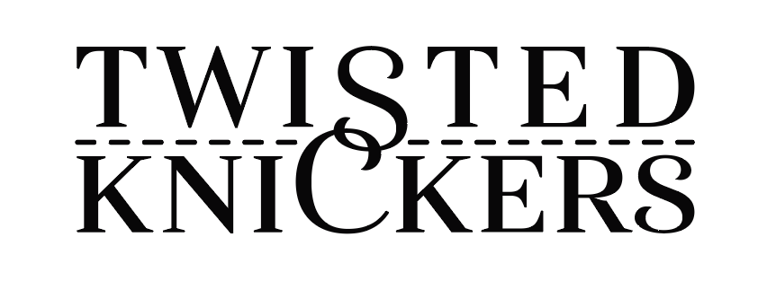
Speaking specifically of the word TWISTED, the kerning between the T and W looks good as it does between the W and I. After that, it’s pretty loose. This gives me the feeling that you are trying to force the type to work to the layout.
You’ve already tried mitigating the problem Steve mentioned by making the top letters just a bit larger. If you adjusted all the letters a little, I think you could mitigate it even further. The W could be narrower. The T, E, and D could be drawn slightly wider. The big C could be narrower and the big S could be considerably wider. For that matter, with a little calligraphic ingenuity, you could make both the big S and the C loop around a bit and, possibly, intertwine slightly more with their neighbors in an Art Nouveau sort of way.
The dotted line (sewn stitches, I assume) are nice, but they could use just a bit more space above and below. The extra leading might even provide an opportunity to make the S a little bigger.
The whole idea’s too good to give up on and leave as is. With a series of subtle tweaks, I think it could work nicely. You’re right; only another designer would notice this sort of thing. Then again, you could say the same about most of what we do.