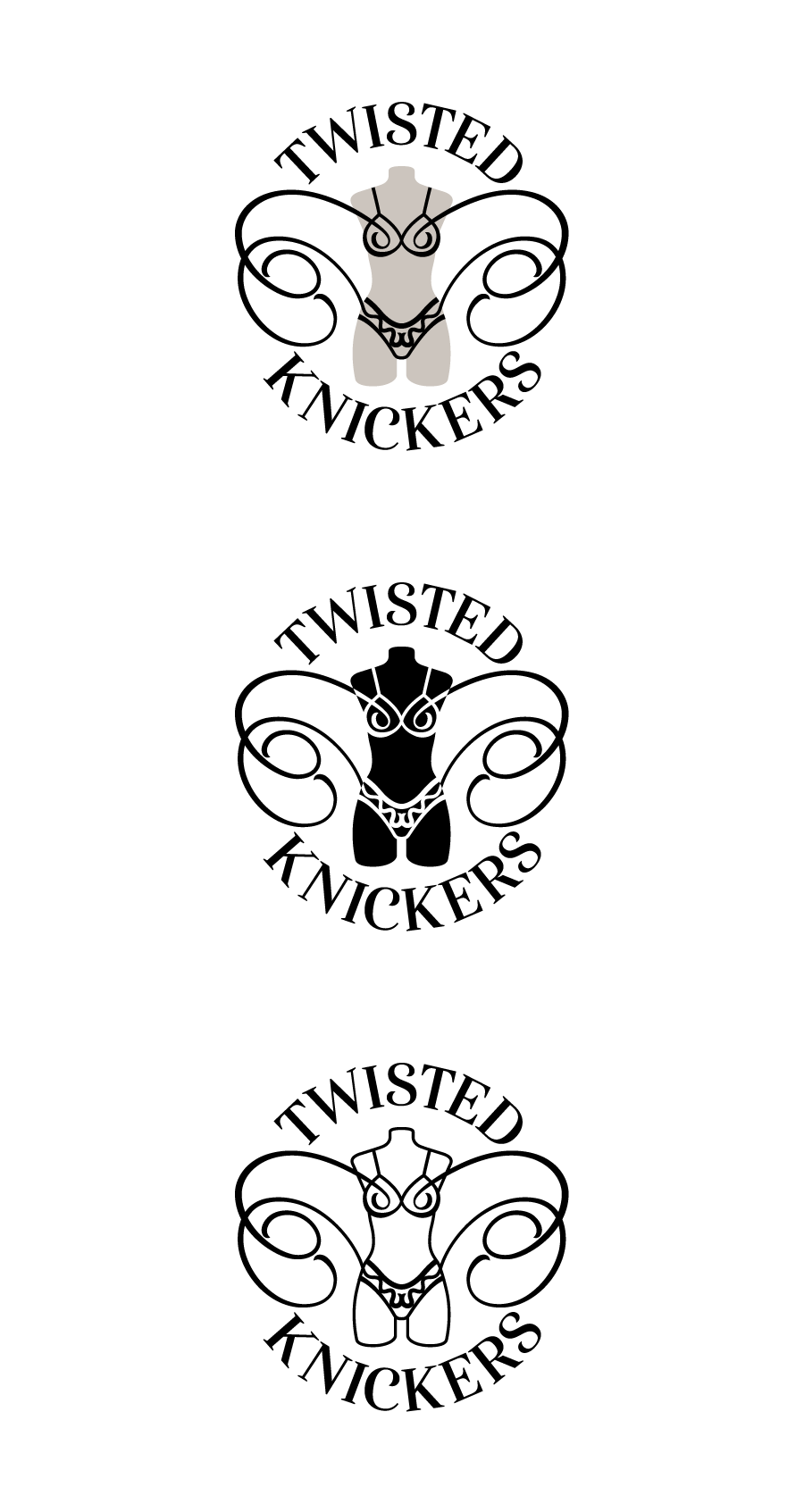
Did this logo design for a business that the wifey is trying out. Whatdaya think?
A little hard to explain but the business surrounds custom bras - teaching classes, selling kits and surface designs, and also producing custom bras for folks.
This forum is mostly comprised of men I think, so yall may not appreciate, as I did not appreciate, the value of a custom bra. As you might imagine, breasts come in a very wide range of sizes and diamentions, and bras off-the-rack do not cover that range.
Twisted Knickers is about unique and custom designs, somewhat sassy and free. With that in mind, I tried to make the lines coming off the undergarments on the dress form suggest wings and express a… twistiness.
For whatever reason the wife wanted it to be circular with rounding type.
So it is all about correct bra sizes and yet, it’s called twisted knickers. That’s a fall at the first hurdle, I’d say.
I may be a man, but without going into too much detail, I have been indoctrinated on this subject for years by both my wife and step-daughter. ‘Most women wear the wrong bra size, you know?’ ‘Yeah, I might have heard that somewhere before!’
As to the logo itself, I am not a fan, I’m afraid. Typographically, it leaves a lot to be desired and it is over-complicated, but fundamentally, it does not say what you need it to. To my mind the whole feel is a bit stereotypical. All feels a bit like a low-budget starter underwear shop for teenage girls.
If this is supposed to be an educative, informative company to help women understand how to measure for and fit the correct size bra, then the feel is off. It doesn’t say knowledgable, or comfortable and engaging or welcoming. You need to put women at their ease, not go for the obvious lacy, girly underwear look – sometimes, even if your client (wife or otherwise) thinks it’s what they want, that isn’t necessarily the best solution for them.
Posting here is gonna be like sticking a knife in an electrical socket…
Your description had two whole paragraphs about bra sizes which are undergarments. No mention of knickers so that was my first impression too. The logo bug does incorporate the knickers so without the description you probably would have been fine.
Not a fan of the skinny serif typefaces. As a sign guy they are the bane of my existence. The melt when made in acrylic, you can’t put light inside them if you want to and there are sizes in vinyl where they don’t like to cut prettily.
I get the free flowing thing with the filigrees but you have them on a dead mannequin. Maybe give it more life? I get “sewing dummy” and therefore maybe “custom tailoring” but it just kills the life.
I know what you mean, and hadn’t been able to put my finger on what the kind of lifelessness was about. I’ve been thinking it’s too symmetrical until now, though it might also help if it were less symmetrical.
I hope we have some women critique this because I feel underqualified.
There’s a frilly personality in it that I like, even though it’s not my personality. Then again, it’s not supposed to be. I go out of my way to avoid the women’s underwear section in department stores.
Even when only cutting through on my way to the power tools department to look at hammers and lawnmowers, I feel like a creepy little voyeur who risks being called out and shamed.
Anyway, the way the lines curl into the bra makes me see eyes, which makes the panties look like a mouth and the whole composition resemble a face. I think this is called pareidolia, which is my big word for the day that I’ve been itching to use.
I do not like the nipple cut outs at all. That’s all I see and what a lot of other women will see - as in naughty lingerie.
The design on the underpants has got to be changed in my opinion. The center looks like dangly bits and that is not a pretty mental image. I might go with a V straight across the pelvic center or a scoop like the rest of the design.
Otherwise I don’t mind the swirl treatment. It’s a bit on the frilly side .. but it seems that is what the Mrs. is going for .. so that’s not a bad thing.
That’s great about your wifes business, I actaully still need to something similar for my wifes business at some point too (she’s only been waiting about four years! ), so good on you for getting around to it
Would love to give you a bit more feedback about your design, but without knowing more about your target market and how you intend utilize the design, I’d only be making assumptions and talking about subjective superficial aspects of your design, am happy to do that if you want, but am not sure how valuable it’d be.
The prime ambition, as I understand it now, is to sell “surface designs”. In textiles, surface design is the designs printed on fabrics, if that’s news to anyone. Her designs will be intended for fabrics used specifically for bras and such and sold in bra kits and by itself.
Her thinking, I think, is that surface designs for bras and such tends to be generic or trys to appeal to as wide a market as possible. Her designs will be sassy or “twisted” in some way and stand apart. Does such a nitch market exist? I don’t think she’s done any real research, but the response she’s gotten to her designs so far has been promising. Her marketing efforts will push the ‘twisted’ angle, I assume.
That’s great, I think there is a totally niche for comfortable and quirky underwear. When you described her business, I instantly thought of brand called Thunderpants: they do ethically-produced comfortable underwear in colourful quirky patterns:
It sounds like she probably does need to do a little market research first though to figure out who her customers will be, what their preferences are around styles, maybe learn about their main complaints with their current underwear. Have you or her got any experience doing market research before?
Yeah, that’s the same sort of market, only this will be for just fabric and bra kits with fabric, so it will be for sowers who make their own undergarments and appreciate quirkiness or whatever.
All this doesn’t disinclined bottoms, but as I mentioned, bras are a special case because a good fit makes all the difference and is not so easy to achieve. I never knew that until she informed me recently, by the way.
Anyway, having reflected on the comments, I think the logo design is trying to incorporate too many concepts and could be stronger with a more focused solution. As her business fleshes itself out I think a more focused direction will emerge.
I read from your original post that it was a more bra-focussed, educative thing, rather than a more generalist, decorative thing. In which case, a more frilly approach is less ‘off the mark’. I also read that the name ‘twisted knickers’ was alluding to getting your ‘knickers in a twist’. Is that a phrase where you are? Here it is an idiom meaning to be confused and a little agitated. I assumed this was referring to a (common) confusion to do with bra sizes and measurements. Anyway, your further explanation means, I was off the mark and had my knickers in a twist, apparently.
That said, I do think you could dig deeper though, as it is nothing I haven’t seen before and a little predictable, if I’m being honest. Maybe that’s OK, depending on the demographic, price point etc. However, you mention that it is supposed to be a bit twisted and quirky. The solution you have is neither really. I would not see from that anything disruptive, different or off-the-wall.
It just looks like you could go a little further and come up with something fresh and original – and maybe a little quirky, if that’s the market you are aiming for. Or are you aiming at not really off-the-wall, but more mainstream for people who like to see themselves as a bit more ‘out there’, but aren’t really.
As Pluto says, perhaps a little more market research is required to define the demographic and tighten the message up a bit.
Well, it’s hard to be original in such a huge and saturated market as DIY bra making and surface design (with a twist), and there must be countless logos with women’s underwear on dress forms with twisty lines shooting out. It’s a quintessential cliché if ever there was one.
Of course it’s not easy. No one ever said it was, but surely, that’s the point of a designer? That’s what we are paid pennies for; to be able to clearly communicate an intended message to an intended audience. Otherwise, everyone might as well take the DIY approach to brand identity as well and just go for pretty adornment.
I think most of the points I could critique on this design have already been hit pretty well - I might add that the twists seem like pretty standard lacy designs you can find in any given store to me, but I think I’d actually back up to the concept phase. Even with a description, most everybody misunderstood what the business was, and it definitely reads as an end-product being sold, not materials. I can understand wanting a circular logo - it makes it easier to translate into an icon for digital purposes.
I’d step back and aim for a new concept, focusing on what’s being sold, and what’s going to be done with it. Am I correct in coming to the conclusion that it’s not undergarments that are being sold: it’s fabric and/or designs being sold to be sewn into undergarments? So the target is people who sew clothing, for themselves or for sale, right? If so, your current iteration is hitting the wrong mark, since it’s reading as a finished product to most of us. I’d lean towards trying to communicate the act of creation rather than the finished product - try to tell the viewer “this is what you can do” instead of “this is what you will get.”