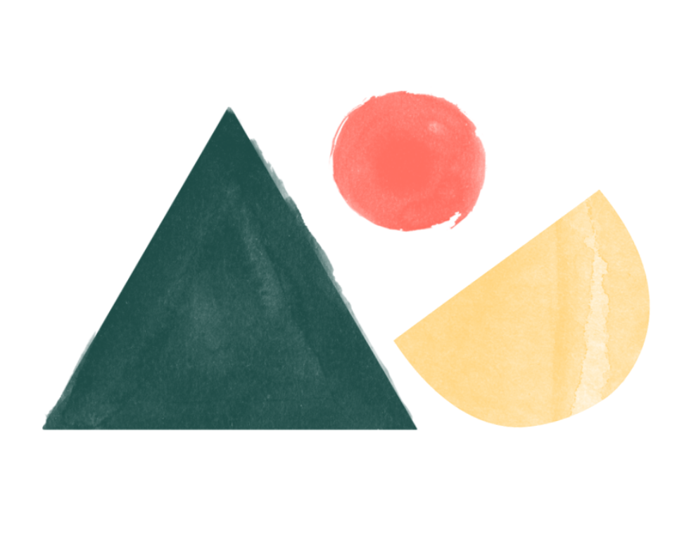
I am trying to work with these shapes to represent the initials AOD. I have spent hours playing around with the shapes over the past few days and am actually reaching a point of brain exhaustion. Its a bit of a handmade twist on bauhaus, with softened colours (forbidden combination?!)
Any thoughts on this logo, or how I could reposition the shapes, would be appreciated. I am a student, so the critique would be helpful as I study online. but I am quite determined to work with these shapes and am just tiring my brain out trying to work them! I tried working with the golden ratio and it didn’t work out (wasted a good 2 hours on that) I have spent DAYS repositioning the shapes to try and get them to look balanced. Does it work? Or do you have any suggestions for a different layout or approach?
It’s quite easy, actually. Start your original art to cover the largest applicable area, say the side of a building, and work your way backward. That will be a coupe of gazillion gigs, but, hey, your raster resolution will be safe.
It might have been best if you had posted these in the student part of the forum. Is this part of a student assignment? Were you instructed to use these shapes? If not, why are you so determined to use them? Why are you painting them with watercolors? Is this just a sketch where you’ve chosen watercolors as a sketching medium or are you thinking of using watercolors to create the final logo?
If it’s a student assignment, we don’t know how many of the parameters of the problem are part of the assignment and which parts are just your decisions.
In a real-world, professional situation, it would be a mistake to force yourself to stick to a predetermined set of shapes. The objective would be to create the best possible end result, which would likely lie outside those parameters. Part of becoming good at this sort of thing is keeping one’s options open and not getting mired down into one line of thinking.
Also from a professional standpoint, watercolor (as has been mentioned) does not typically lend itself to logo creation. Logos need to be reproduced in many different ways where watercolors won’t work. For example, it would be difficult to make a storefront sign from a watercolor. it wouldn’t be possible to screen print it on a t-shirt. Printing it on a dark background would not be practical.
Try to make a size contrast of shapes in golden ratio proportions. Maybe you have been tried but not with the good position of shapes. Try with the field behind objects. Maybe with a circle or some shield.
Much as it pains me to admit it, raster-style logos are not as impossible as they used to be.
You just have to love it printed is all.
If the resolution is there, I can print you a store sign. Might last 5 years where a vector vinyl or 3D version would last you 10+ years. Or if you want to spend $high-four-figures I can get a longer term printed material like cHPL or porcelain, or maybe an auto-finish airbrush artist to mimic your design (won’t be 100% perfect.)
If the resolution is there I can print your banner or boothback.
I can direct print your t-shirt, hat, gloves, water bottles etc. without using a screen, though the printers for such things are still limited in output area, but you won’t be able to do conventional silk screen easily (the halftone line screen would be too course for small items.) Pad printing would be out, as well as embroidery.
Life is full of tradeoffs.
Choose wisely.
ljube’s answer is right on target. Google “golden ratio in design” and you will discover what it is and how it is used. You might also take a look at using the “Unit Sizing” method. Unit sizing has been used by the best logo designers for decades. As a retired 50-year professional in the business, I can testify that both the golden ratio and unit sizing have been a valuable aid in helping me create many award-winning logos. Clare, I wish you the best of success with this project and in your new career in graphic design.
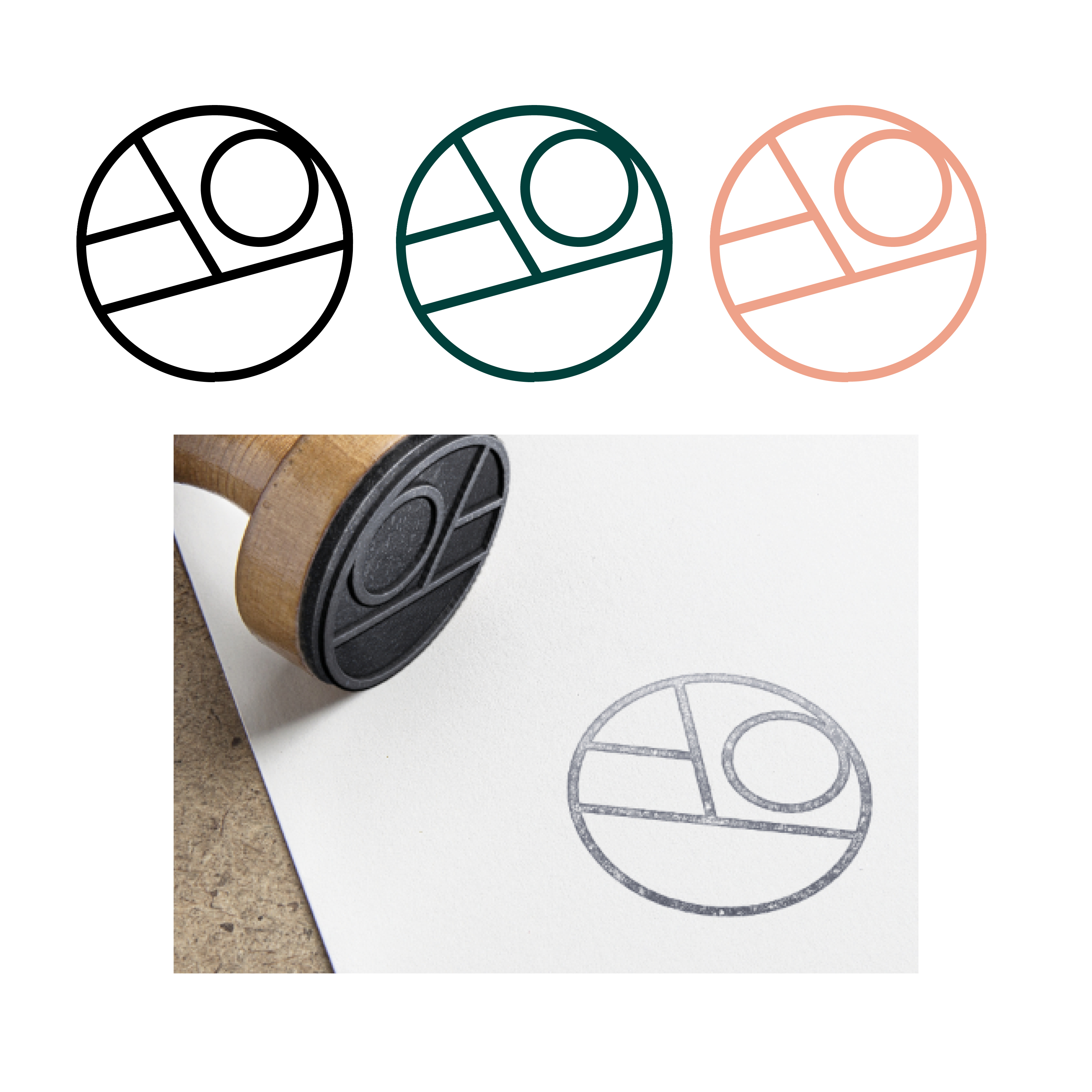
I decided to abandon previous idea as it just wasn’t working much to my dismay. It is a personal logo (I use my second name on these forums)
Our assessment is to design our first set of real personal branding and its felt like the hardest brief I have ever had, strangely enough. I settled for a mix between a previous idea, and a ‘Bauhaus’ outline style. The watercolour is seeming a bit impractical and all of these comments have helped loads for realizing that. I do a lot of illustration work with digital watercolors, so I have a good idea of digital watercolors and resolution etc. But, as I have realized (thanks to this brilliant forum as always!) the practicality just wasn’t going to work for different formats.
This is my updated logo. What are your thoughts? If you have a minute. It is my final logo as I have to submit in the next two days. But any alterations are still possible. I aimed for something more timeless, adaptable and suitable for social media etc.
I have copied and pasted this message from another reply to explain the situation.
I appreciate your feedback and did decide to keep my options open, as per your advice Thank you.
I decided to abandon previous idea as it just wasn’t working much to my dismay. It is a personal logo (I use my second name on these forums)
Our assessment is to design our first set of real personal branding and its felt like the hardest brief I have ever had, strangely enough. I settled for a mix between a previous idea, and a ‘Bauhaus’ outline style. The watercolour is seeming a bit impractical and all of these comments have helped loads for realizing that. I do a lot of illustration work with digital watercolors, so I have a good idea of digital watercolors and resolution etc. But, as I have realized (thanks to this brilliant forum as always!) the practicality just wasn’t going to work for different formats.
This is my updated logo. What are your thoughts? If you have a minute. It is my final logo as I have to submit in the next two days. But any alterations are still possible. I aimed for something more timeless, adaptable and suitable for social media etc.