I am newly branching out into the field of branding/logos… and this is my first attempt at a “real” logo. Please give me a little grace on the finer details - I’m still learning my way around Illustrator.
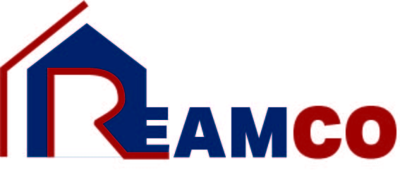
This logo is supposed to represent Reamco Inc., an all-around construction/remodeling business. Their tagline is something along the lines of “Quality, Honesty, Integrity”. In my original logo sketches I was using a gold/yellow with the blue, but after playing around with some color palates I came up with the red and am currently trying to decide if that’s the direction I want to head. Also, does this logo/branding/design seem too close to Lowe’s? I just noticed some similarites…
I’d suggest going back to the drawing board. Take some time to sketch a few dozen designs. Review those designs, and see what is working and what is not working. Toss all those designs out, and continue sketching more.
The logo design you posted is a start. However, before you even consider designing in color limit yourself to black and white. Resize the logo, make it large and small. Print it out, stand back a good ten feet and reassess your work for size, contrast, and so on. I’d do that with any logo you design.
I worked for several years in graphic design/art with a publishing company. Currently my husband and I are hoping to put together our skills (he does web building) and create our own website building/branding company.
A bit obvious and not well executed. What other concepts do you have aside from a house shape? What separates this construction company from all the other construction companies out there? Start with a concept. A house for a construction company is not a clever or interesting concept.
Your sketches should be graphite pencil only. The logo should work in a single color.
Resist the temptation to mutate type into a visual metaphor. It only works maybe 1% of the time, so your odds of hitting in that success rate are very low, and your forced example here is a reminder of that.
The logo doesn’t have to pull off a circus stunt. Many critics will tell you the design must convey everything the company does and stands for, and their personality, and their founder’s vision, and the strength of the things they build, and the colors must signify this or that, and yada, yada, yada. But none of that is true; recognition is the objective, and effective branding is rooted in research. Study the competition and find subtle but significant ways to differentiate Reamco’s “fit and finish” in the eyes of their potential market. Think about your own impressions when you see a home improvement company’s branded vehicle, and how they might influence which one you call when you need them. Think about the ones you’ve already seen and remembered, and recognize why you remembered them. A good brand doesn’t tell a story, it creates an impression — a memorable one.
Firstly, I do want to clarify that I did work my design out in pencil/black and white before I started playing around with the colors. I understand that is an integral part of designing a logo… and I assumed it went without saying. But anyway…!
Thank you very much for the rest of your input. I have to admit I’ve heavily bought into the “your logo must have some cool hidden feature” and it’s been frustrating when I can’t seem to come up with any of that. The comments about checking out ReamCo’s potential market/competitors has opened up a fresh door. Thanks!
I don’t mean to be harsh, I too come from publishing, and the transition to branding is surprisingly difficult. My closest friend is an expert logo designer and we discuss/collaborate a lot. Branding does not come naturally to me as a book designer, in spite of the fact that both book covers and logos are designs that you have to live with a very long time. That said, here it is: your “R” reminds me of a real estate logo, the E is totally lost (it’s reading as “RAM”) and the type is just pedestrian. Before you jump on me for being mean, start with a font, a really good font, one that you like, one that is interesting, without being too cutesy or trendy, but has a feel that you are wanting to convey. Try it in caps, and u/lc. Then try it with some, not all, but some, kind of interesting feature to see how it works, I don’t hate the “house” idea, but maybe something less “literal” and more interpretation of a house. and go from there. Try shades of one color, like the blue, the red and blue are fighting each other in this. I think you can do this, you need to let yourself get looser and have some fun without being too gimmicky.
My first impression of the logo was that it was big and loud and thick and that’s not a feeling I want to get when I’m looking for someone to remodel my house - assuming from the house metaphor that houses are their specialisation. I’d prefer something gentler, warmer and perhaps more modern, thinner lines and font.
And though I agree that the house metaphor is nothing new, if done well it might just work!
Yes, that was my impression too. Rather than residential houses, it has the look of a company that might manufacture and install steel warehouse buildings or perform large-scale excavation or demolition work.
Logos need to hit the right emotional tone that fits the subject matter. You haven’t really provided enough information to say for sure what kind of construction or remodeling this company does, which is important because that would, in part, determine what kind of emotional quality the logo needs to convey.