Stuck in a rut. Help me find a good color combinations for my logo.
I know you’re only requesting feedback on your colour choice, but have you considered increasing the line weight and text weight of the logo, I think it seems a bit too thin?
That said, if you’re dead set on using it how it is, would recomend going for one colour or even just black and white - simple, clean and elegant.
Have quickly redrawn in a thicker weight:
removed by mod
As a reminder, please do not re-do any posts offered for critique and do not offer free work.
Thank you ![]()
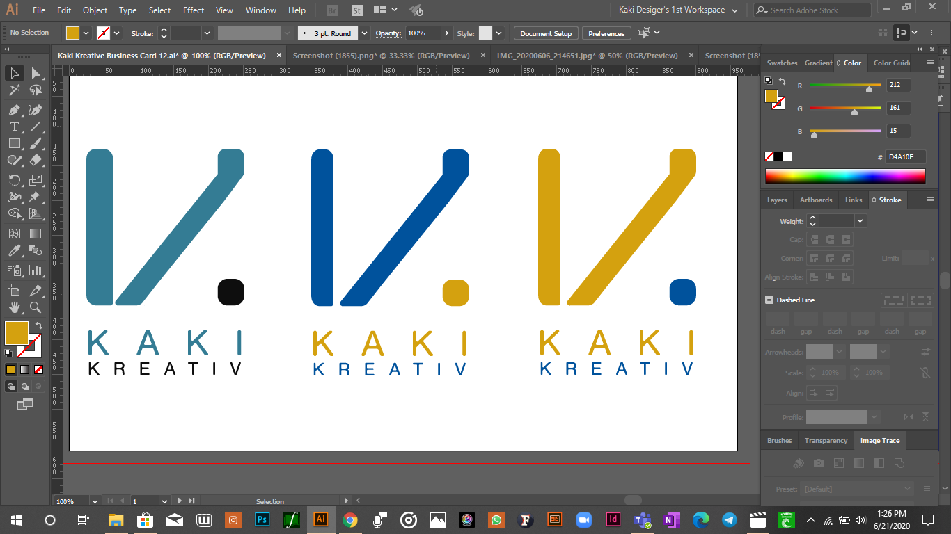
I think the middle one works best for contrast.
Just some comments.
To me, the entire composition seems a bit scattered and loose. Everything is flying apart. The letterspaced words accentuate this appearance. Whether this is good or bad is another issue, I guess.
The diagonal shape is noticeably narrower than the vertical shapes. It probably ought to be the same thickness or, at least, appear to visually be the same thickness.
I’m not a big fan of creatively misspelled words, like KREATIV. That’s probably just me, though.
As for the color combinations, which is what you asked about, I don’t have a preference, but the way you’re using the colors, again, contributes to the scattered or sparse appearance of the entire composition. Personally, I’d be inclined to add some bulk to the logo to better balance out the negative and positive shapes, which I think is similar to what @Pluto was suggesting.
2 Likes
… and me. That makes two out of 5 million. Er, I mean milun.
Just as a side note … if you are going to have a K along with two other words starting with K … that’s 3 K’s right in a row. Might want to rethink that ![]()
Perhaps skip the trendy spelling and go with the traditional spelling.
2 Likes
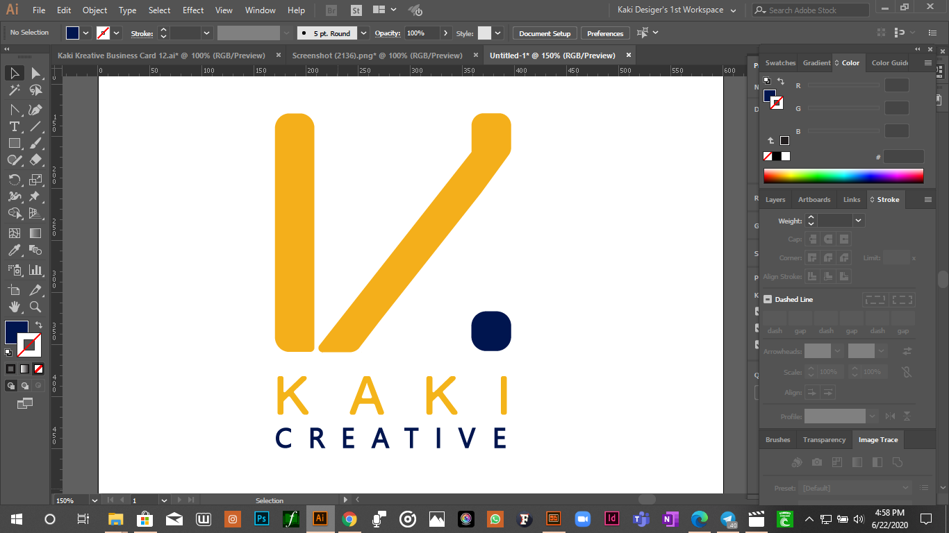
Here’s the thing: You’re setting yourself up for potential entanglement here because of the high contrast between your 2 colors. It works okay on the white background of your Illustrator artboard, but on a light background other than white, the gold color will recede and weaken the presence of the brand-recognition-critical elements, lending disproportionate “anchor” to the period and ‘CREATIVE’.
On a dark background, the opposite will happen, or you’ll have to reverse the colors, and effectively, the same as above will happen.
With a mark this simple (a good thing) a single color is the often a better option than forcing a second color on it (which is what I believe you’re doing here). If this was mine, and I was bent on 2 colors, I might consider making the partial-K symbol and the rest of the elements (personally, I’d get rid of ‘creative’ and the period) a single color, perhaps adding a “background” shape element in the second color.
1 Like
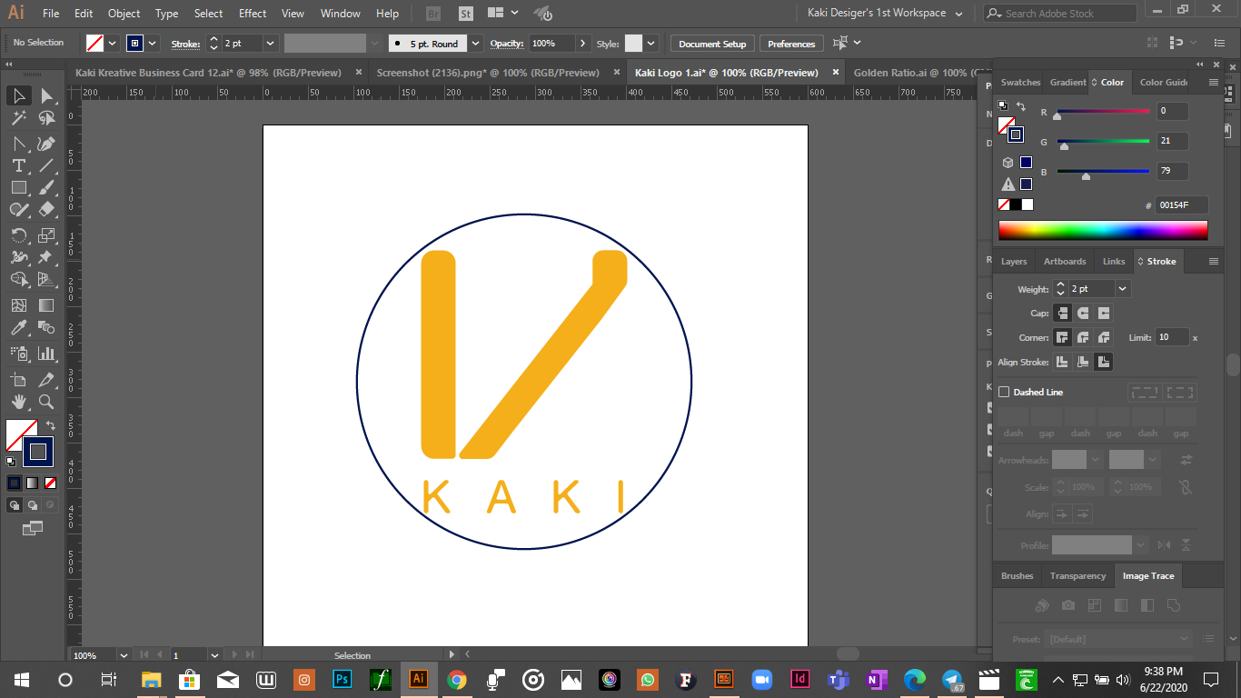
@HotButton is this close to what you’re suggestin
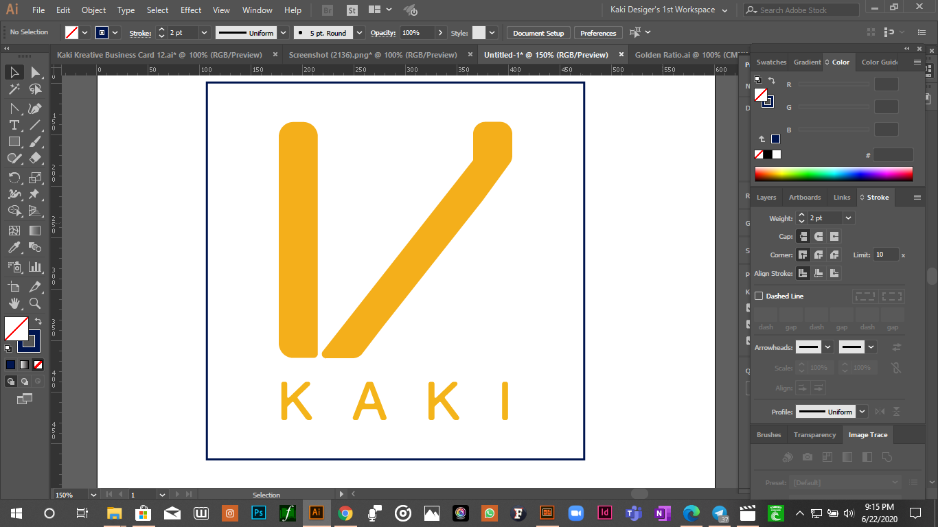
I keep on seeing a V, if you’ll excuse my lack of imagination.
That circle is suffocating your logo.
Is that a brush effect?
I’ll let you weed that vinyl for your sign…
Well, a circle would probably be the worst choice you can make, given the shape of the logo, and just an outline isn’t what I meant at all.
The rules prohibit me from reworking your example, so I’ll clarify my suggestion with this quick and dirty silliness…

I would add: sketch, sketch, sketch. And then make some sketches.
Now i get it thanks. Thanks y’all