I have another logo concept made for fun. Of course, I will be glad if you share your opinions with me.
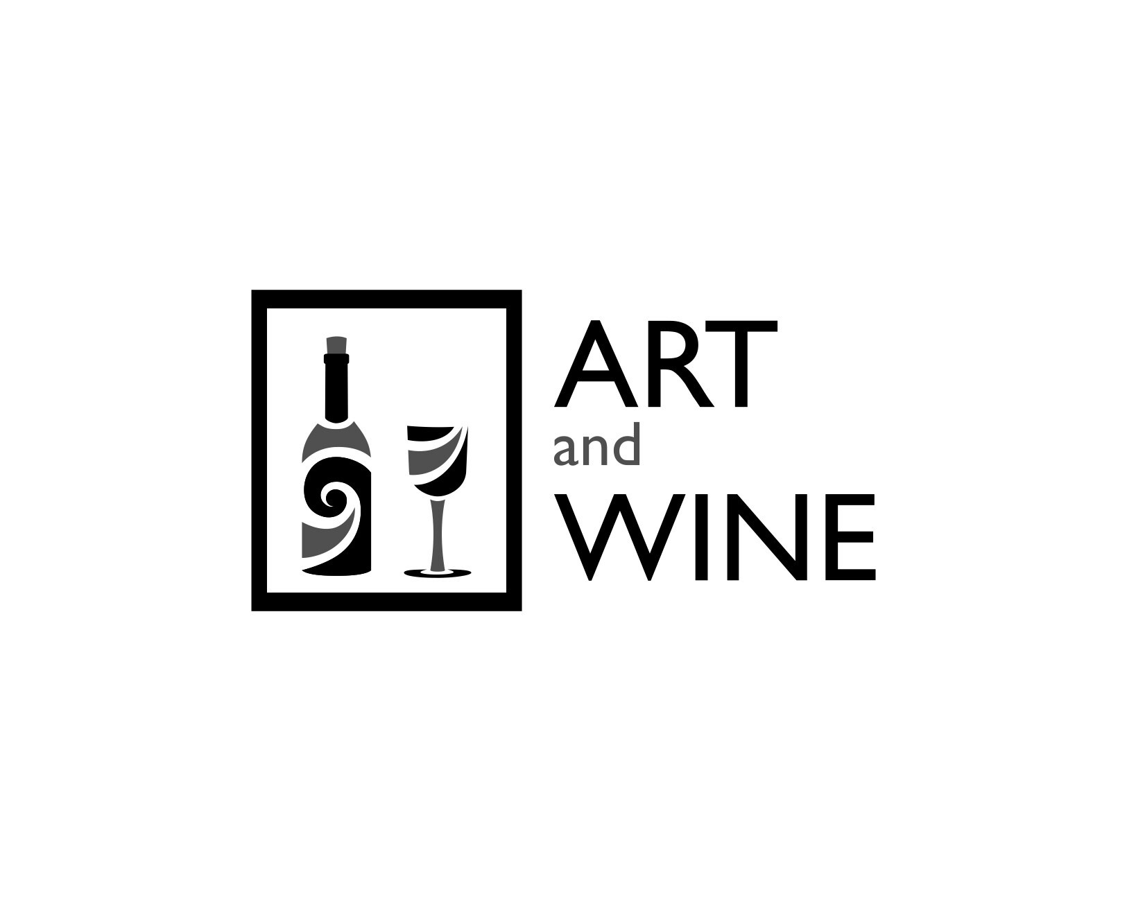
The art goes well together with good wine so the logo could be used for an space where art exhibitions are made. these could be accompanied with the wine tasting event for example.
I like the choice of typeface for “ART” and “WINE” and I think the black rectange looks quite dignified and reinforces the art idea.
The bottle and glass both feel quite busy though and the the lowerase and grey “and” feels like it’s not part of the rest of the design. I think I can understand your reasons why you’re trying to lighten the contrast and make it more subtle, however I think it looks a bit out of place.
Have you considered changing the “and” to the same size and colour as the other words and making it an ampersand instead?
Regarding the bottle and glass, I think you need to pick either the bottle or glass, there’s just too much detail in them, to have them both.
In my way of looking at things, there’s just too much in the logo that doesn’t hang together.
The idea of an artsy wine bottle and glass is interesting in that it suggests both art and wine.
To me, though, your typography has a different personality that doesn’t quite match. The heavy, black border around the bottle and glass seems off too. It helps unify the composition, so I can see why you used it. Perhaps if you narrowed the width of the stroke to match those in the type, it might help.