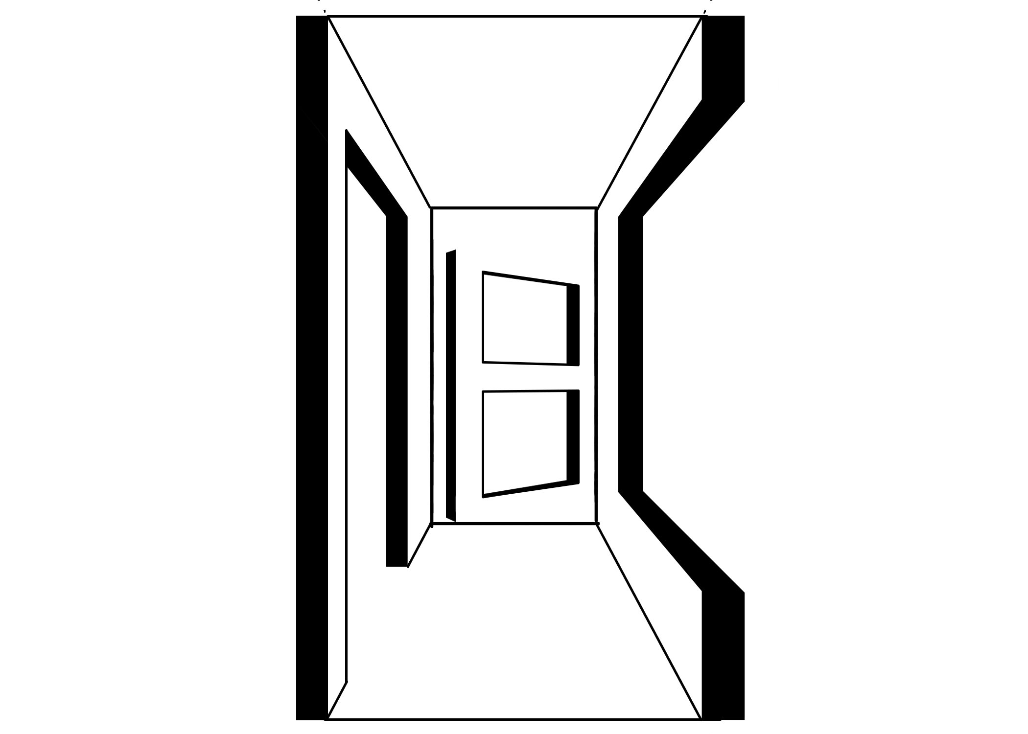
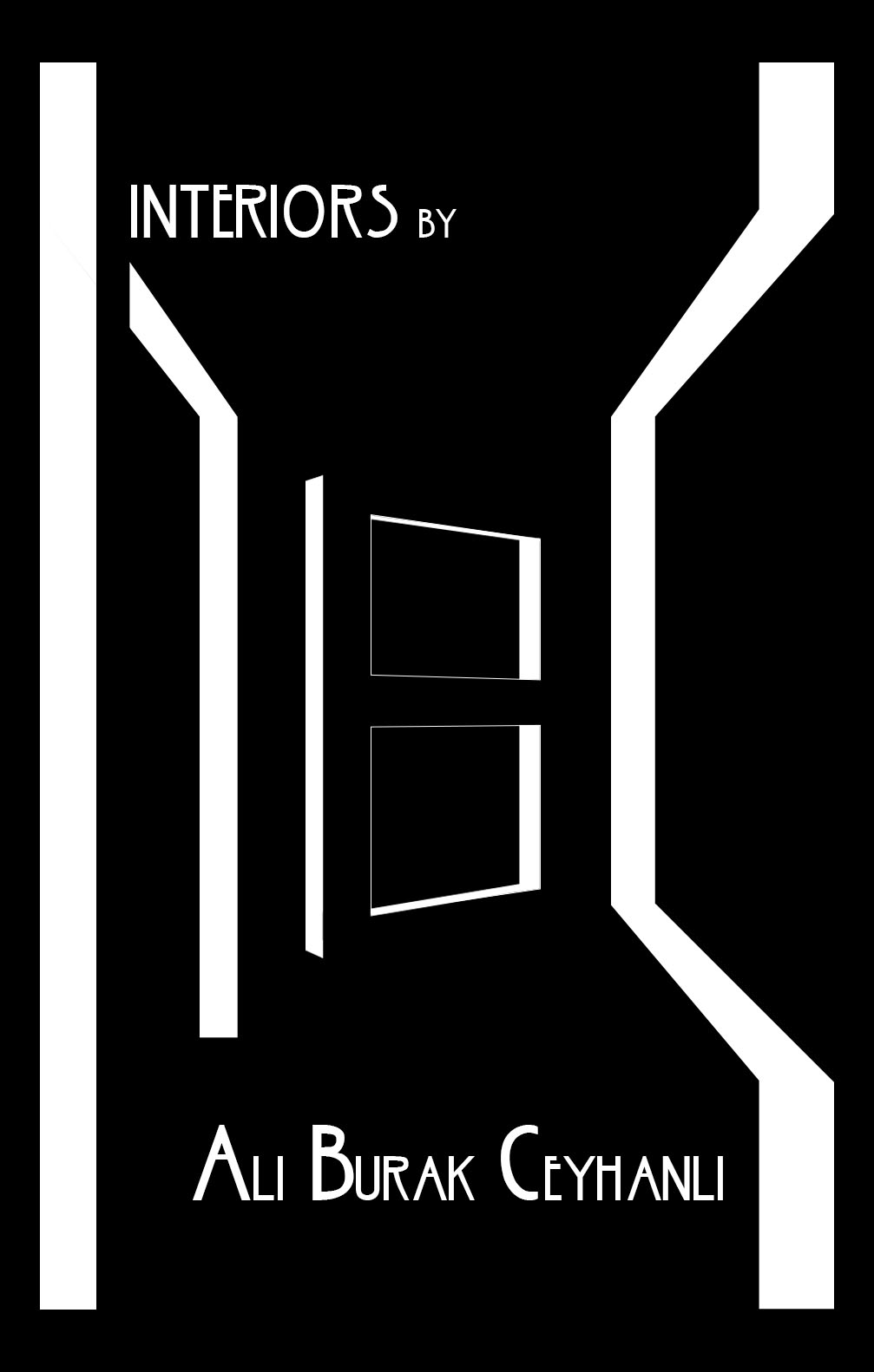
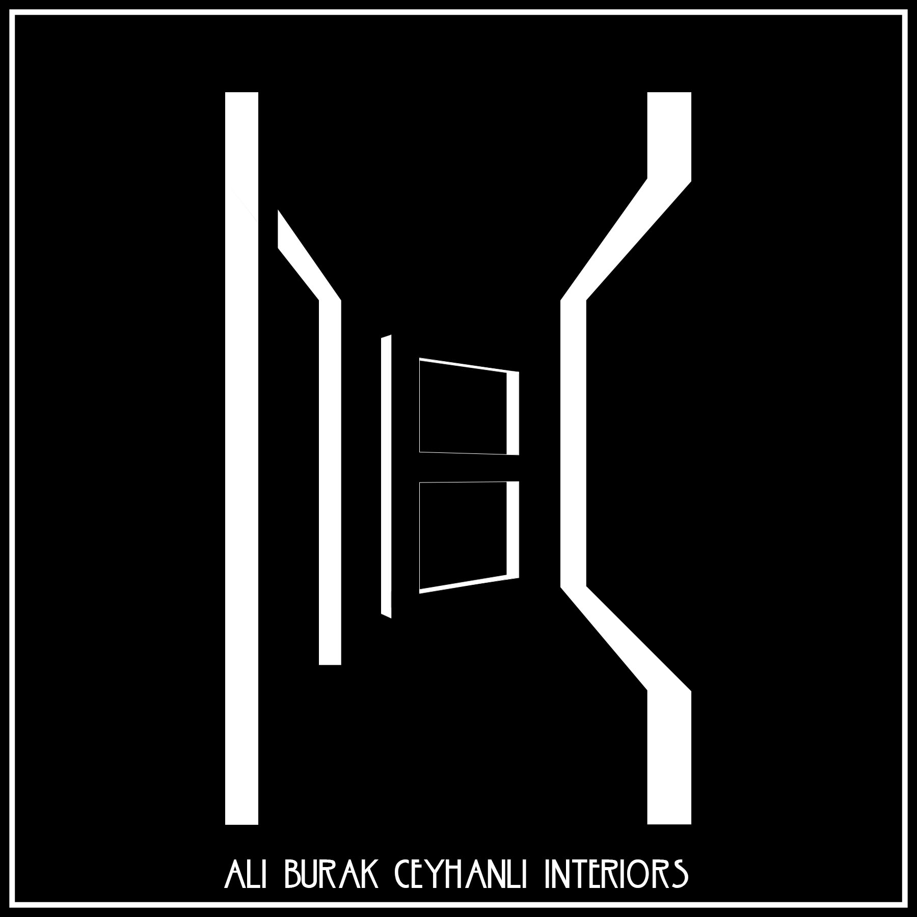
Hello everyone. I really need comments & critiques about this logo for my portfolio website and such. I’m trying to create a space (one point perspective) with my name initials (ABC) as design elements and add a perspective section view style .Thanks.
I think the concept has merit, but the execution needs a lot of work. It doesn’t read as a logo. Those thin lines fall apart at small sizes.
The way you have it locked up with text reads more like a cover of a novel, or film noire poster.
You have to do something about the thin lines on the B without it all getting too busy.
I like the concept.
I agree with the other comments—the concept is really cool, but it’s not quite looking like a logo yet. It seems like the window is the main focus of the logo, so is there a way you could simplify it and remove some of the outer lines so that there isn’t as much distracting from the window? (Not an expert here, just a student.)
Hey guys.My computer is giving me lots of BSOD these days. Sorry for the late reply and Thanks for all the great feedbacks.Really.
BTW That ‘B door’ has been a bad boy since the begining so here is my latest solution.
Cheers.
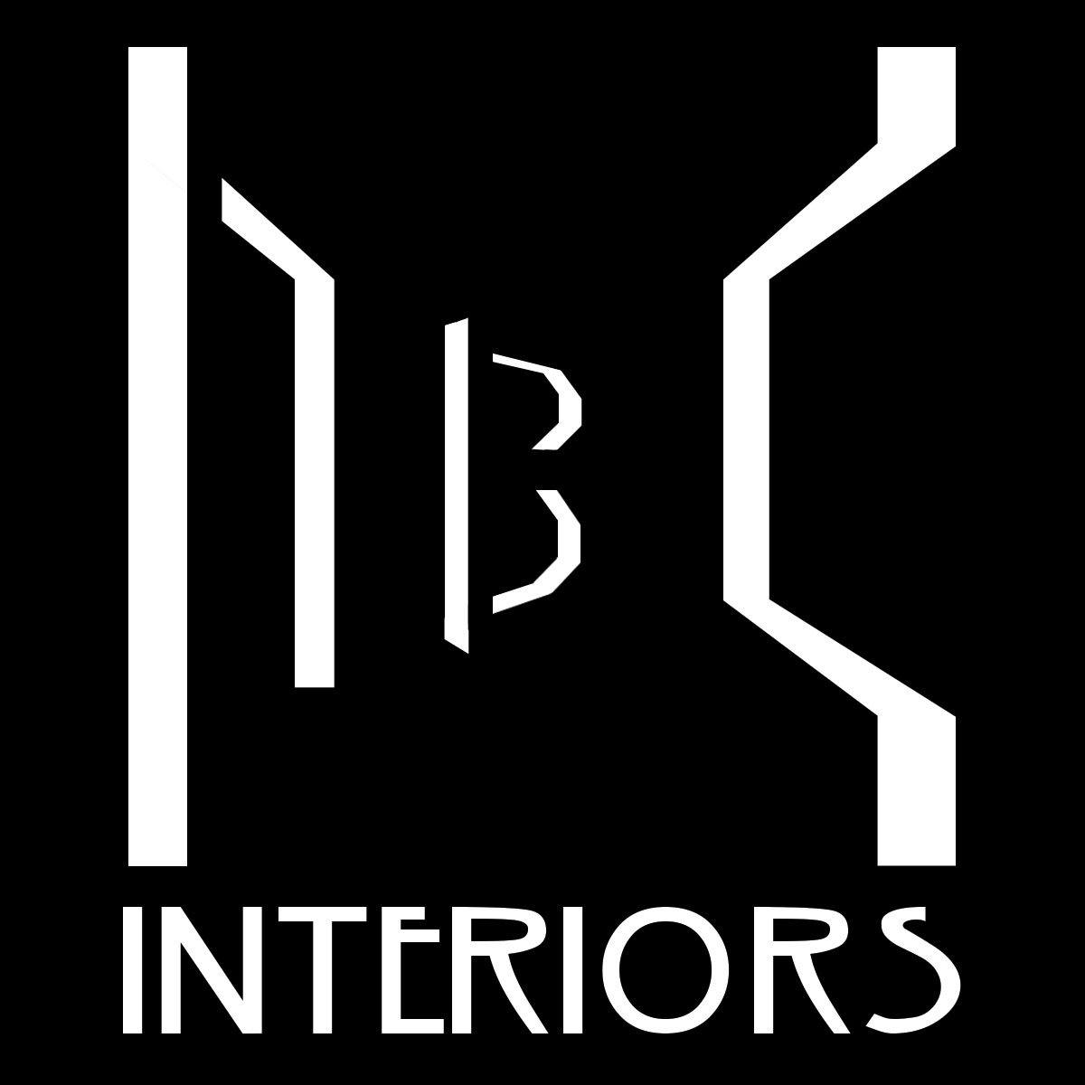
I don’t find that the letters “abc” are easily recognizable enough to hold there own without supporting text. The font you’ve paired with it gives me the impression of cut-rate art-deco as the some of the characters are imprecise, specifically the R’s and S. It also doesn’t pair well with the utilitarian styling of the characters “abc” characters you’ve created. I feel that there is an imbalance in the hallway suggested by the “abc” characters, it all feels imprecise, IMHO, and that is the opposite of something I’d be looking for in an interior design company that represents themselves with geometrical forms or art-deco styled font.
the ABC isn’t really lit properly.The A and C don’t have the same light source as the B.
If you are going to put the crossbar in the B, you should probably do the A (though I get you are trying to make it an archway.)
I’m still digging the concept (but not the font.)
Are you keeping yourself to single point perspective for a purpose? Or might your concept be better suited to a down-angle? I don’t know the answer to that. It’s just something to ask.
I really liked the idea of the design. It is really clear what the company does when you look on it.
This thread is almost 4 years old.
Closing.