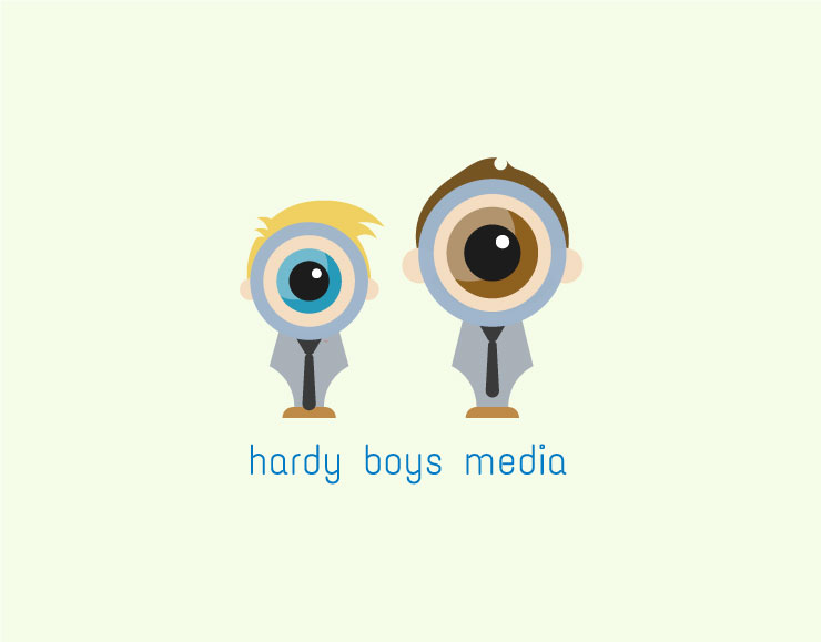
Admin, not sure if this should be a different post or not. Logo design direction for social media company. This originally started being a single figure mascot logo, but it was mentioned it would be more appropriate to have both brothers in the design. So I decided on the idea of the main feature being a magnifying glass to play along with not only the name “Hardy Boys” (yes their last name is really Hardy) and the co-founder wanted to think of embracing the mystery of finding the right content, and to convey focus. The bodies are abstract fountain pen nibs to symbolize the content. And put together in a playful way, we constructed the elements into the brothers/ owners of the company. And the interacting part going along with social media, the boys’ outfit styles can be changed. Although this is about 90%, with color and typeface, I wanted to share and get feedback as character illustration isn’t my thing, thanks all.
I like your thinking, I like your illustration work, and I understand having to work with client demands. That said, I really think you’re trying to do way too much with this approach, and now it’s doubled having two characters. I would suggest you take your strong conceptual thinking and simplify, simplify, simplify. Just my two cents.
I like the concepts: pen nib, magnifying glass, people, tie as a handle, etc., but it is a lot. As Steve suggested, I’d be inclined to simplify.
What bothers me the most, however, is the giant, cycloptic eyeball in the magnifying glass. It’s just a little bit creepy. I don’t know if it would work, but if it were me, I’d try making the eyes smaller and include pieces of other parts of the face and hair, only enlarged some since they’re being seen through the glass.
I’m sorry but think this misses on a conceptual level. It’s quite typical of what happens when you commit to a weak concept and then use every trick in your book to force it to work. The magnifying glass idea was one of the weaker ones in your sketch session, IMO, and the addition of the second brother pretty much negates its potential altogether. The mismatching magnif-eyes side by side dispose of anything clever that could have been done. All that said, your execution isn’t bad at all . . . wasted perhaps, but not bad. From under my Director hat, I’d send you back at this with encouragement to simplify, and a challenge to include both brothers in one single gimmick that unifies them rather than applies to each separately.
I actually think the way you have combined the different elements is quite clever, but the logo doesn’t quite work for me.
-
The eyes look creepy. I’d try and make them cuter. Maybe by moving the position of the eyes so they aren’t look away, but instead look at me. I’d also bring the boys together, as the distance suggests conflict between them. If they were nearer, then eyes would probably look less creepy.
-
I’d drop a few elements to make it simpler. I don’t think you need the ears. The smaller boy could probably be a touch taller so there is a little bit more uniformity. The eyes probably don’t need the inside curve with the lighter shade. I also don’t think you need the skin colour circle around the eyes. (Or if you go with that circle, then remove the outer circle). The smaller boy’s magnifying glass handle could line up with the larger boy. I’d maybe even simplify the hair on the smaller boy so it only has one spike.
I think if you can cut down on some of the elements, it will be a much stronger design.
I think this whole thing misses the point.
The logo isn’t about the brothers.
It’s about the demographic that is going to use the platform or their services (you are unclear if this is a marketing company or an actual social media platform.) Is this going to appeal to a broad swath of that potential audience? If you make it too “cute” are you going to lose audience?
What do the Hardy Boys and magnifying glasses have to do with a social media and how will the logo be deployed going forward? You mentioned outfit changes. Why?
I like the illustration style. I didn’t get the magnifying glass though, and the typography feels somewhat disjointed with the imagery.
Because it’s cute and the founders want to be able to tell people it’s them in the logo.
I agree though, it isn’t about them. I see this too often where the client wants to feel like a star. Some find it very difficult to put their ego to the side and do what’s appropriate for the business.
I guess I’m not the demographic market then.
I’m not going to hire a media company to do corporate social media wrangling that is ‘cute’ and childlike. I’d be looking for serious performance.
But I suppose there’s a market out there.
{shrug}
For a social media platform, if that’s what it is, I’m not sure if this would even appeal to today’s tweens that would possibly use it.
I really appreciate the feedback, wiped my tears and did some more sketches. I will have to post A mark when I get back to my computer, typography might take me a few though, but I’ll get your thoughts on something waaaaay more simplified and focused.
Just an idea after some sketch time. I understand I would need to do something to have this be more unique, but the idea was discover, and focus on the target audience. Got the tissues ready.

Mikedub
Who is the audience: Customers or clients?
What is the service being sold: Creative ideas or methods/process that generate bigger results?
Clients tend to be a smaller base and prefer strong relationships with the business. In that instance, the boys logo has potential.
Customers tend to be a larger base and don’t have a strong relationship with the business founders. So in that instance, the boys logo is the wrong approach.
If the hardy boys are selling creative ideas, then the boys logo could appeal to clients.
If the hardy boys are selling methods/processes that generate bigger results, the two boys logo is the wrong approach.
The one thing that is throwing me is that the magnifying glasses are centered. Are the Hardy Boys cycloptic? Even when working stylistically, keep one foot in the real world. These are the kinds of things that most clients can’t explain “why” it “feels” wrong.