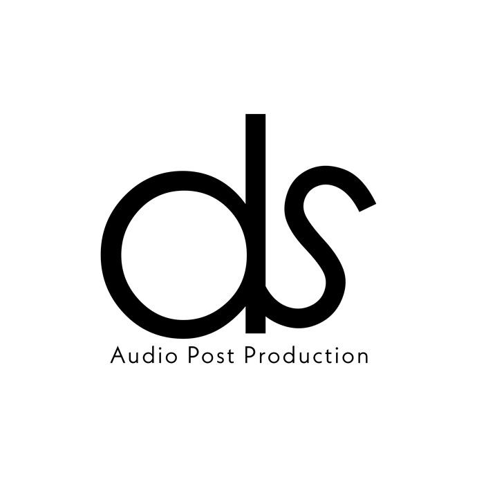
I’m in need of a simple, slick and modern logo for an audio post production company. The name of the company will be DS Audio Post. My biggest problem is that I can’t seem to keep it clean and minimal without it just looking plain, boring or amateur looking. I feel like just a single tweak could bring it there. See below and any guidance would be greatly appreciated!
It would be helpful to have some sort of a brief … what does the company do, who is their target market, etc. Even without that information, though, I feel pretty comfortable saying this is not the best solution. It looks like you were just messing about in Illustrator. Is there a reason the S is angled? How will the delta between the size of the “ds” and the size of “Audio Post Production” play out when this logo is applied in day-to-day use? Sorry, but I think it’s going to take more than a “single tweak” to make this shine. I think you need to spend more time in the brainstorming / sketch phase. Hope that helps even though it’s not the answer you were looking for.
Totally agree with Steve_O, we need more information to provide any meaningful feedback.
Totally fair. I’m obviously very new to this. The company will be providing sound services such as music and dialog editing, sound design, mixing, music licensing, voice over recordings etc… There will be a strong focus on working with high end advertisements and marketing campaigns. This is a one man operation so the DS is the owners initials. I was trying to avoid the standard tropes of incorporating graphics like speakers, sound waves, microphones etc… This was my 5th attempt but I do think I need to go back to the drawing board.
It can be read as “ols”. Think about that.
hello this is normal, what i do first is to try it on a mockup related to the company, if you still not happy with it doo a fast different one unti you figur it outt again thats what i doo after my research and brainstorming…
Good luck!
@photofractal I want you to imagine that you’re a furniture designer and you’ve been tasked to design a a single seater chair.
If that’s all you’ve got to go on - well, there are probably millions of potential design you could come up with: armchairs, dinning chairs, outdoor chairs, portable chairs, big chairs, small chairs, stools, affordable chairs, industrial chairs, office chairs…
How are you going to know what’s a good solution and what’s not?
However, if I said I needed you to design a portable camping chair for kids aged 4-6 that’s supposed to look fun - you might have a pretty good idea of what a good solution might be.
The more you know about the business you’re designing for, its customer demographics, what the companies positioning is, where a logo will be used, is there a particular of genere of audio material that’s being process, the easier your job will be at determining what good solution looks like.
Personally, I think you might be closer than you think with this one. I spent countless hours over my 50-year career doing audio post production directing as an Advertising Creative, and I saw possibilities in this design. I immediately thought of the “d” as a roll of old school audio tape on a Post Editor mechanism with a portion of the tape pulled out (the “s”). Keep thinking it through and I wish you the best of success with this project.
