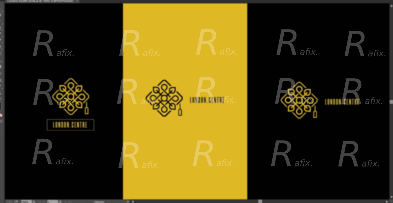
Hello folks .. I am attempting a logo design for a “about to” inaugurated local centre in Pakistan that provides services in education, health, wellbeing and beauty(cosmetics) and goes by the name London Health Education Wellness and Beauty Ctr ( Please keep in my mind it has nothing to with london though). Initially, keeping in mind the services I have tried to incorporate them into logo in respective symbolical way to represent the overall business mode. Heres my attempt :
I have tried to give a graduation cap look that represents education, leaves as wellness ( go green inspiration), have tried to represent health with line art motif (lifeline) (i dont know if people get it or its me not explaining it properly), all incorporated into a symmetrical identity represents “beauty”.
Well, that’s what I have reached up to so far after multiple hours of contemplation and brainstorming.
Please provide your thoughts and constructive feedback on it.
I actually like the execution of the mark (from what I can tell, the image you uploaded is pretty blurry).
I also will say that you are facing a challenge in coming up with a logo that represents the notion of Health, Education, Wellness and Beauty. But I do feel like it is a good start. My initial concern is how the name of the actual organization is so much smaller than the mark.
I will also say that trying to incorporate all of the elements such as health, wellness, education and beauty in the logo as a literal representation isn’t necessary, but you do need to come up with a mark that can help convey the notion of the brand and what it is that needs to be communicated.
Just out of curiosity do you have other sketches or ideas? Sketching with actual pen/pencil and paper (or even “sketching” on a phone or tablet in a drawing app of some sort) help to quickly work through concepts and ideas without getting so hung up on rigid execution.
Thanks for the feedback and giving me a bit of optimism lol.
To start off, yes it is a challenging task for me and I may counter few more in upcoming phases. However, I tried to focus more on the mark than the text to “get it right in the beginning” and that’s kinda answer your curiosity as to how the name of actual organization is quite smaller than the mark itself because it has not been paid much attention. And that is what I am trying to fix next. I will keep in mind what you said.
For other sketches and concepts, I am working on it and initially put my first concept to see if my brainstorming process is in the right direction.