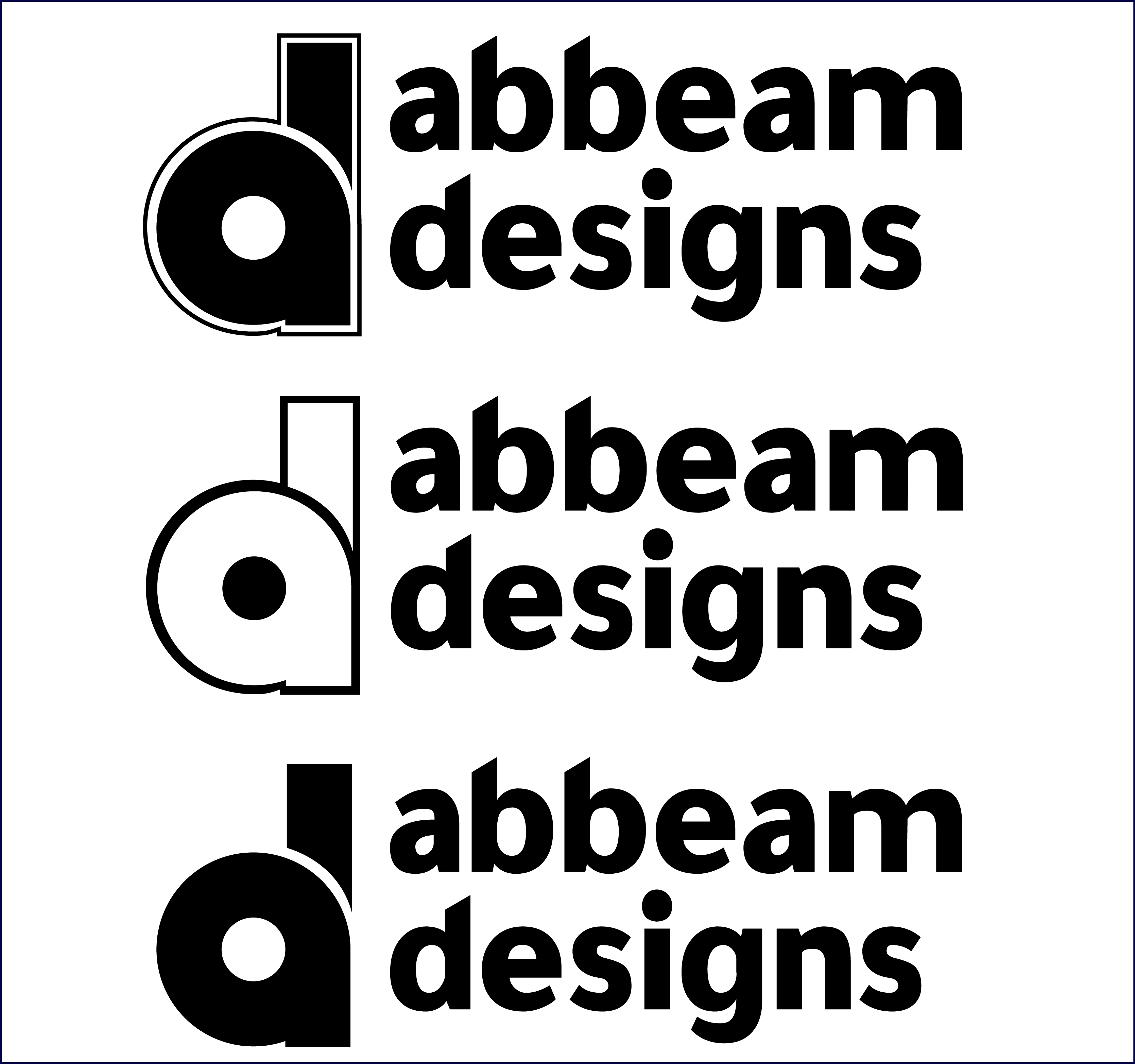
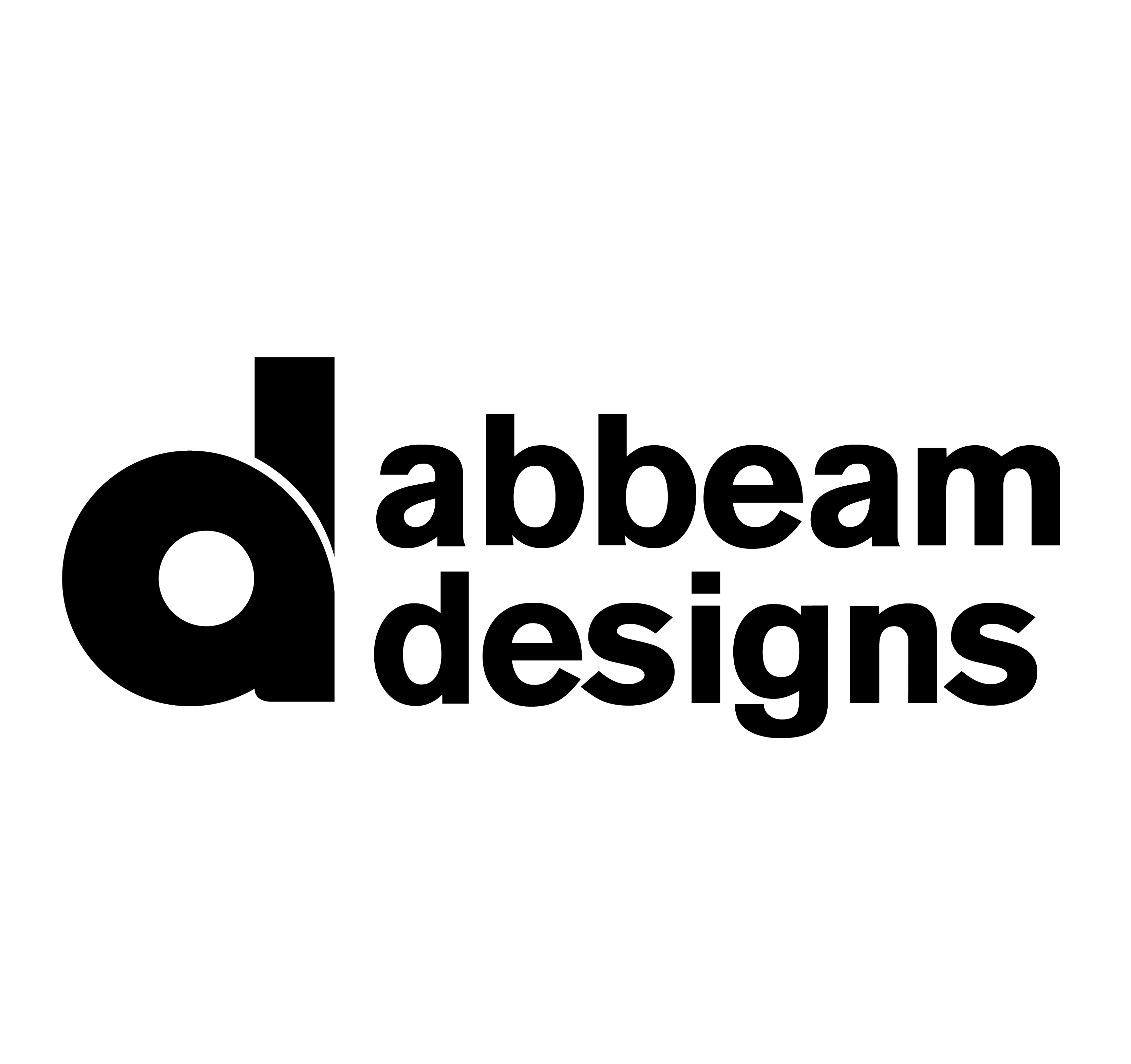
Here is an upload of my logo redesign. My old logo (Abbeam Graphics) doesn’t seem okay for me. The redesign features the initial letters of my name “A” (Abbeam) and “D” of Design. The logo is designed in lowercase and the letters “a” and “d” are merged together. I desired the logo to appear clean, bold and simple.
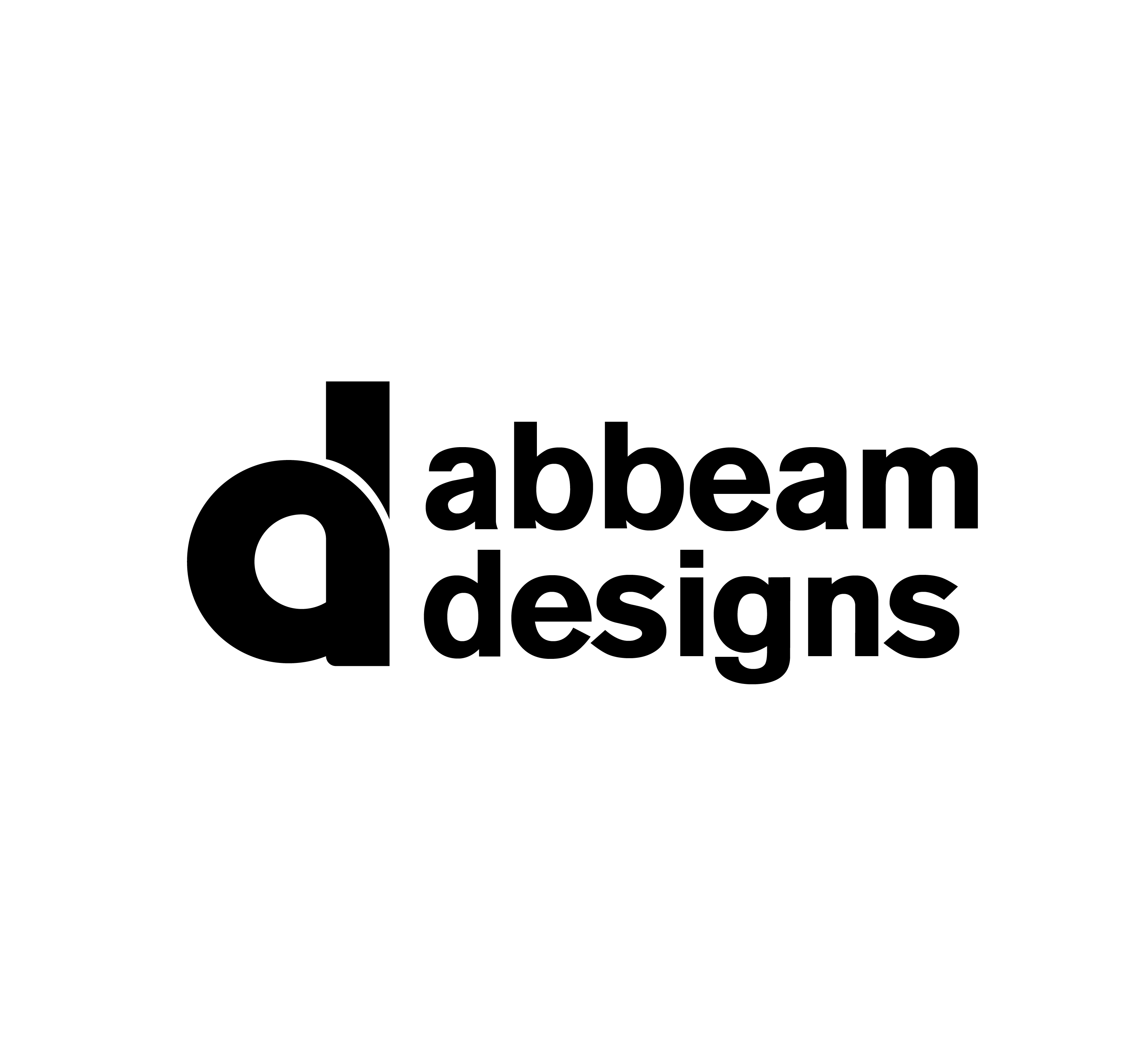
I want to know whether the line and letter spacing are okay. I want to choose the last one.
I would get rid of the lower case “d” and just keep the e with the actual letter “D” design. the “designs” text seems to be too far up not sure if it is meant to be like that but for me it looks off.
Of the three variations on the mark that you’ve submitted, I would say the third option is the strongest.
As for the type, it needs some work. One of the things I see over and over with logos that are submitted for critique is a lack of sensitivity to type. The font, the capitalization, the relationship of the type to the mark – contrast, visual weight, size and position – are all critical.
This work gives me the feeling the type was just slapped on. Sorry; you need to spend more time on this.
In addition, when it comes to typographical marks, simple geometric shapes can’t necessarily be used without visual adjustments to compensate for optical illusions and areas of visual weight where various shapes join.
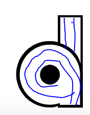
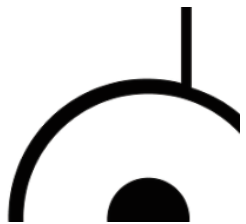
For example, take any well-designed typeface, like the one you’ve used to spell out Abbeam Designs. Notice how the thickness of the bowl outlines on the d, a, b, m and g decreases as they merge into the stem of the letters.
Now compare that to how you’ve constructed your d logo and how you haven’t made those visual adjustments to the bottom of the letter where the bowl connects into the stem. It creates this awkward little nick in the mark where the bowl abuts the heel of the mark. In addition, since it’s a rounded shape, the bowl would typically extend just a little bit below the baseline of the heel, which yours doesn’t.
You might want to do what I described above and exaggerate the nick by decreasing the thickness of the bowl as it merges into the stroke, decreasing the width of the heel, angling its left edge, and dropping the bottom of the bowl to just below the baseline. It’s difficult to explain in words, so see below.
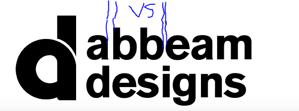
I think your type looks much better with that font (is it Akzidenz Grotesk?), although you have a little refining to do get it on point. Would recomend tweaking the spacing between the characters. Notice the drastic difference in space here:
Regarding the mark, if I’m totally honest: am not much of a fan, mate, personally - I’d scratch it and design a different one, but if you are dead-set on using that mark, have you tried grabbing the black weight of that font and doing the “d” in that then using a straight line instead of a curve?