Hello everyone,
Criticize this logo and tell me what you like and what you don’t. Thanks!
1 Like
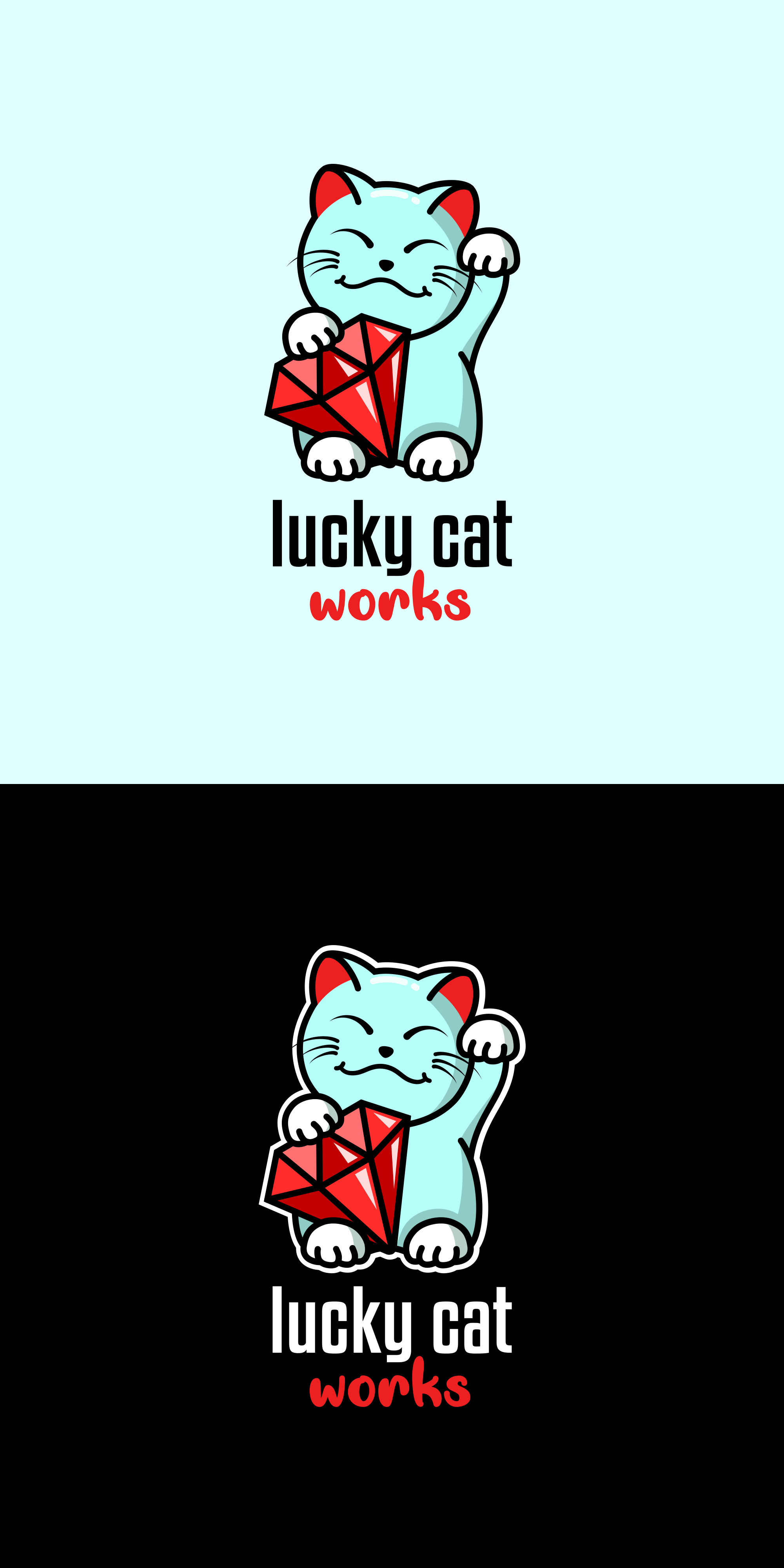
At first glance it’s a very cute illustration, however there is a lot going on. Too many colors and such fine detail, I fear it would be lost in the printing and scaling process.
In my opinion that is ![]()
1 Like
Oh and also …
Welcome to the forum Rami ![]()
Perhaps lucky cat works, but the shadows and reflections don’t.
1 Like
It’s a 6-color logo. Could be expensive depending on what you plan to do with it.
As for if it’s appropriate for its purpose, can’t tell as you’ve given us no information.
It is cute. It reminds me of the cat sculptures I see in a lot of the Chinese Food takeout places around here. Which I think it is meant to do. But if you are selling death metal costumeware, cute doesn’t work.
1 Like
Thank you![]()
1 Like
Thank you so much I started to like it![]()
![]()
1 Like
Thank you. It’s fo a web design company. They wanted this style!
Somewhere what a client wants and what they need and what will work for them are two different things. Sometimes (fairly regularly), part of the designer’s job is to educate the clients.
I once did an annual report for a company who ran a huge, international container shipping company. The CEO said, ‘Can we ’ave the front pink. My wife likes pink.’ He didn’t get pink, but it was a hard slog explaining market sector, client and investor expectations, etc, etc.
What you have there, as others have said, is a cute illustration. It’s not an effective logo, as it needs a lot more simplification. What it is definitely not is a logo for a web design company. You’d think they’d know better, unless it is one of those companies That are actually developers who call themselves designers. Either way, I think you need to have a conversation with your client about effective design. To my mind, (with a caveat that the design and name may be a little more OK wherever this company is based), a name change wouldn’t go amiss either.
1 Like
I agree with the other comments, but with a few caveats.
It’s a nice little illustration. I like it a lot. However, as others have said, logos need to be simple or they cause many problems. For example, when this company wants to print their logo on the barrel of a pen or print an invoice from a black and white laser printer or embroider it onto a company hat, this logo, with all its detail and color will cause reproduction problems.
That said, there’s nothing wrong with having multiple versions of the same logo for use in different situations. Your logo might be absolutely fine for use on your client’s website and that might be its primary purpose and use. However, you need to think past that to those kinds of instances I mentioned where it won’t work as well. Solving that problem might mean creating a simpler version and one that can run in purely black and white (no grays). This is a common way to handle these problems and it involves explaining the need for it to your client.
Then again, maybe your contact with the client is limited. Maybe you’re creating this as part of a remote crowdsourcing job where the client only requested one logo, only has a budget to pay for one version and where you have limited ability to explain it. Well, this is one of the problems with crowdsourcing — designers are being paid lower wages to design what the client wants instead of what the client might need. If that’s the situation, maybe there’s not much you can do about it, and if the client likes what you’ve done, that’s about all you can do. It’s important, however, for you to know that it could have been done different in ways that might have mitigated the problems that have been mentioned by everyone.
I’ll add one more thing. If the name of the company is Lucky Cat Works, why is the word works in a completely different typeface. To me, it introduces yet another bit of needless complexity into the logo the detracts from the drawing of the cat.
With all that criticism, however, I really do want to stress that you’ve created a really nice little cat. I love it.
1 Like
Welcome to forum! It’s looking very cute at first site but i agree with others too many colors making it too complicated for printing, try to simplify it!
1 Like
Dammit. I really must learn to check properly before posting. I meant, Sometimes. Corrective typing strikes again.
1 Like
You are absolutely right. But sometimes you stubborn clients!
Thank you. Yes it’s a remote work that’s why I coudn’t do anything. For the word ‘works’ I wanted to break the sans serif font by adding a script as a touch of the drawin above of a handy drawing.
Thank you. I will