I have no formal graphic design education, but I enjoy learning and flexing my creative muscle. My background is actually in experimental writing (with a strong visual component).
I’m starting a new business, and I’m pretty much on a budget (also, I do love a challenge), so I decided to try to create a visual identity for the brand, starting with a logo. If I really really suck, then I will hire a professional designer, but I wanted to try myself first!
So, about the business:
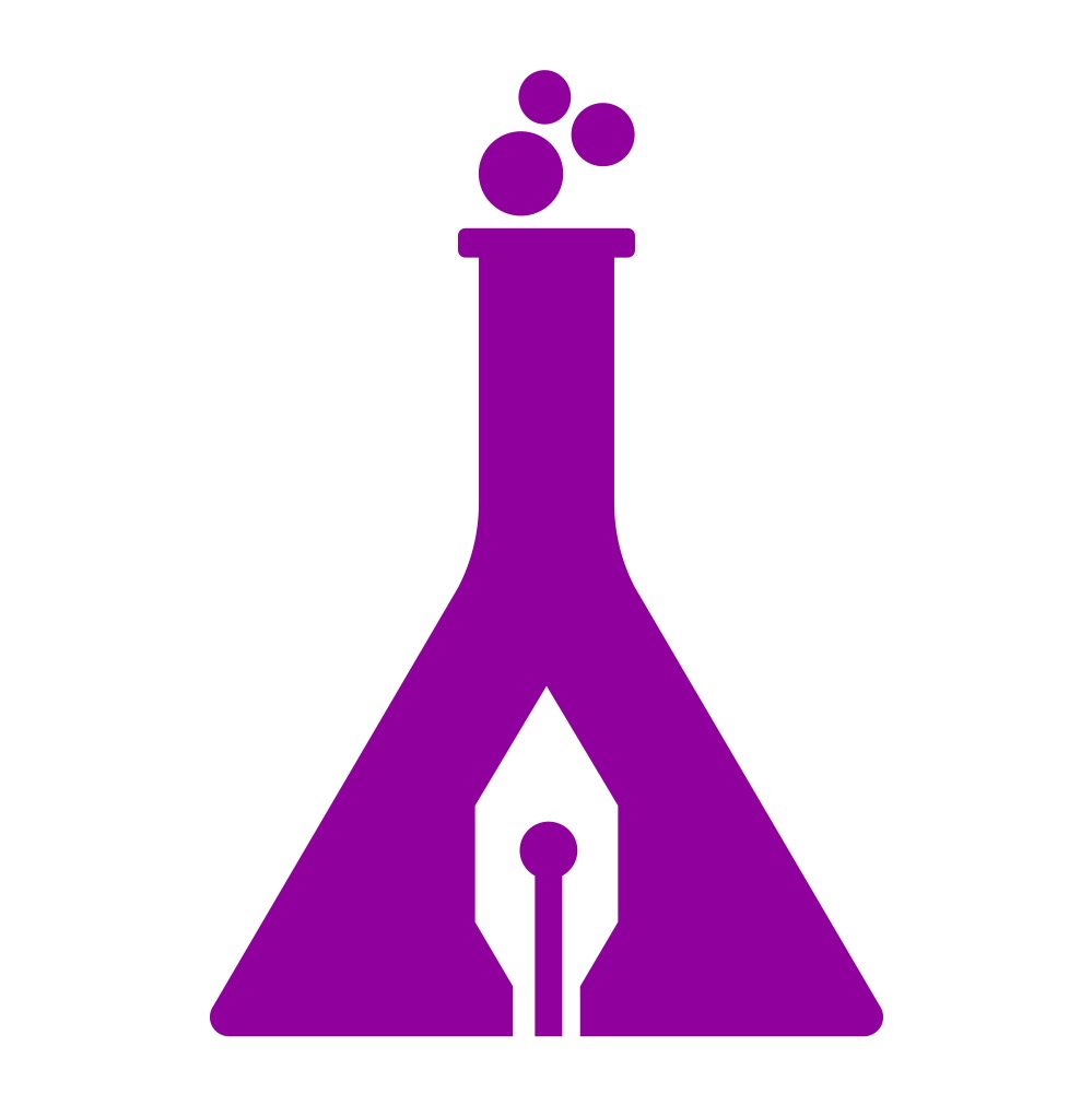
Concept: logo for a creative writing education business called ‘Experimental Writing School’. The experimental component is crucial, and so is writing.
Format: Mostly digital, after a while also print.
Audience: Creatives interested in writing, amateur writers interested in improving their writing skills.
My experience level: informal student, I guess.
Nature of Job: a self-directed project for an actual business.
I’m exploring two routes here. What do you guys think? I’d appreciate your feedback a lot, and thank you for taking the time to look and answer!
The first thing that strikes my eye is the pen nib. The slit is at the tip, as anyone who ever uses a pen can tell. To have that in your logo is not helping.
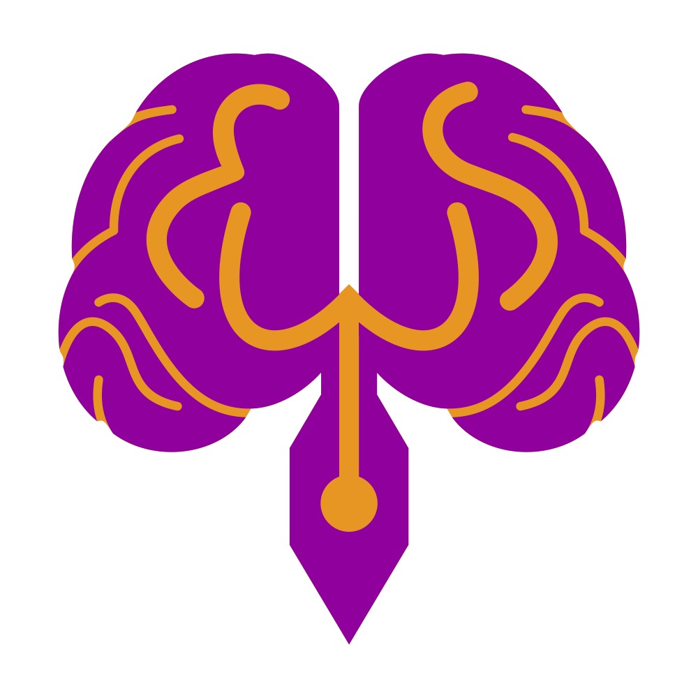
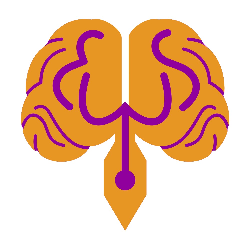
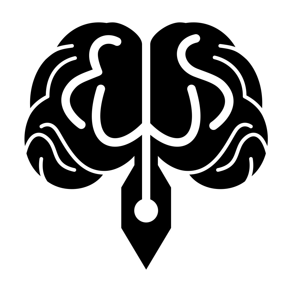
The first one has an awkward combination of a nib and a lab flask (or an inverted “Y”). Is it lab report writing?
The second one is a little more interesting; but to a depraved mind it suggests a pointy family jewell. Hope other minds are not as morally corrupted.
Honestly; I’ve seen worse, but… hire a professional. Even though I can see where you are coming from. It is a very broad brush stroke, cliché approach. First idea stuff, that everyone goes to, but that need to be discarded.
Even if you could get that to be aesthetically pleasing, then it would still not be doing the job you need it to to be doing. It would only (possibly) say what you do and act as adornment. It would still not communicate how you do it to a specific, intended audience. That requires skill and experience to speak in the right tone of voice to the right people.
Mechanics with crossed spanner and screwdriver logos are never going to get to work on Aston Martins. Greengrocers with smiling apple logos are never going to be the go-to for chefs to source fine foods. See what I mean? It’s fine if you need an oil change for your Toyota, or 2lb of Maris Pipers, but people looking for white truffles are going elsewhere.
Broad brush stroke logos that say what you do are not discerning enough to speak to specific, targeted demographics. You are trying to talk to a pretty specific group of people.
By the way, when seeking the right designer, beware those with question marks in thought bubbles!
I like all of them, but as a suggestion if this logo is for education why not combine the chemistry bottle with the brain ?, I mean just to show to the user what are you speaking about. I hope this helps !
One would think the conical would be in the pen nib.
It looks like a logo for a pharma or chemical company.
Currently you get the meth lab vibe for it rather than a creative writing vibe.
The other one looks like a diagram of the female reproductive system.