Version A Aside from it being a 9 and 7, i’m not sure what else it could be. It is recognizable though and a cool looking design.
Version C is also nice. Easily identifiable. The only issue I have is the way the corner point of the top right of the 7 doesn’t blend with the 9 like Version D sort of does. Perhaps adding a curve to that corner in Version C would be cool. (Don’t forget the inner corner of the 7 for a curve as well)
I like B. There’s something elegant about how the 97 is made up one unit. Have you tried making the top left point a round instead of a sharp corner? That might help the readability of the 9.
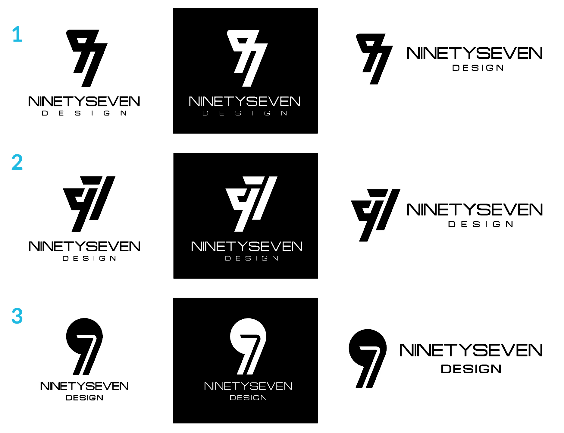
Thank you Line and Buda for your comments. I took your advice and made those changes to the designs and this is what I came out with. I´ve narrowed it to 3 options and included for each a black background and the logo in horizontal mode to see how they work in different situations. I think I´m getting close!!
I’m a student, so don’t take my word as expert advice, but at first glance, I’m really drawn to the third option. The first two seem too intense for me. I like the contrast you have between the rounded icon and the more box-like type of option 3. And it’s nice and simple!
I dig #3
I get it easily, looks nice. The new thing to try editing is your wordmark.. Perhaps making the NINETY block-ier/bolder than SEVEN to relate to the logomark.
The white on black looks quite good on #3, but im not sure the shape of the 9 looks right.especially with the rest of the design & lettering looking straight & tight. Maybe mess around with the size and shape of the 9 to lose some of its “roundness”. Solid ideas though!
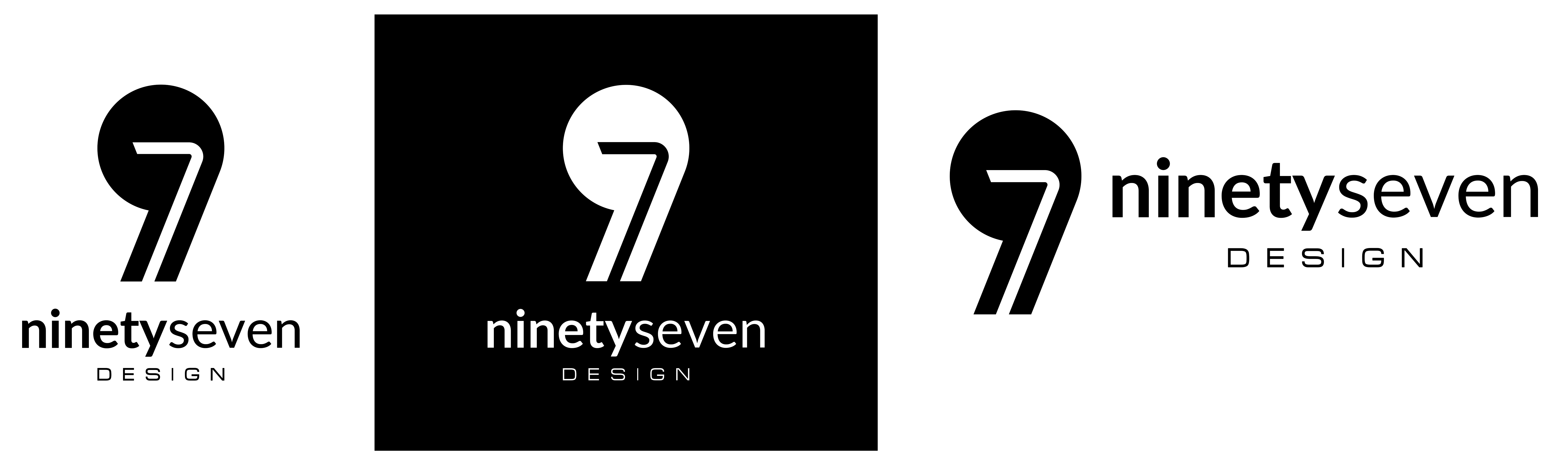
Hey Line! thanks for your time to comment. I gotta say we think very much alike because I thought the same thing about the wordmark some weeks ago but I forgot to post my final design here. I´m gonna post it, I think it looks good. Tell me what you think!
Hello all. It´s been a while since I posted here but I´m glad to tell you that I came to my final design which I present here. I´m quite pleased with the result and I would like thank you all for your time to comment and help me get to my final design.
Cool beans the “design” text I might also change .. perhaps a little bigger.. or different font or more space in kerning… Stuff to try..
Also, one last thing.. It’s bothering me only a little bit that the 7 is the length that it is, but I am curious to see how the 7 would look if the bottom portion was lessened keeping the top of the 7 where it is, just cropping up a little and corking the white space to be black with the 7 inside. I understand it would no longer be of the white space but I am curious to see how it would look.
I saw your recent post says final but I’d be curious to know.