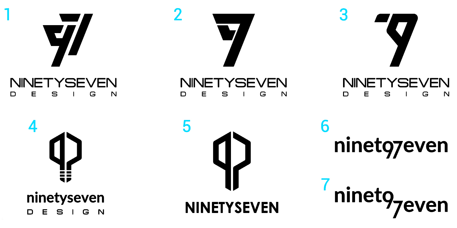
Hello all! I´m new here and would like for you to please give me some critique on these logos I designed. The company is for industrial design, tv set design, stand or expos, pop displays, etc. Ninetyseven stands for my initials which are I and G.
What do you think?
3 Likes
Oh, goodness, please, No Lightbulbs…!
The “ninet even” isn’t working at all either.
#2 and #3 stress the 7 as in 79.
#1 works the best but jamming the “ninetyseven” then stretching the “design” isn’t the best solution to this.
Not sure where the I and the G of your initials enters into the picture.
Keep sketching.
3 Likes
These are smart, but none of them are just right just yet… All of them feel a bit forced, and ‘overdesigned’. Work on it more and find a simple visual solution. I think you’re halfway there…
1 Like
I think #3 is an interesting idea. It looks like a person bent over (I suppose that’s what you were aiming for?)
Though unfortunately it doesn’t go with what the company does. Could be used more as a logo for an athletic event or something similar.
But if you could somehow make it more relevant for your company, I’d try and develop it. Or perhaps use it as a base to work on a clear and simple design.
1 Like
I like the Flamingo in #3
though as stated above, it could be a person bending over and waiting for someone to come [sic] by.
3 Likes
Thank you for your reply!
As for the lightbulb I don´t like it very much either, just throwing some idea out there.
Do you think the 7 is stressed more in #3 tan the 9?
Oh and the letter I is the 9th and the G is the 7th of the alphabet.
Thanks for your feedback
Thank you very much for your critique. Any ideas as to how I can make them right or which has the most promise?
Thanks for your reply! No, I wasn´t trying to aim for a person bent over. It is supposed to be a 9 and a 7 merged.
I´ll keep sketching.
Thanks for your reply!
For what it’s worth, ninety-seven should be hyphenated. Companies with typos in their names can make a bad first-impression.
As for the numeral 97, I think you’re trying to force those two glyphs to do things they just don’t want to do. One thing I learned early in my career is that when a seemingly good idea doesn’t pan out quickly, the best thing to do is move on to the next idea.
4 Likes
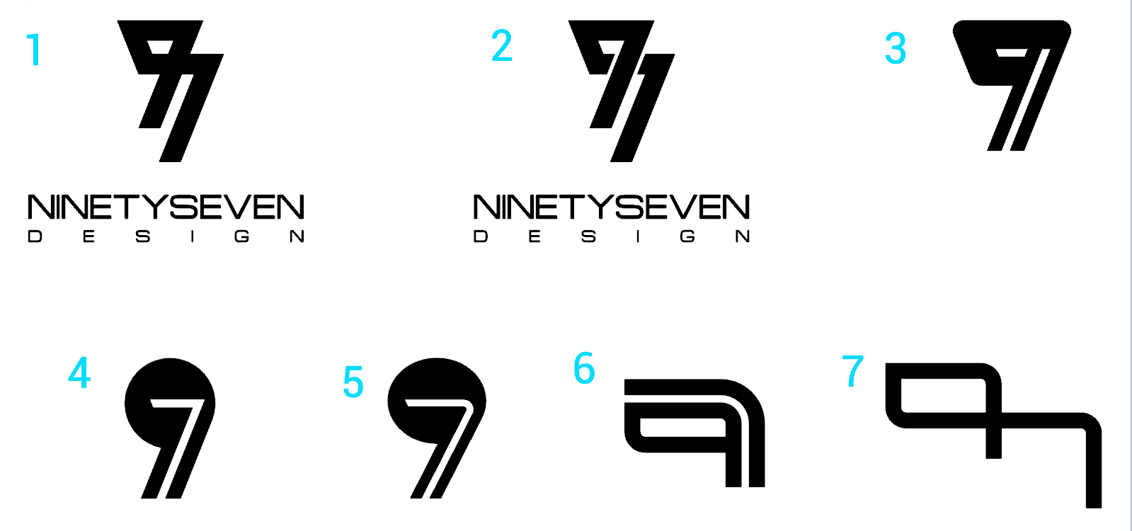
Ok so I kept sketching as some of you suggested and made it simpler. I only included the name on the first two but all of them would have it. I´m looking to have a name and a mark that can be recognizable for itself.
What do you think?
1 Like
I get what you say about the hyphen being the correct grammar but on this case I think I´m gonna leave it without it for aesthetic purposes.
Do you think my new designs work out better?
Thanks for your feedback!
#1 is the best, however it still needs some adjustments and maybe some shape of enclosure or partial enclosure.
1 Like
Some of the other users suggested to make it more simple, which I think I made. Don´t you think that by adding enclosure I´m gonna make it more complex or ´overdesigned´?
Thanks for your feedback!
It seems too open. Just a collection of shapes beside each other. Something like a half circle border might make everything appear as a single element. But that’s just my opinion.
Or all reversed out of a half circle solid black.
The 97 is too far away from text too.
Also use the ninetyseven from the old one’s #4 (Not the word “design” tho)
Hi NinetySeven,
Nice designs..
I like the idea of the 9 and 7 being part of your name in I and G. I would think that the company name should be nine seven myself.. 97 technically goes outside the alphabet ![]() But I understand how people would read it too.. so.. there is a quandary.
But I understand how people would read it too.. so.. there is a quandary.
The design that i would like to see more like a 9 and 7 is your logo design idea number 4-5..
Perhaps the way to make it work would somehow to work the 9 as the outer portion of the bulb and the 7 as the filament.
I look forward to seeing what comes of this post and your logo!
-Line
1 Like
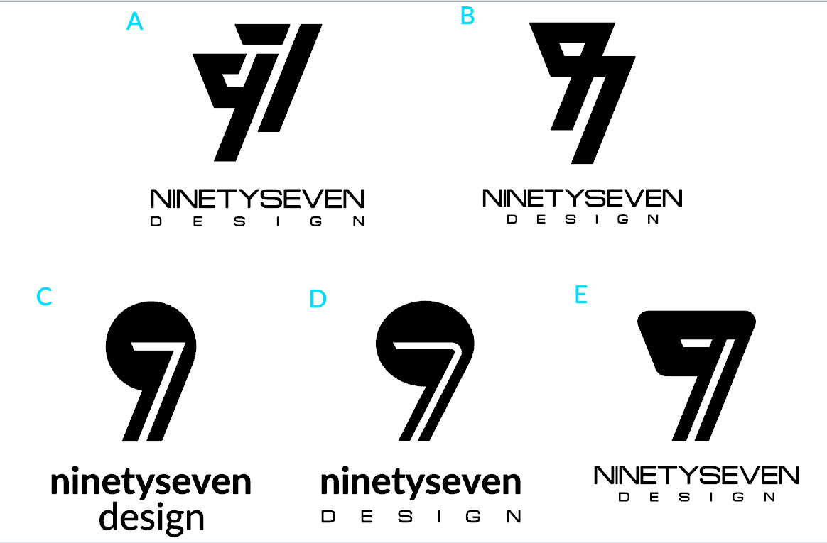
Hi everybody! Thank you all for your kind feedback and critique. It seems that I´m getting mixed comments and ideas from my logos and I´m kinda lost as to what direction I should go for. So I´ve selected my 5 personal favorites from all the options that I posted and now using letters to identify them and avoid confusion.
I would appreciate a lot your help since I don´t havea lot of logo design expertise.
What do you guys think???