Hello everyone! I´m also new here and would like for you to give me some critique and an idea of the problem, please.
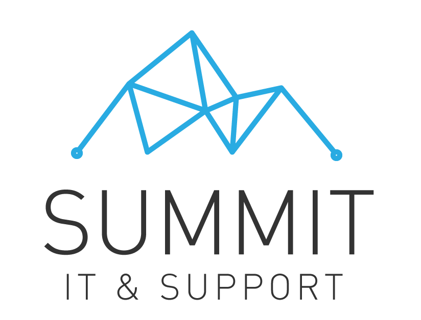
The company is an IT company. They are new and this will be their first branding. I’ve done 5 logos but the client liked these two and said, ‘Could you please add a little detail to the logo that also that describes us as an IT Support’
I’m stuck in here now, thinking several things like maybe changing the box one to talk bubble? don’t know.
Educate them that logos do not have to directly show the “tangible” thing that a company does or is known for. McDonalds logo does not show burgers or fires in it, Apple does not show a computer or phone, Starbucks does not show coffee … some big brands do have a nod to what they’re known for, such as burger king, but its your job to educate your client on how logos should not be necessarily a literal representation.
Instead they should invoke the what the company wants to be known for whether it be professionalism, casual, friendly, energetic, trustworthy, solid, etc. it’s a larger branding discussion and exploration. The logo is only part of their brand, its their tone, the way they interact with clients and customers, their corporate culture, etc.
Keep in mind that the logo may be printed large and small, color and black and white. With that in mind…
I feel the top one is too thin all over. I would make “Summit” heavier, and would change the graphic to something that goes with high tech. Both words have too much tracking between the letters.
The graphic on the bottom one doesn’t represent high tech. Plus, the orange and blue are both middle values, which means it won’t print well in black and white. I’d add more contrast, like a dark blue and light orange. And I’d stay away from any soft or “bubble” effect. That works for a child care facility, but not for serious IT stuff.
I would go back to the drawing board on both graphics, as neither one looks high tech.
Try to go beyond what your client likes, and push through to what the client’s customers will respond to.
However, I can see something on the first one. I can understand your logic behind it, but I would change the symbol a bit. I know it’s quite close to IT (network specifically), but it also reads M? Or 2 Ms together? (MM). That could create a bit of confusion. Also, if your client thought the same thing with me, that this symbol only relates to network, maybe that’s why he wants a bit more detail. But he probably doesn’t know that the detail is not the solution (as Craig said).
I would try to change the symbol, change the shape of it and maybe add a few connecting dots instead of having only 2. And if he really insists on more detail, why not try something like these:
You can also go to https://thenounproject.com and type in the search field computers or something. You’ll be surprised how much inspiration you’ll get from that website.
Regarding your bottom one, sorry but I don’t see anything on this one. Maybe I don’t get it. But if I, a designer, don’t get it, imagine people that don’t have anything to do with design…
Hope I helped and didn’t confuse you more! Let us know how you get on. Good luck!!
I don’t think an IT company needs to illustrate IT components in their logo. Otherwise all IT company logos would look the same. A logo is a chance to differentiate the brand apart from their competitors.
I agree, Buda… sort of. I agree that the logo doesn’t need to have high tech elements… but I also think that it should have a crisp, unemotional, competent look and feel. As opposed to a preschool, for example.
IT companies don’t usually sell a product. They sell solutions. There is no need to illustrate the logo with computers or networks any more than a designer should be using lightbulbs to represent “ideas.”
The first one, as an illustration of a network, has a real snarly mess in the middle that certainly isn’t a good look for an IT company. Yeah, I know, it represents mountain summits but it gives the wrong impression.
I actually quite like the second one with the mountain peak/up arrow. Other then the soft colors it is relatively strong. I’d check your “signblank” (the shape of the board you would put this on if you made it into a sign on a board.) Having the company name overhang the badge is a better look than if it were justified under it. It gives it more of a solid base. It just looks slightly unbalanced at the moment. Think to where you would put the ® if they decide to register the mark at the trademark office. As a sign guy, I hate floating elements. You will too if it unbalances your design later.