I’m fresh a graphic design graduate helping my friend build a logo for her business she’s starting. She’s a personal fitness trainer. We decided having a minimal, trustworthy, and some what serious looking brand. The audience would be anyone mostly likely 18+ that is new to fitness and may not know what to do. I see this most likely just being in a digital format for her website. I tried to come up with something original as I could and avoid the overdone dumbbell and kettlebell logos. So, the concept I have currently is a trainer helping someone do a situp in a w shape. I struggled getting to this point, and just looking for feedback at this point. I included one logo option with it stationery and another logo option were its skewed or italic to show more activeness that I thought the over was lacking.
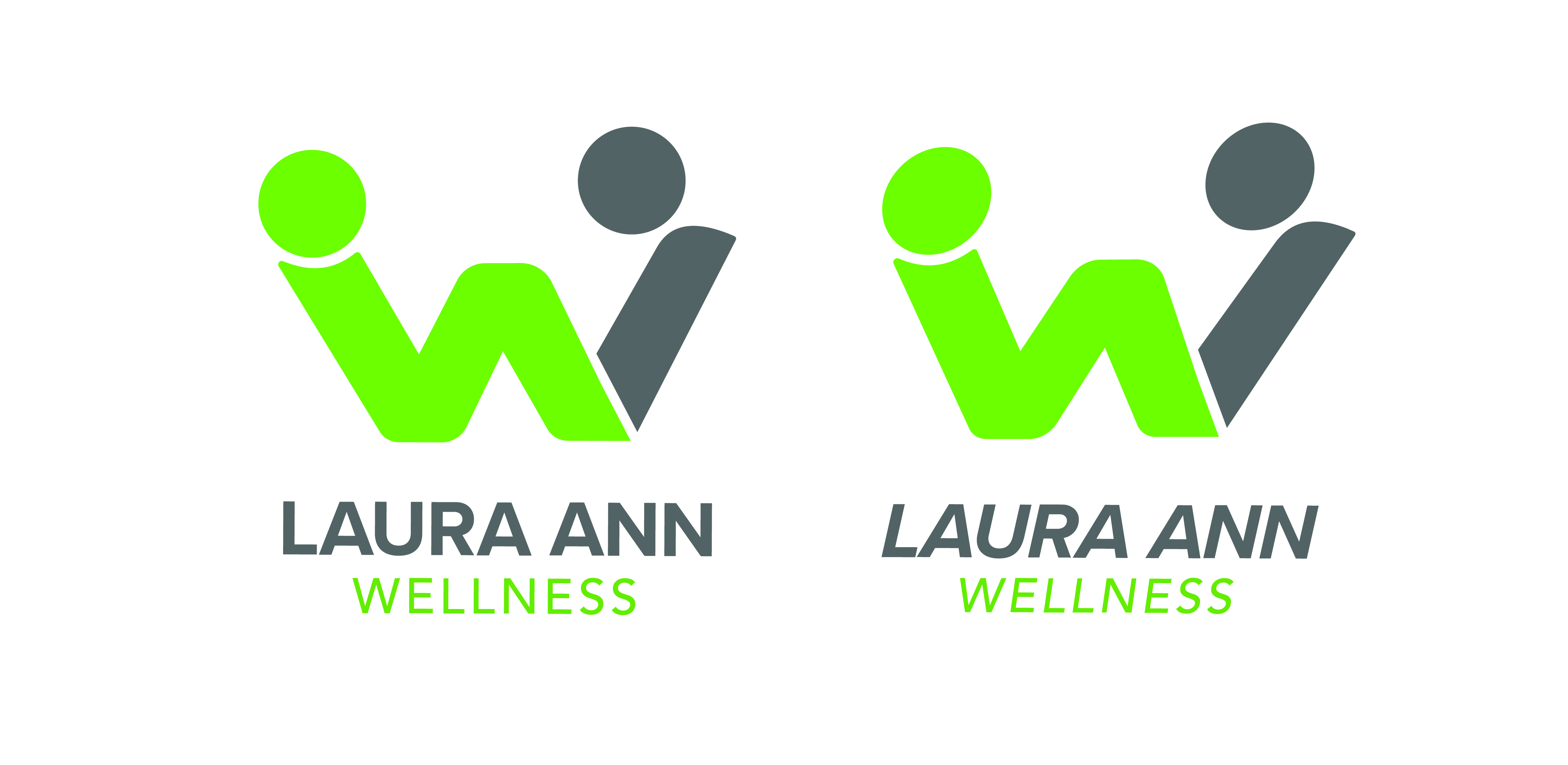
I hate to be critical right off the get go .. but this totally looks as though someone is assisting a woman in active birth.
![]()
… and welcome aboard ![]()
Ummmmm…
What RKK said…
(though not where I went first.)
Not to mention, that green is totally not printable in CMYK. I’m not even sure there is a spot color that color.
#3 on what redkittie said, first thing I thought was lady giving birth.
Also, not sure if this is correct theory wise but I wouldnt use the dominant neon green for the Logo then the Greenish-blue color for the name. Sends the wrong message for recognition to me. You know the Gestalt theory of similarity thing.
Thank you all for the feedback! Do you guys have any suggestions on making it not look like a woman giving birth or should I just scrap this all together?
I’d say scrap personally. Specially since the letter is a W which would represent the wellness rather then Laura Ann. Theres no connection between a W and Laura Ann; and if you do have one that got to be some mental gymnastics your going through to get to that connection.
Laura Ann is the brand you are trying to represent in your logo, wellness is the quality that your trying to exemplify. Your logo concept is very backwards to me.
The focus of the brand is NOT the owner.
The focus is the clients and their Wellness.
To proceed otherwise is folly.
What type of branding is going to bring the target demographic through the door.