Hi everyone!
I am new to the Graphic Design Forum and this is my first post.
I was given the responsibility to design a logo for a community called Astha , which helps out old people. It is a very serious issue in India right now (maybe world wide) that young people when they get a job and start a new family, they usually give less attention to their old parents and leave them on their own. Sometimes, the parents manage to live on their own, but sometimes, they do require a kind of recreation or something to pass the time, something fruitful to do. Often they require timely medical help which they may not be able to get on their own.
So this community helps them with just that. Along with this, Astha does a few other social work as well.
Anyway, a few details they provided are as follows -
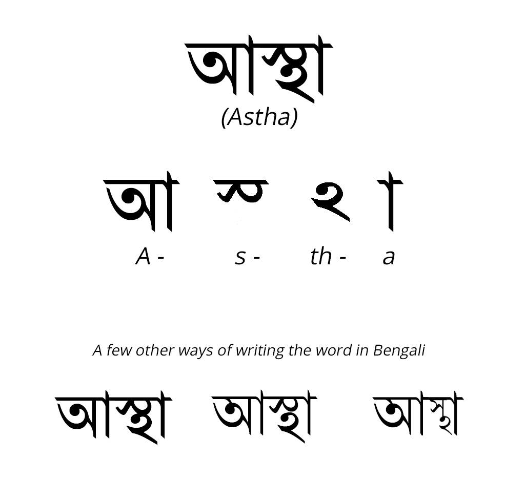
- They want the logo in the Bengali script.
- They want something symbolic like a hand or something that gives the idea of help/care.
So here is the way the name, Astha is written in the Bengali script.
Incorporating a hand in a logo has been experimented with a lot, but even then, since they want it, I did give it a try. But non-Latin scripts are kind of difficult to design in this format. Here is what I came up with -
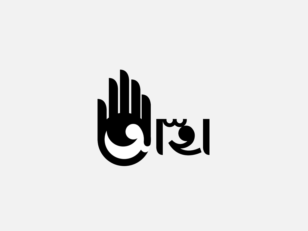
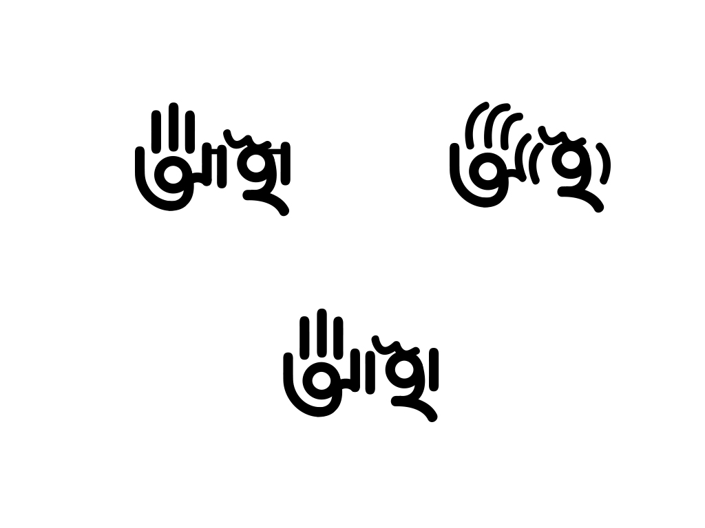
I believe this design is heavily off balanced. I would really appreciate if anyone could critique these options and help me out! The space and balance is very important and unfortunately I am at a loss trying to fix that. It is a bit challenging, but there must be some smart way to solve this!
Looking forward to your comments! Thanks in advance.
Regards