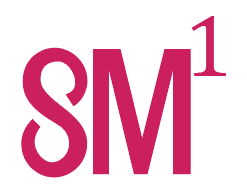
Hy ! Iwant to start my branding identity buisness and for that I have crated a logo for self branding named’someone’ cause there are aleready too much names to remember so the last people remember eachother as ‘someone’ so i thought why not my name should be someone which people remember everytime they call someone . The design choice is to crate power of 1 in the logo as one in someone cause in mathematics ,power of 1 ia associated with orignality , Kindly critique my idea and logo as it will be helpful for me
What is the purpose of life? … sorry … What is the product or service?
2 Likes
You have three disparate elements. Can you tell me what they are?
So,Basically the service I provide is branding strategy and visual identity and for that purpose the branding agency name is someone it may be someone designs or someone create ,But firstly I need to aprove te concept of name and logo
Yeah, SO the name is ‘someone’ as i explain it in the post ,But for a logo mark it is written in the least words that can be readable like S and M together makes the sound of some and the power of 1 is for the word one in ‘someone’ .The fact is I want to approve the idea first then the concept of power of one if it readable or successful or not . all other things like color and font might be change later .Kindly review if u understand the concept
I see S and M to the 1st power…
Kinky?
3 Likes
My first impression is what @DannyD suggested. The second is “small” as in shirt size. The aprostrophe looks very secondary.
I could use some more explaining.
2 Likes
Okay. Thanks for your time to review this ,secondly Kindly suggest me if i have to change the logo or name of agency also
1 Like
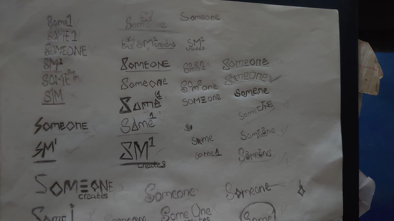
Guyz ,kindly suggest me to change the logo only or the name also,although I have some more logo sketches if any of u like to choose from them it will be appriciated
1 Like
I asked if you could identify the three disparate elements, and you came back with an explanation of your concept. That’s not quite what I was going for, but I wanted to push you to see if you could spot the flaws — or at least what are flaws to my eye.
First, you have the S with curvy strokes of fluctuating thickness that looks like a display face (actually, I thought maybe you were going for an infinity symbol). Second, you have a very geometric, sans M that has even strokes. Third, the superscript goes to a serif font. None of these elements are working together.
I think you need to scrap this and go back to the drawing board. I would be surprised if “someone” would look at the logo with no explanation and read it as “someone."
2 Likes
Dammit, THAT is what I meant.
1 Like
At first, your logo read 8M¹, which made no sense to me. I eventually decided the 8 was a S, but it still made no sense. Finally, it struck me that you expected viewers to sound out the consonants and the superscript 1 to say Someone.
Conceptually, it’s a stretch that I don’t think is working. It’s too complicated, and once someone figures out the puzzle, which most never will, it’s still underwhelming as an idea.
Originality? I’ve never heard or read that anywhere. The Power of One is a movie in which the title refers to the power of one person to overcome adversity. However, the mathematical use of a numerical superscript usually denotes the power of the base variable that precedes it. When using the exponent power ¹, it essentially means x = x. No one will pick up on any of this, and if they do, they’ll still be wondering why. The idea is too complicated, convoluted, and ultimately too clever in a way that misses the mark.
There are aesthetic problems, too. The S looks like an 8. The S is strangely drawn, and doesn’t match the M in either width or style. The superscript 1 doesn’t match either: it’s a serif glyph, whereas the others are sans serif.
I’m very sorry to be so blunt. You’re not yet ready to design logos, let alone comprehensive branding problems. I’m not saying you couldn’t reach your aspirations with formal training and the right mentors, but for now, you have much to learn.
I can see you’ve put thought into combining “S” + “M” + “¹” to form “Someone,” but the fact that most people are reading it as SM¹, 8M¹, Small, or even something kinky shows the concept isn’t landing the way you intend. A logo should communicate quickly and without explanation if it takes a paragraph to decode, it’s probably too complex.
On top of that, the letterforms don’t feel unified the S is curvy and stylized, the M is very geometric, and the superscript 1 is a serif. Because they don’t share a consistent style, they look stitched together rather than one cohesive mark.
The “power of one” idea is interesting in theory, but in practice the math metaphor doesn’t communicate originality or identity in a way most people will pick up on. Instead of trying to pack too much concept into one mark, I’d suggest going back to basics:
- Keep it simple, one strong shape or wordmark that clearly says “Someone.”
- Make sure all parts of the logo feel like they belong together (same weight, style, rhythm).
- Let the meaning come from clarity and execution, not puzzles the audience has to solve.
I’d encourage you not to see this as failure but as part of the process. Logo design takes a lot of trial and error scrap what doesn’t work and use the feedback to guide your next iteration.
2 Likes
I can’t top what other people have said in terms of the concept or the execution. So the best advice I can think of is to consider this “one idea” and come up with another one. And maybe a few more.
You seem to have zeroed in on this concept, which has an idea behind it, so now try something else. Sometimes the quickest way to progress is to recognise when one route isn’t quite working.
And above all, keep it simple.
1 Like