hi, what you tink about this logo design?
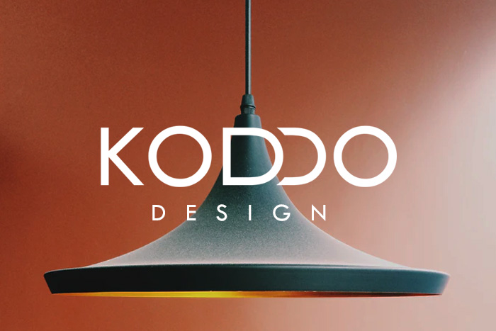
nlogo.pl/portfolio-2/koddo-design-logo-dla-biura-projektowego
hi, what you tink about this logo design?
nlogo.pl/portfolio-2/koddo-design-logo-dla-biura-projektowego
Means nothing without context. We can only comment on how pretty it is or isn’t, without some idea of the problem it is trying to solve. I can only assume a lighting company. What is its marketplace, target audience etc?
I think it’s a picture.
Not sure if that’s KODDO, or a backwards C in KODCO, or what? Could also use a lot of work on the kerning.
Design?
I’m assuming the logo is just the words and doesn’t include the background image?
Does the company design lighting fixtures? Or is this a different take on using a lightbulb to signify graphic design “ideas?”
I’ll let someone else click the link first, seeing as this is your first post and I’m at work. ![]()
![]() My gut says this is an advertising posting by @nlogo .
My gut says this is an advertising posting by @nlogo .
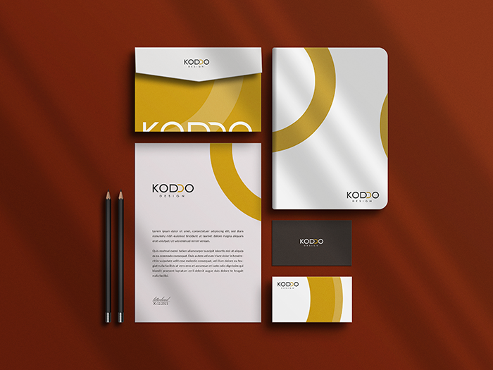
I wish we had more context, but knowing it’s an interior design company (thanks to @Joe) helps.
I think the wordmark probably has the right overall look if the company specializes in a modern look. However, the details are a bit off.
@hadidui You are only allowed one account. Are you keeping this one or tanzil ?
Thanks for your sugestions
This topic was automatically closed 365 days after the last reply. New replies are no longer allowed.