Hello, i am new to this forum, would be nice to get some feedback from other designers,
rather than relatives >.<
Please feel free to give honest feedback before i submit to client
thankyou!!!
Hello, i am new to this forum, would be nice to get some feedback from other designers,
rather than relatives >.<
Please feel free to give honest feedback before i submit to client
thankyou!!!
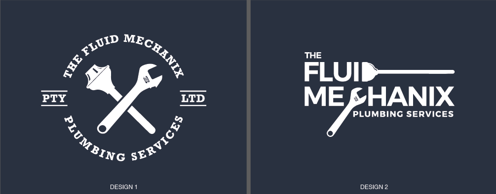
On both logos, the plunger appears to be a bit more of a stylized illustration whereas the adjustable wrench looks to be more detailed. I’d rework the wrench so that it’s more simplified to blend with the plunger.
On design 1, I’d add some sort of a shadow to help set the wrench off from the plunger (or vice versa. I’d also consider adding a thin rule above and below PTY and LTD. What is PTY, by the way?
On design two, I’d tighten up the leading between THE and FLUID. The looks a little bit like it’s floating up there. You might consider reducing the size of THE. I’m a bit torn on this one. At first glance, I read it as you intended. But on second look, I see FLUI more than FLUID. Try making the plunger the same height as FLUI or spend a little more time working on the D / plunger interaction.
thankyou for your quick response.. much appreciated, all taken on board !!
No one needs a toilet plunger in their logo.
Is your design logo a lightbulb over a computer screen?
Why misspell mechanics?
On the second one, using the tools as letters isn’t quite pulling it off. Maybe the plunger D, but not so much the wrench for a C.
the client specifically asked to include the plunger, and the name was provided like that lol… thanks for your feedback!
Sometimes your job as a designer is to talk clients out of bad ideas.
Or, at least, have some fun with it. Something more fluid or mechanical maybe?
Plumbers and wrenches are so cliche.
Google Search
One of these is a ttttrendy badge logo which will go out of style within a few years.
The other has problematic text and a very inconvenient descending element.
When you create a logo, consider the sign blank it is going on.
The first one is a circle with ears. Fairly standard fare.
The second is going to be a box with a hanging appendage?
The 2nd one is the most promising in my opinion. Like @PrintDriver said, it can be cliche to do the trendy badge style circle logo, whereas the right one has some promise for longevity. Instead of the wrench, try using the hexagonal shape for a nut for the “C” in Mechanix, just knock out a section for the opening of the counter.
In order to make the plunger D look more like a D, I would break out the handle from the base of the plunger. Give a little gap between them (like the gap in the first design separating the plunger from the wrench) and I think that’ll help it read more as Fluid and not Flui.