First time asking for feedback here for a logo design, so bare with me if my english translation to explaining what what is isnt the best
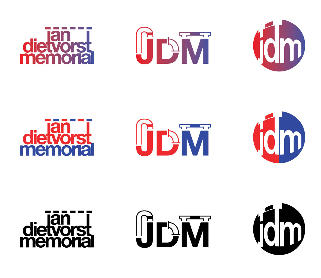
JAN DIETVORST MEMORIAL
It is a competition held by the athletics club I also train at and I take care of their visual communication, known as SPADO. Jan Dietvorst is the name of our beloved late trainer that was mostly known for his hurdle trainings. After his passing a new compition rose up with all the components of the sport he gave training for.
What was ask for:
The logo of SPADO is red en blue and so this is wanted to be incorperated in the logo design.
Easy to use for Social media (means in a circle or something like that), wich I personally didnt put 1st as what was most important.
Primary I chose to go with the hurdles, because it was he was most known for
These 3 design are what I have send off to the organisation. So therefore I would love some feedback on all 3 of them. It’s the first they see.
I know a lot of people in de graphic industry politely pass on color gradients but I feel like sometimes it can feel like a little extra pop wihthout having extra stuff added to your logo. Thats why I included it. Maybe there is a way I can use it better in these cases?
The first design:
A few letters of his name become the hurdle to keep it simple and clear. To me, its my favorite because it feels timeless. I do know that some people will not reconize whats going on, but I also asked myself the question: Is that needed for outside the Athletics world? I also see now, that the RI in memorial should be a little bit more spaced as it can be viewed as an N.
The second design
Are the “initials” of the name. Fused together with the 400 meters, hammerthrow area and the hurdle. I myself are not the biggest fan of it, felt like I needed to show them something more then 1 element of the competition.
The third design
Came out of the first one, but focused on being compact and therefor “more” usable for social media. As I think a client would look at it. Feels more directed to youth.
It’s a time ago I was able to fully design a logo and such for real so all the tips are welcome I also have to start designen a logo for the National Championsships Junior 2023 this month, so can’t wait Feels goodddd…
I think the first group has the most potential. It’s straightforward and doesn’t rely on visual gimmickry. I don’t understand what the dotted line is for. Is it a visual reference having something to do with hurdles? I agree that the r and i need to be separated more. When I first read it, I thought it said memonal. Rather than space them further apart, I’d likely trim back the ear on the r a bit to create a little space.
The second logo look like a plumbing logo to me. The little graphic devices remind me of the pipes under a kitchen sink.
The third design relies on awkwardly distorted letters. I don’t think it works all that well.
Edit — I figured out what the dotted line on the first one is about. The j and t are hurdle posts and the dotted line is the board connecting them. You might want to work on that a little more to make it more obvious.
I agree with Just-B. The first design is best. I would stay away from gradients as they could cause visual difficulties in small sizes. I would also give a second look at the posts that are supposed to be the letter “t”? The horizontal marks on the t should be much more visible as t letters and not the letter l.
I agree with the others, the first is the most promising, but that does not make it a good solution, I’m sorry to say. There are many problems with it typographically, from both an aesthetic and a production point of view.
However, my main problem is that competitions are simply not an ethical way to procure design. They tend to lead to worst case scenarios, and design decisions made by committee. Above all, it is not right to get designers to work for free in the hope of ‘winning’. You would never engage any other professional service this way.
Back to the logo itself. I’d suggest getting rid of all of the options with gradients. You need a logo to be a simple visual mnemonic. Particularly, in this case, where you are required to use red and blue, you end up with a predominantly purple solution.
As B says, the hurdle device is not working. If you saw that without context, you would not know what it represents. The thinking is good, rationalising down to core services of the club is a good way to go, but you need to think a bit deeper and rationalise further.
1: Thats a good one, trimming back the R in the first one.
About the “hurdle”, yah mayb it works if i make them a little higher so they dont feel connected to the other letters “AN”
@PopsD I’ll look at the T’s to make them more visible, not sure yet how to do that.
2: O, didnt even see that myself, the plumbing your right!
@pluto The audience is athletes that mostly use this competition as a practice one because it’s in the beginning of the summer season. But we want it to make it bigger then that.
Can you explain yourself a little more about going deeper? Altho it doesnt need to be known for people out of that world, it does need to be for the ones in them.
@sprout I dont really understand the beginning of your second paragraph (language wise )
“You would never engage any other professional service this way.” True, I would have more time to do research and design. However, we decided they needed something quick, and this would be finetuned further on. Look at it as a begin, maybe I needed to make that clear also.
On second thought, I think the answer regarding the “t” looking like an “l”, I think the answer might be, instead of extending the top of the letter “t” let it stop naturally and don’t let the tall posts go all the way down to the top of the letter “t” and leave a gap there instead (so it appears to be a vertical line on top of the letter t. Is that clear enough?
Are the participants any particular gender or age-range? Do you know anything else about them, like their interests (aside from atheltics) or lifestyle for example? You mentioned that the organizers are trying to grow the event, how are they trying to do that?
The more you know about who you’re designing this logo for, the more you’ll know about how close you are to hitting the mark.
Absolutely - what I mean is that just because it’s a hurdle jumping competition doesn’t mean that you need to incorporate a litteral representation of a hurdle into the logo.
I prefer the first set of logo type. I don’t mind the gradient and it can be useful depending on the medium. I don’t know the kind of work being put out by this club or how the logo fits in from a consistency standpoint. The only feedback I have would be to let some of the letterforms breathe — with kerning and a bit more leading.
If the dashed line is making up the hurdle, why not a inclined rounded dashed line to emphasis the leap verse the straight bar.
Thanks for all the feedback and help
I was hit pretty hard by Corona in the face too, so I havent been able to work on it yet.
I will reply later again when it’s going better again