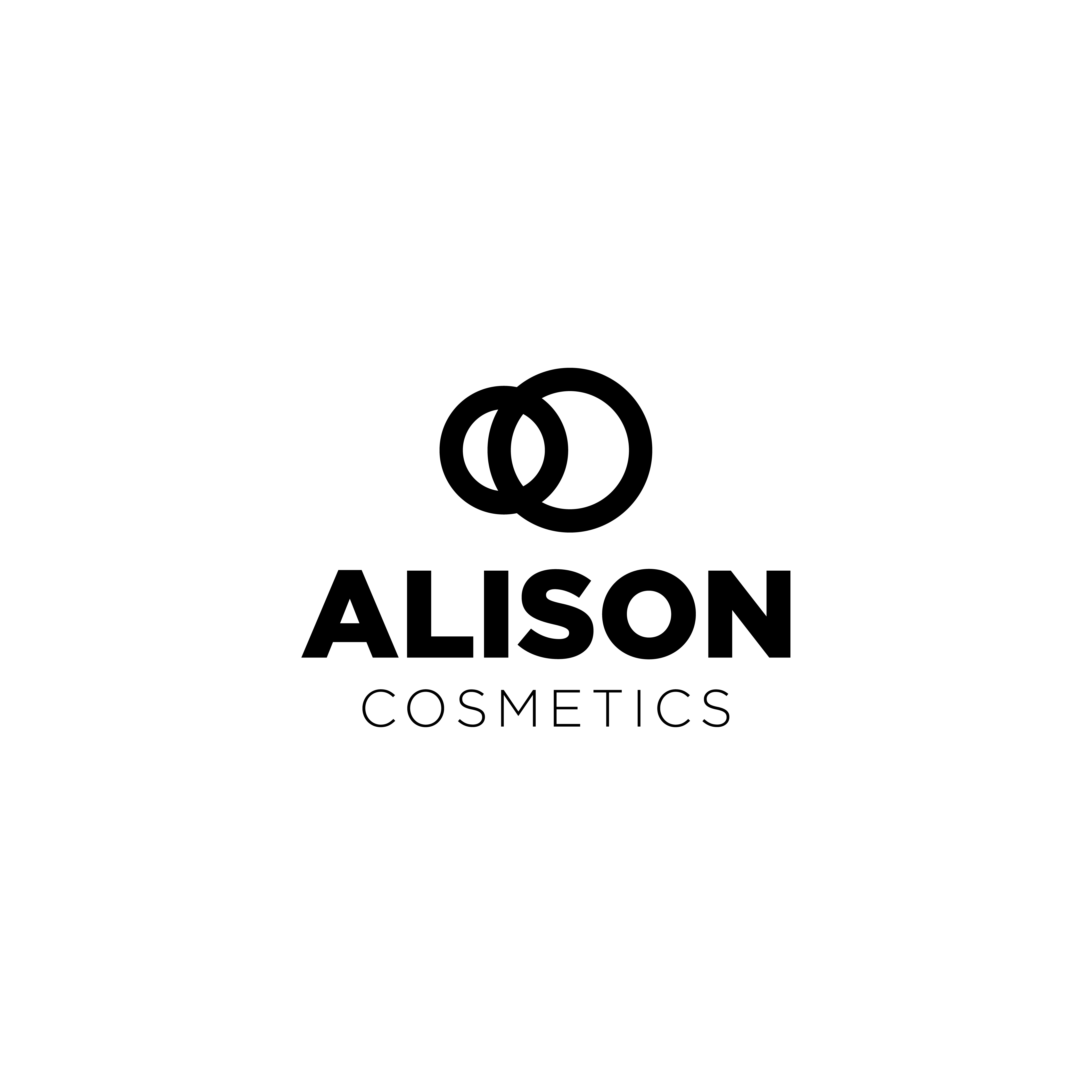
Hello! This is the logo for one of those 30 day logo design challenge’s. This one is for Alison Cosmetics, an online beauty store. The idea behind this logo is that two circles, one of whom is significantly larger than other, represents pupil of an eye. It is based on the fact that your pupils dilate when you see something beautiful.
I’ve been learning logo design for past 6-7 months solely from books and youtube.
Let me know your valuable feedback on this! Thanks!
Ok, you might see that as two eyes because you know what you designed.
To the rest of us?
It’s just two interlinked circles.
Aesthetically, your balance is off. The circles are competing with the word Alison as far as density. They are just close enough in weight to be similar but just different enough to cause visual discord.
As a sign guy, I hate skinny stick fonts (I can’t fabricate them, they have to be printed) but they seem to be a trend these days.
Trends…End. Eventually.
I like the concept behind the logo, its smart and creative. I don’t think the execution works though.
3 dimensionally the logo looks more like maybe a tube; it doesn’t really say beauty products to me. The thickness of it also doesn’t say refinement. I say the logo more speaks to something like a bank/investment firm.
The typeface you used for “ALISON” also has the same feel. I would suggest using a typeface that has slightly rounded corners for a friendlier look. Maybe like Brandon Grotesque which has bit of a classy look to it.
The visual hierarchy of the text looks decent. I would maybe look to make “cosmetics” smaller though. I would also look to take it out when designing the logo. If the logo doesn’t say “beauty products” without the “cosmetics” in there it’s probably best to rework things.
Visual balance is also off due to the graphic. Everything is centered. So the asymmetric logo throws off the balance. If you were to keep the same graphic. I would maybe try aligning “cosmetic” left of right? not too sure if that will help but worth a try.
Thanks for your valuable feedback. Can you suggest me some ways in which I can improve my work. I used a font with rounded corners and it looks way better. What else can you think really improve my design while keeping the same idea?
be creative, use cosmetic themes and imply those into the logo
since i don’t use cosmetics, i cant recommend a certain one, but a mascara brush or lipstick might help visualize the concept without any text.
I’m not a fan of incorporating visuals into logos if they don’t further the design.
Don’t see graphic designers using a keyboard and a lightbulb in their logos.
Cliche = Boring.
A brand mark doesn’t have to have recognizable objects in it. Might require extra marketing effort though.
Honestly there’s not much that can make your logo better. A logo is a element that creates an inherent link to the company in the mind of the consumer. Think of iconic brands such as Apple. The concept behind the logo wasn’t amazing (it’s just cause Jobs was a fruitarian and worked on a apple farm) but the design elements that went into the simple apple logo are vast. It’s curves were based in golden ratio circles. The previous color stripes communicated the graphic interface of the computer, while the more modern version has a Bauhaus inspiration as Jobs and Apple computers follow that design aesthetic. But what makes the apple logo great is how instantly recognisable with the apple brand not just in name but in feel too.
Take a look at McDonald’s. Yellow arches yes are really simple but if you break it down; the rounded curves of the arches are very friendly, as well they have inviting facial quality to it. The low thick-thin difference from makes it viewable from a distance while still giving it a homey handdrawn inviting look. The colours yellow is inviting, gives a sense of sunshine and happiness and red is a go go go I’m hungry kind of color all which works well with the Fast food industry.
I googled the brief for Alison Cosmetics. The logo doesnt idealize anything that they wanted in that brief. (Though what the client wants isn’t always what is needed). What your trying to do it create a logo that seemlessly merges into a world were there’s already 1000000 cosmetic brands while standing out.
That said if you want to keep your design the way it is and just improve it. I would look to creating thickness contrasts between the circles might create more balance and make it more visually appealing.
For what it’s worth, I quite like what you’ve done.
It’s clean, simple, elegant and matches the look that I associate with higher-end cosmetics. I really like how you’ve made the weight of the lines in the logo match the stroke weight of the typography. I also think your choice of type is close to perfect.
The only reservation I have is my tendency to try to read some significance into the two circles and why one is smaller than the other. Nothing really comes to mind. Maybe there isn’t anything there other than two circles, but it’s the ambiguity of not knowing what, if anything, it’s supposed to represent that doesn’t seem quite right.
Seriously, though, aside from wondering about that, I love the looks of it.
I don’t know if it’s too close to be an inspiration, so here’s my feedback. I’d prefer a less bold version of the same font to give it a tad softer touch. Else I like what you’ve done even though the meaning you expected it to convey doesn’t hit the mark.