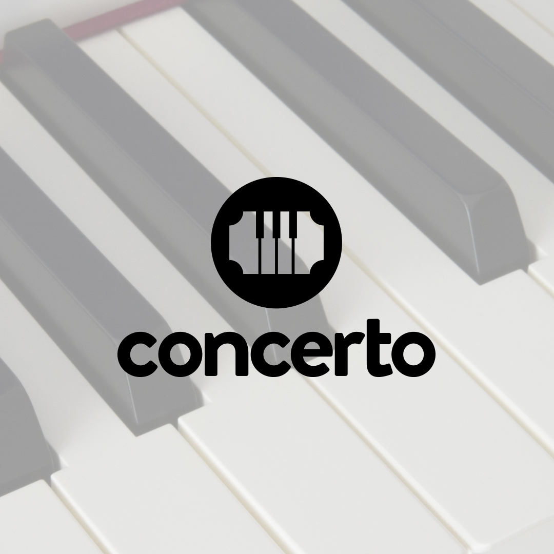
Hello! So this is the logo for a madeup company called “Concerto”.
Here is the made up brief:
We’re a company that provides SMS updates when your favorite local artists are about to announce a tour in your city. It automatically integrates with popular music streaming sites, recommends the best seats in venues, and automatically knows which tickets it should hold for you.The logo should definitely convey the aspect of music, concerts, and possibly tickets. Our Concerto service relies on Facebook messenger to deliver messages, so it would optimal to make the design very user-friendly as well. Our customers should feel comfortable exchanging credit card information with the Concerto chatbot.
You have a lot of positive things going on with this logo. It works well in one color. It doesn’t rely on gradients, shadows or gimmicks. It’s memorable and simple. Nice use of imagery combing the ticket and piano keys to form a new element. The mark would work great as an avatar or app icon. It has an established look that exudes confidence. So, overall, great job.
The one possible downside is that this has a strong classical music feeling. I think that has as much to do with the name as it does your design. Since this is a fictional project, I’m not sure I’d worry too much about that.
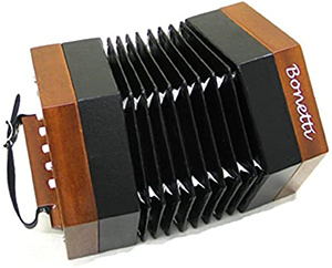
The first thing I saw was the word concerto, which sparked the notion of the logo being a concertina rather than the piano keys and ticket you probably intended.
My concern is that the name and piano keys make it appear to be geared more towards classical music than popular. Also, I can’t get past seeing a razor blade. Don’t get me wrong, it’s not a bad logo as a stand-alone. However, it’s about communication and it seems a little off to me.
I hope the background keys is not part of the logo design. It completely ruins it. Besides, the logo element should reverse out of whatever is in the background.
My first reaction (and I judge a lot of my work based on first impressions. I know not all will agree with this method) is a piano but that is because there is a picture of a piano in the background. With out that it would be somewhat difficult to understand that this logo is about music.
Also, from the brief it seems like a company that sends alerts about favorite artists. There is not much in the logo that would protrade an image of alerts.
I would go back to the drawing board. Find an inspiration about alert, music, updates and perhaps artists.