Hello,
I am looking for some critique on this logo for Spiritus. They are a clothing brand that has the unique concept of ‘designing backwards’ where the clothes are designed to fit the fabric.
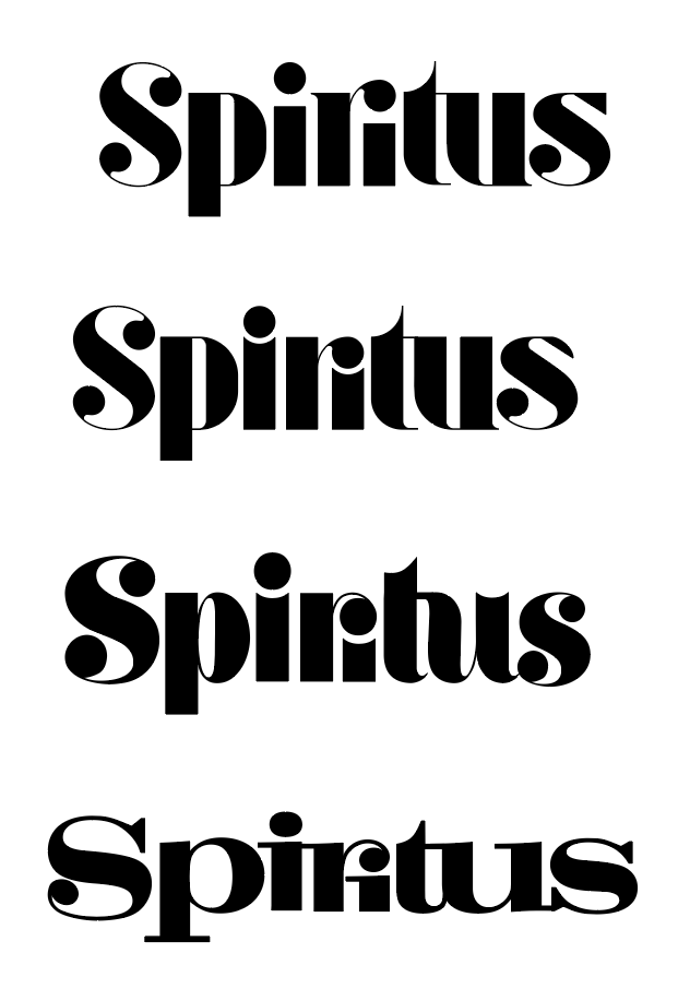
As a sign guy, I am sooo not a fan of any font that uses strokes as small as this, especially the top three examples, so If I had to choose it would be the bottom one. But that one has issues too, like the “ir” connection and the “us” connection.
Remember, a clothing label isn’t always just a pretty picture on a website. They may want to embroider this in some fashion, or even if silk screened, if any smaller than my current monitor size (which is massive, LOL) you are gonna lose those thin strokes to the ether.
Hey thanks for the advice, I’ll try to thicken the lines up.
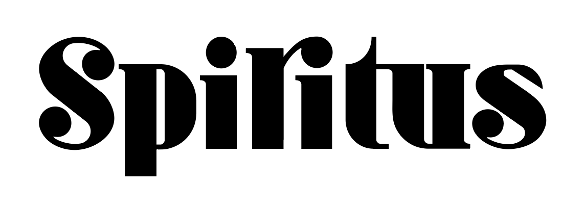
I’ve had a quick play with using the typeface from #2 but having serifs at the top and making the tittles same height and increasing the tracking, plus thickening up the lines. Wondering if you think this is more legible and will work better for more applications.
Hmmm, I really like what’s going on with this.
Thickening up the serifs addresses some potential practical problems down the road, but it compromises the bounciness (for lack of a better word) of the word mark. It also makes the serifs a more visibly important part of the design. As such, the decision to use or not use them on this or that letter seems arbitrary. The t and us have bottom serifs but the p, two is and the r don’t.
Then again, it’s the incongruities that contribute to the design, like the odd way the top of the small s ends. Even so, I’d likely put a serif (or two) on the bottom of, at least, that p. It seems needed to balance out the serifs on the bottom of the t and u.
You’ve also increased the letter spacing a bit, which likely increases legibility, but takes away some of the personality. Like many things in design, I suppose it’s a balancing act of compromises.
Your latest rendition leaves out the playful way the ball on the r cuts into the stroke of the i. I really liked that playful little detail and would be inclined to bring it back.
Hey Thanks for the direction, I had a similar feeling about the serifs, but couldnt dictate what it was. I’m going to keep working at this to try and achieve the best balance I can. Thanks for the help!
Second one is much better than the previous one ![]()
You can do bouncy and playful without resorting to nearly non-existent letter strokes. Or maybe consider doing away with them altogether.
I’m all about practical, today. I cannot tell you how many times I’ve received stuff that designers wanted to halo light (which requires that LEDs fit inside the letter strokes.) “Hey I gotta thicken your letter strokes to do this.” “NO! that’ll ruin my design!”
Yup